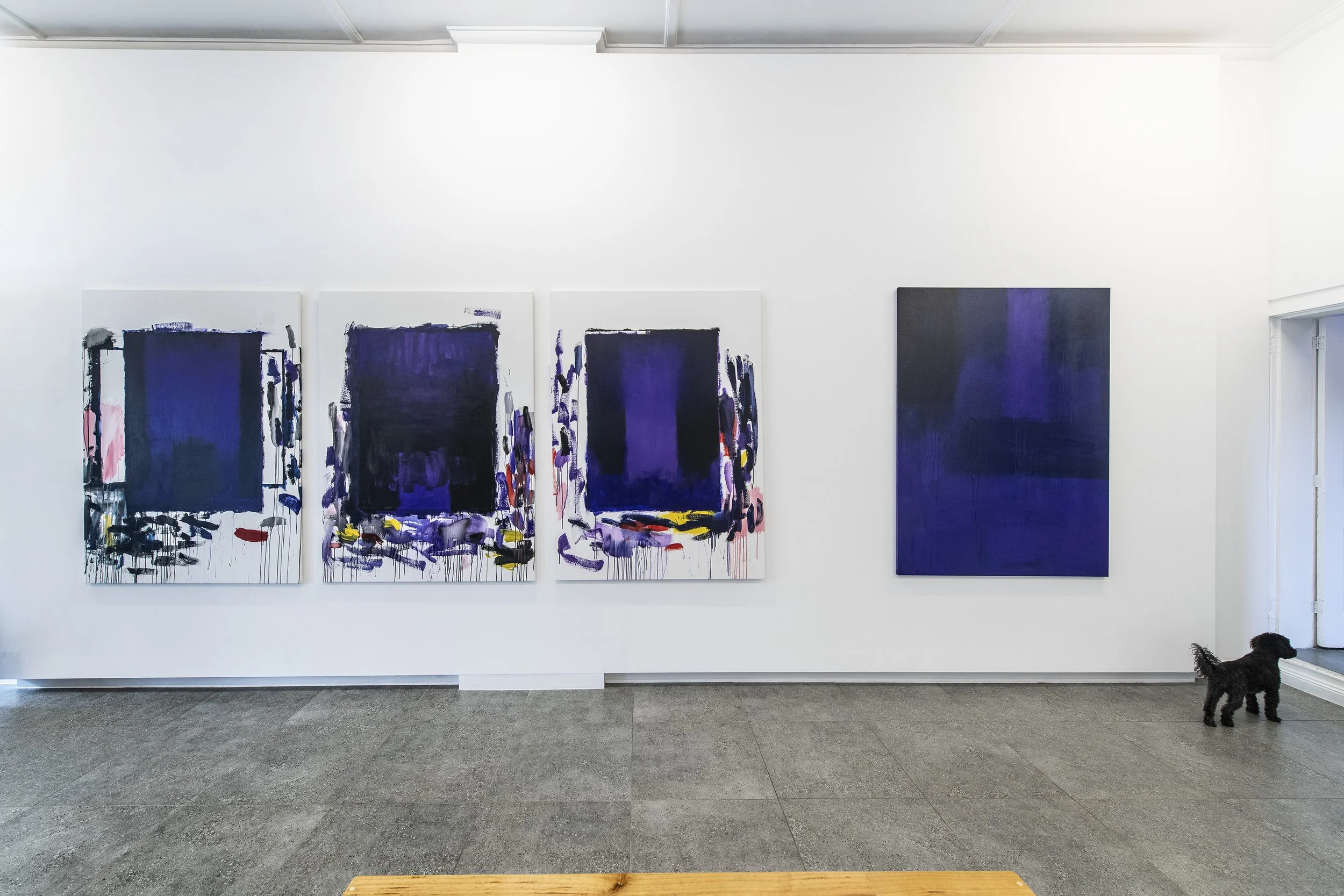
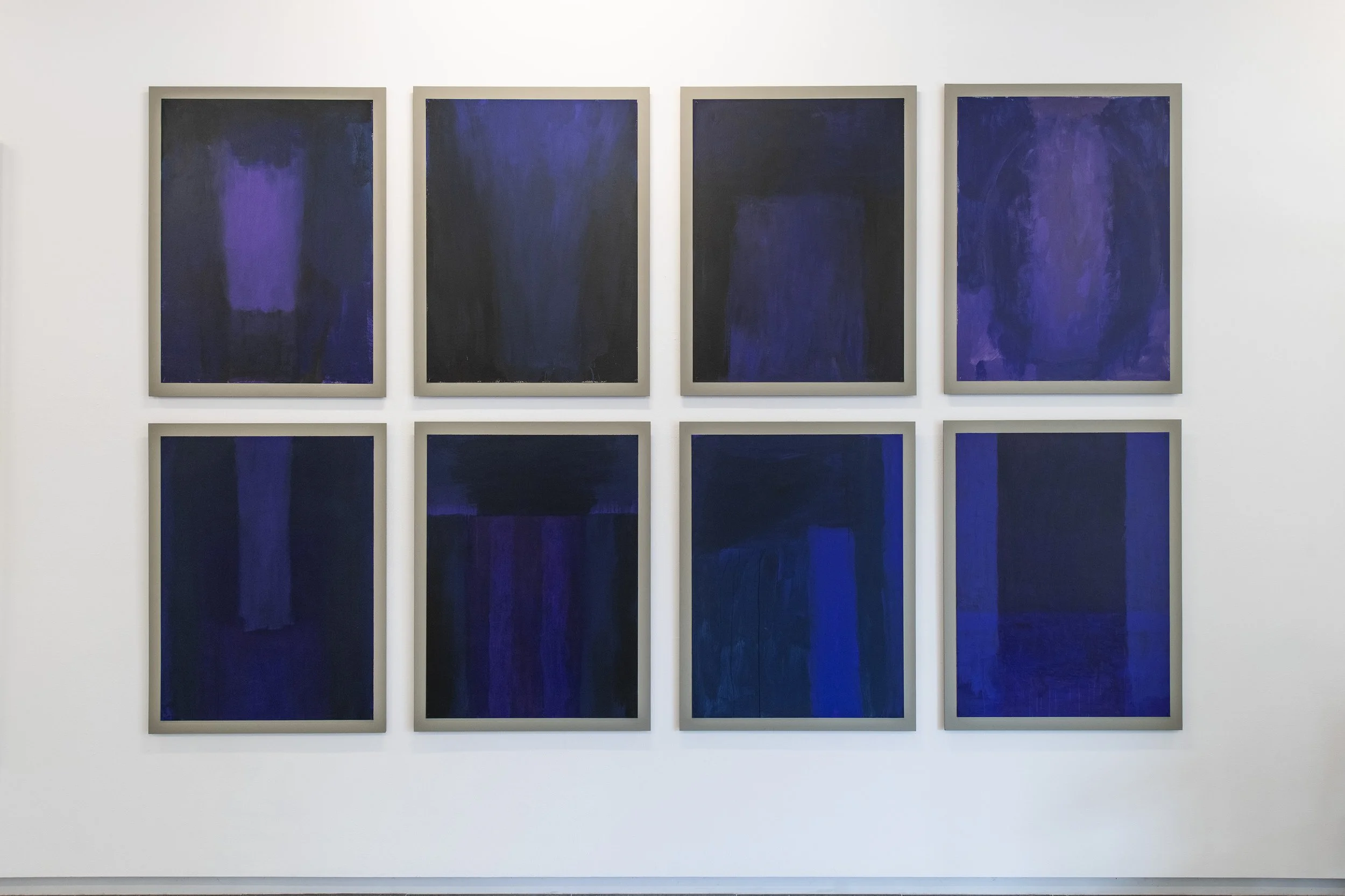
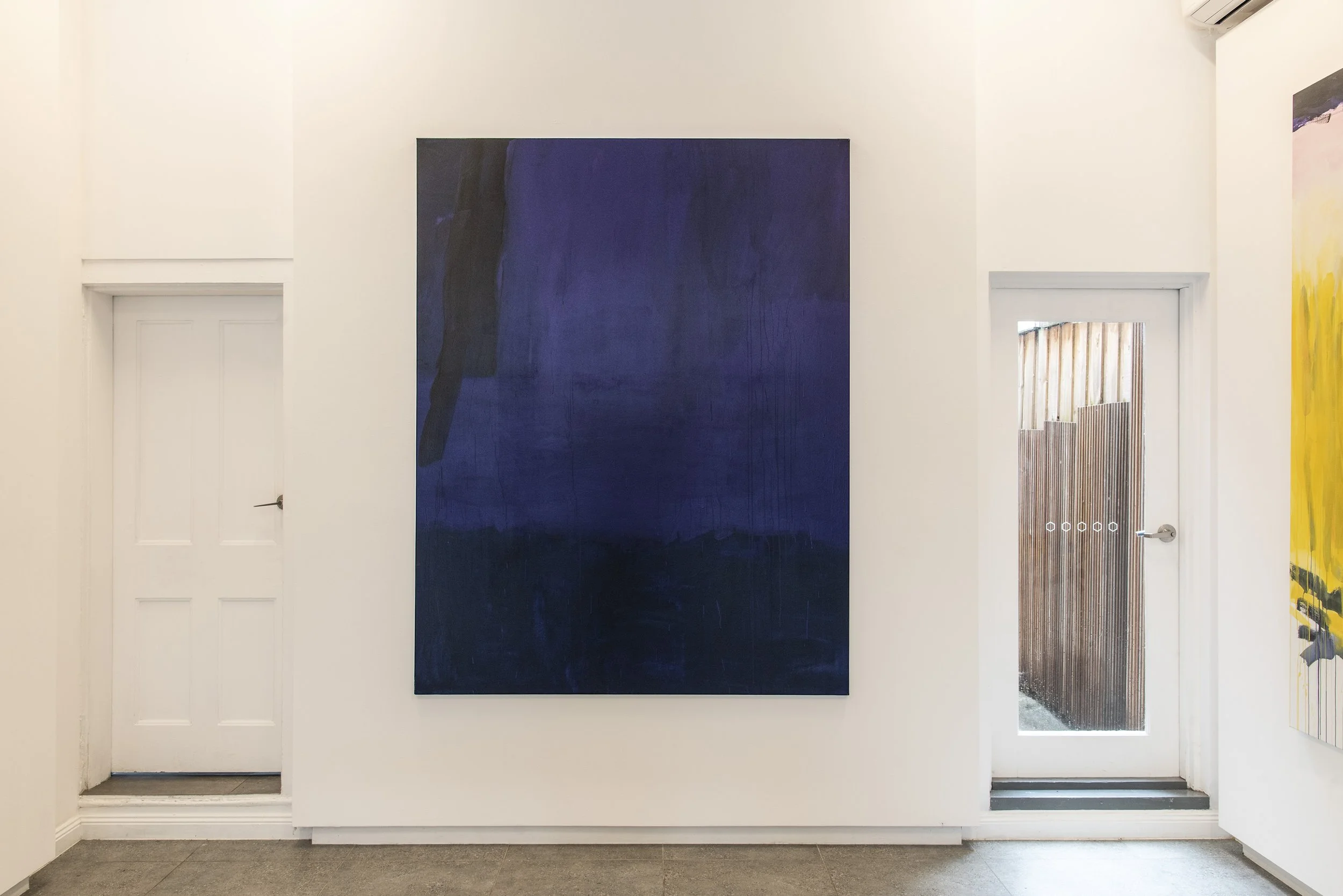
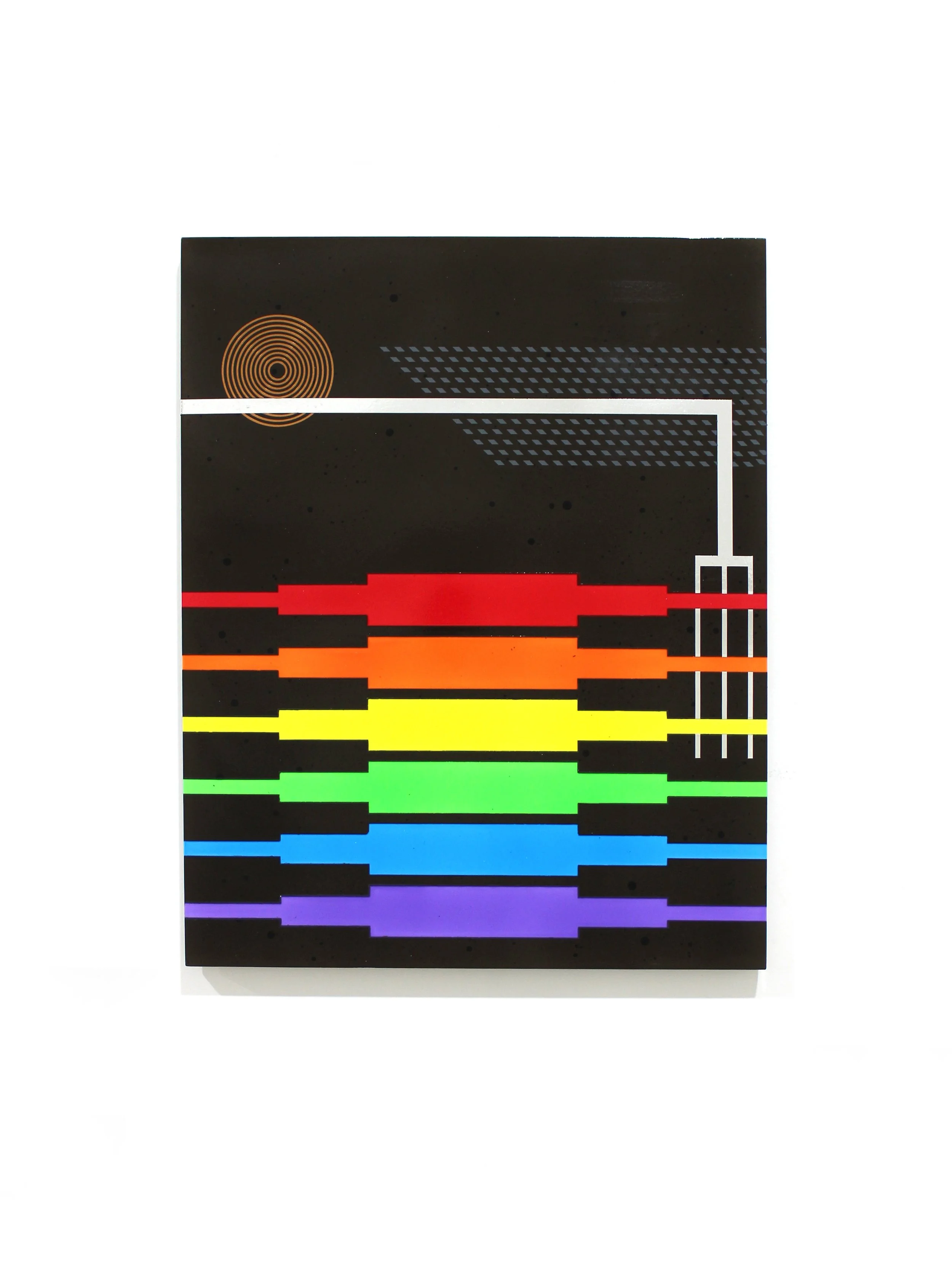
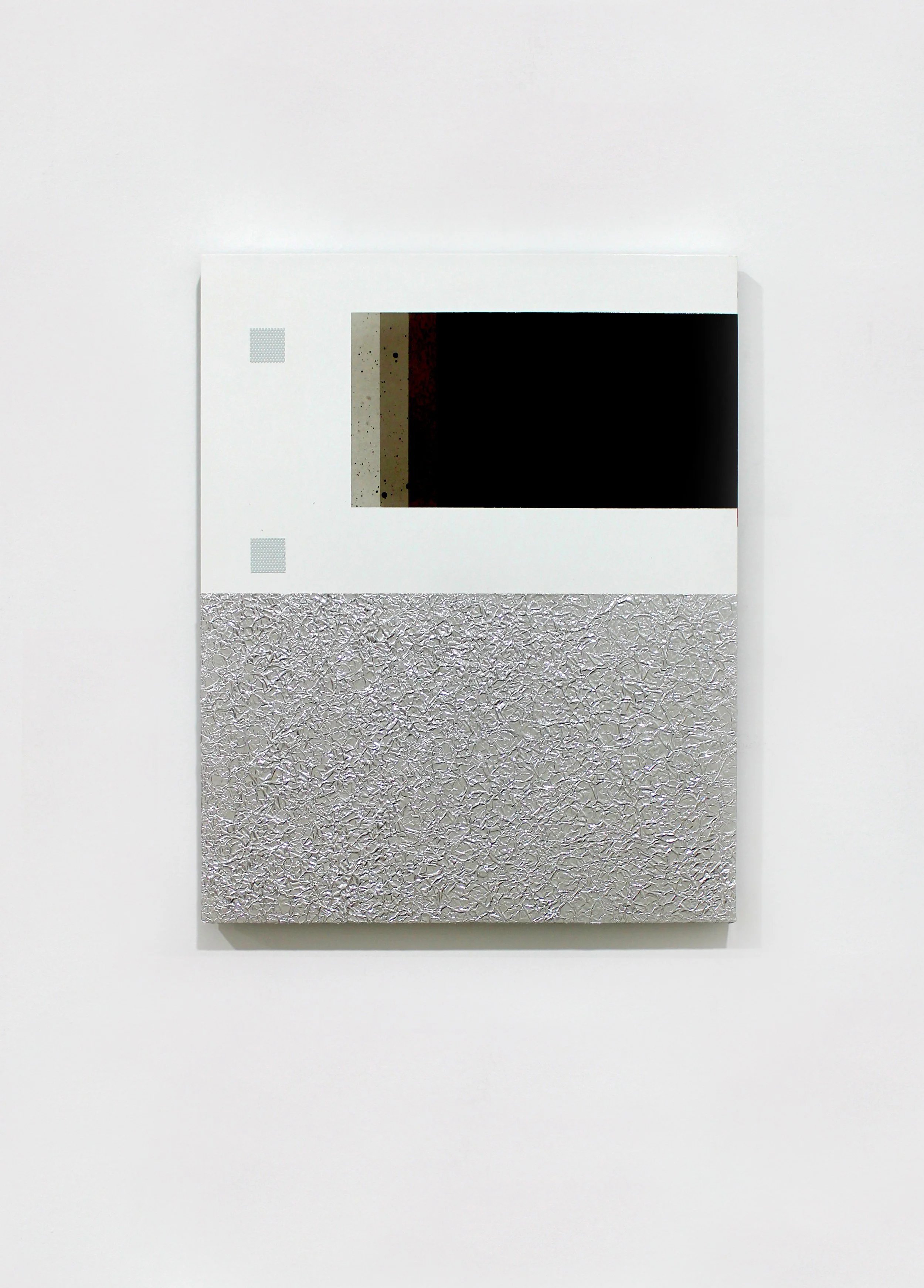
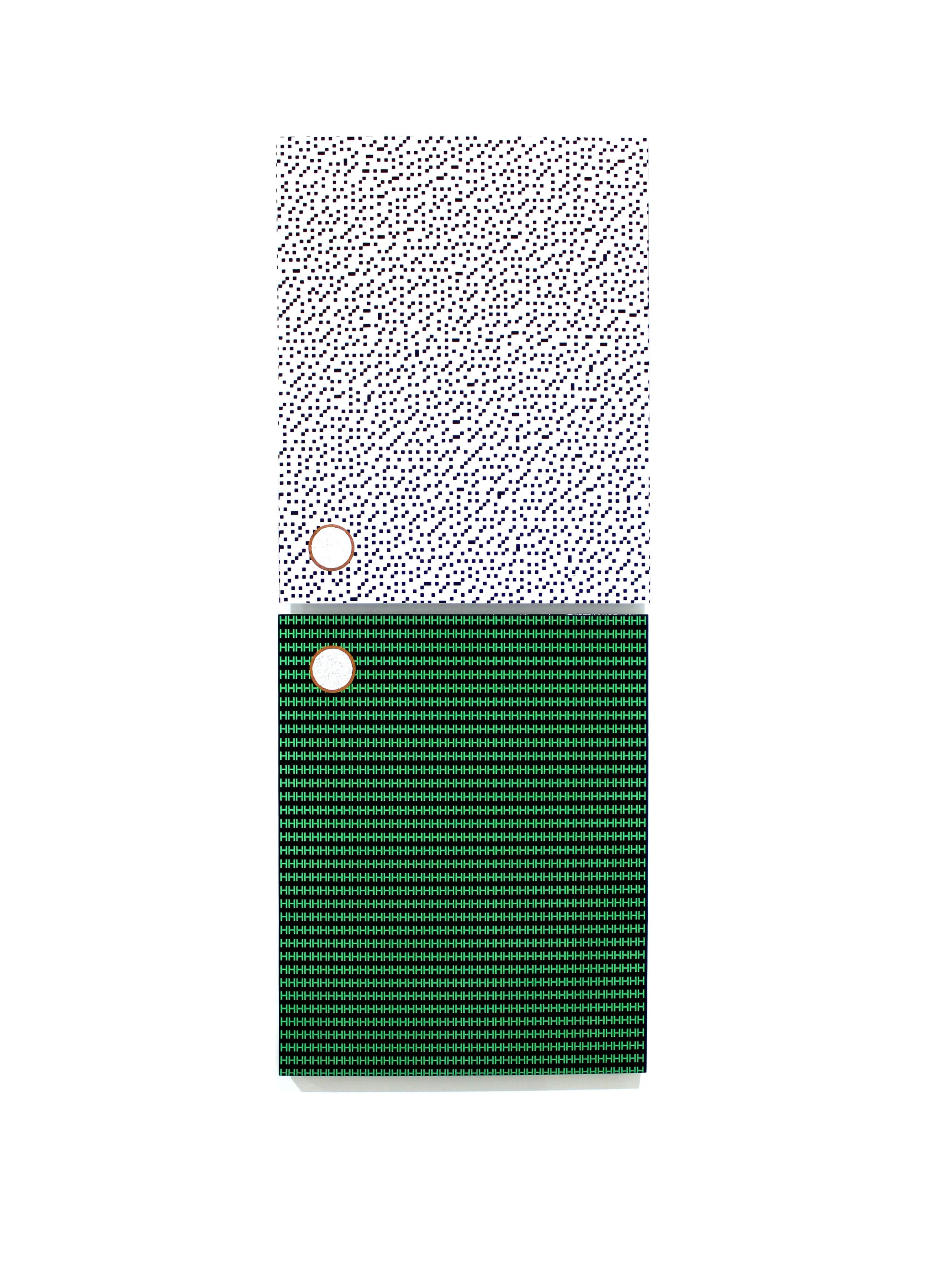
PETER WESTWOOD: Known unknowns and unknown unknowns
PETER WESTWOOD: KNOWN UNKNOWNS AND UNKNOWN UNKNOWS
01.07.26 - 25.07.26

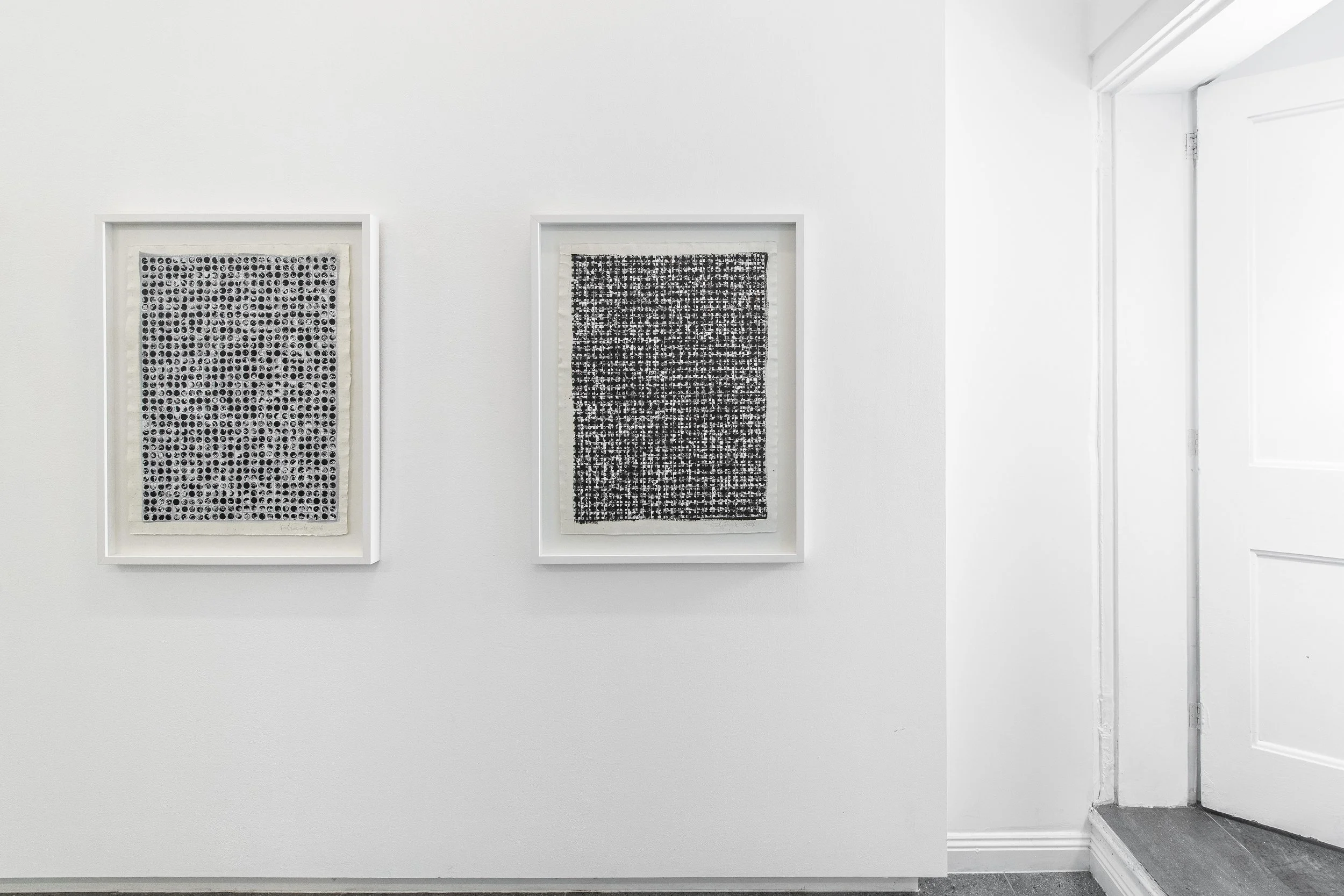
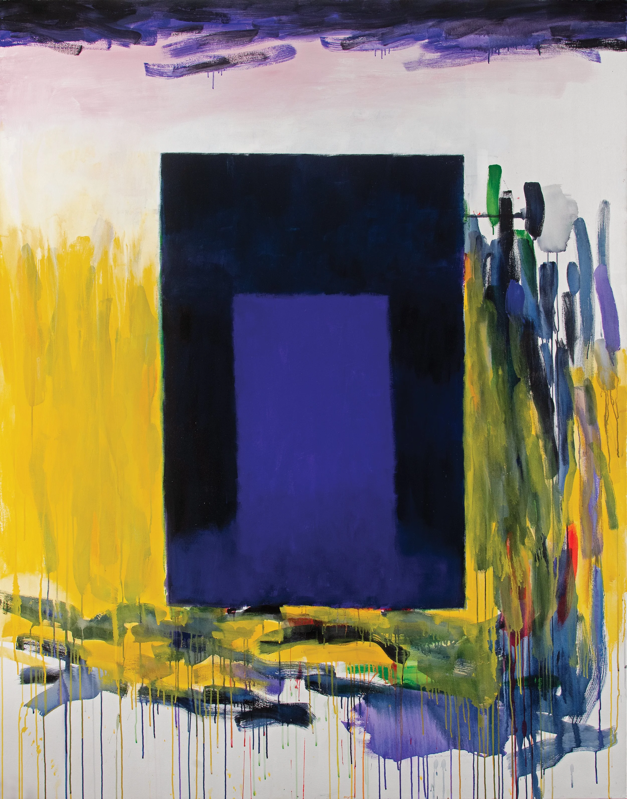
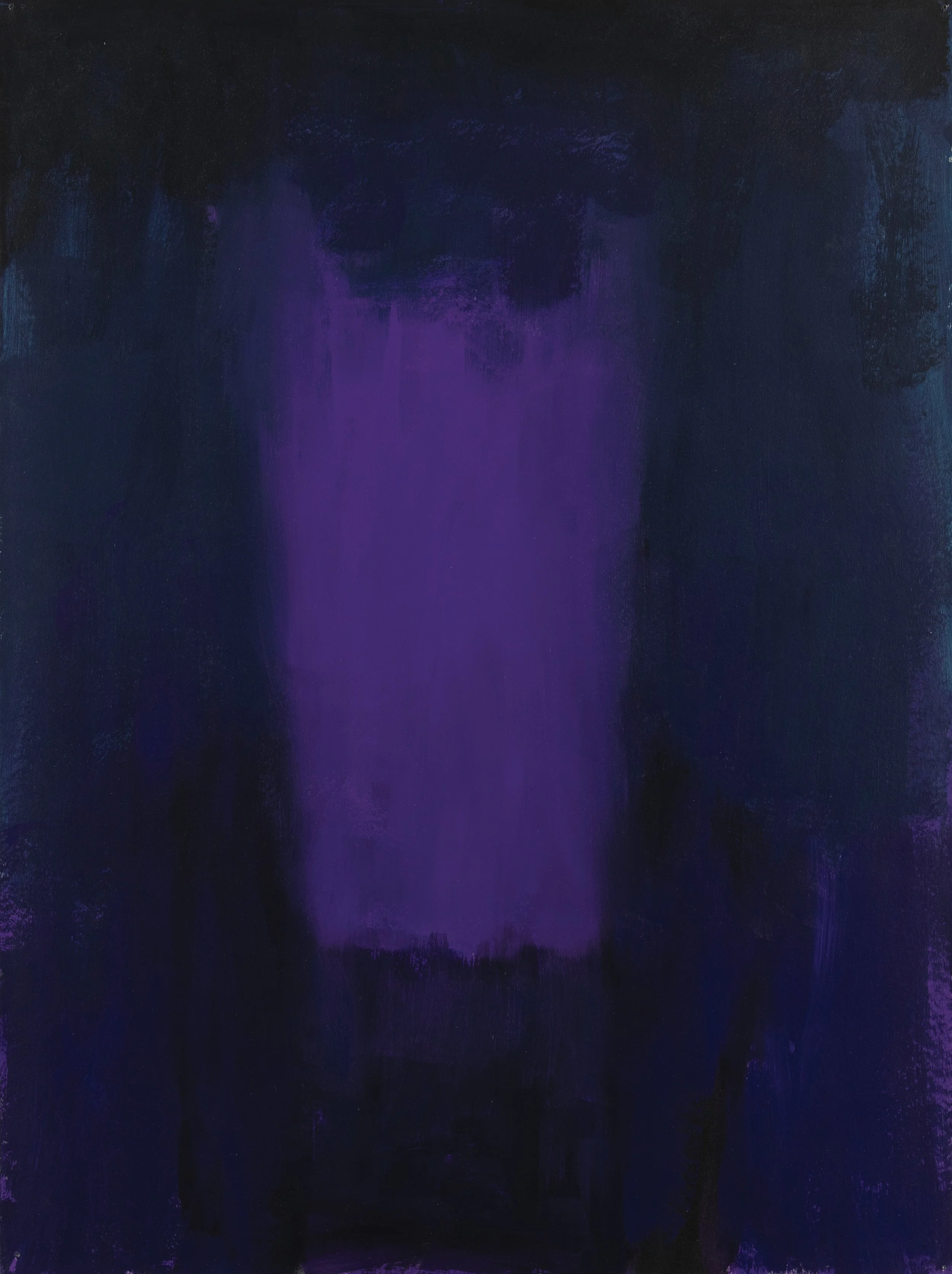
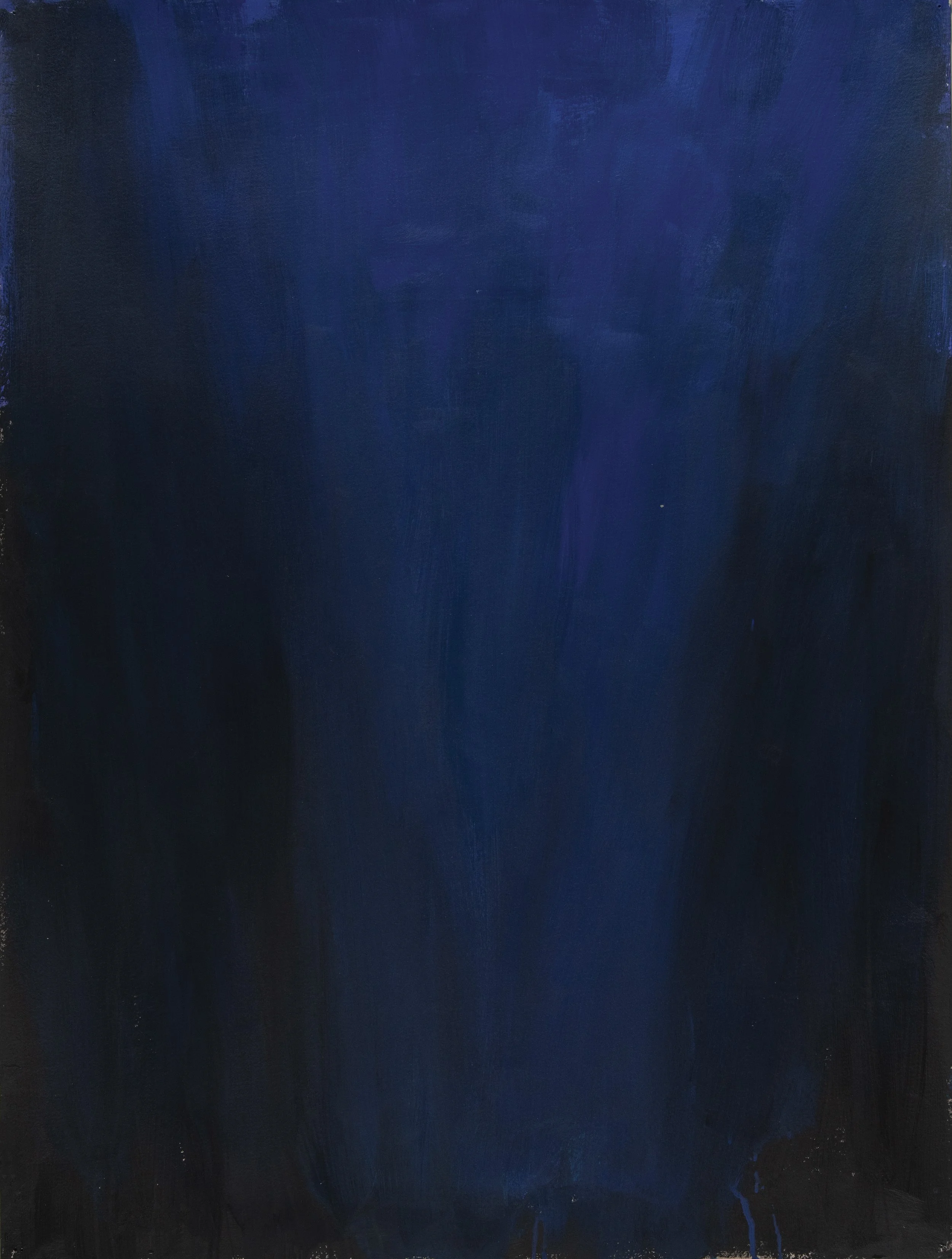
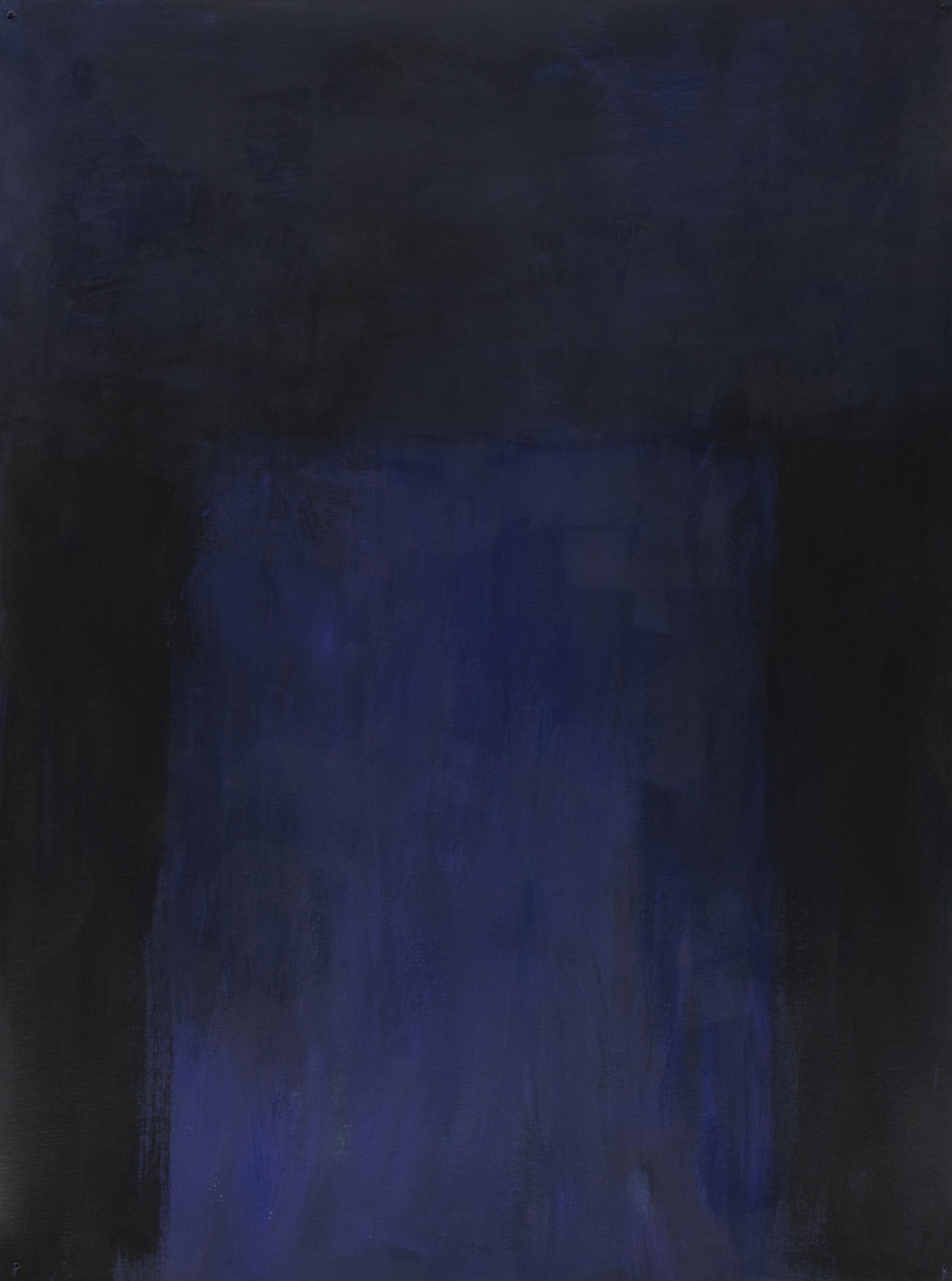
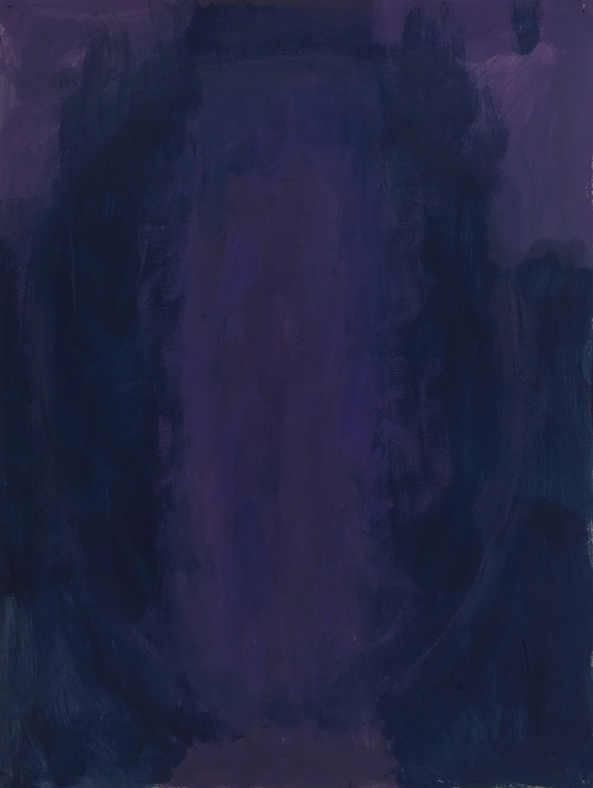
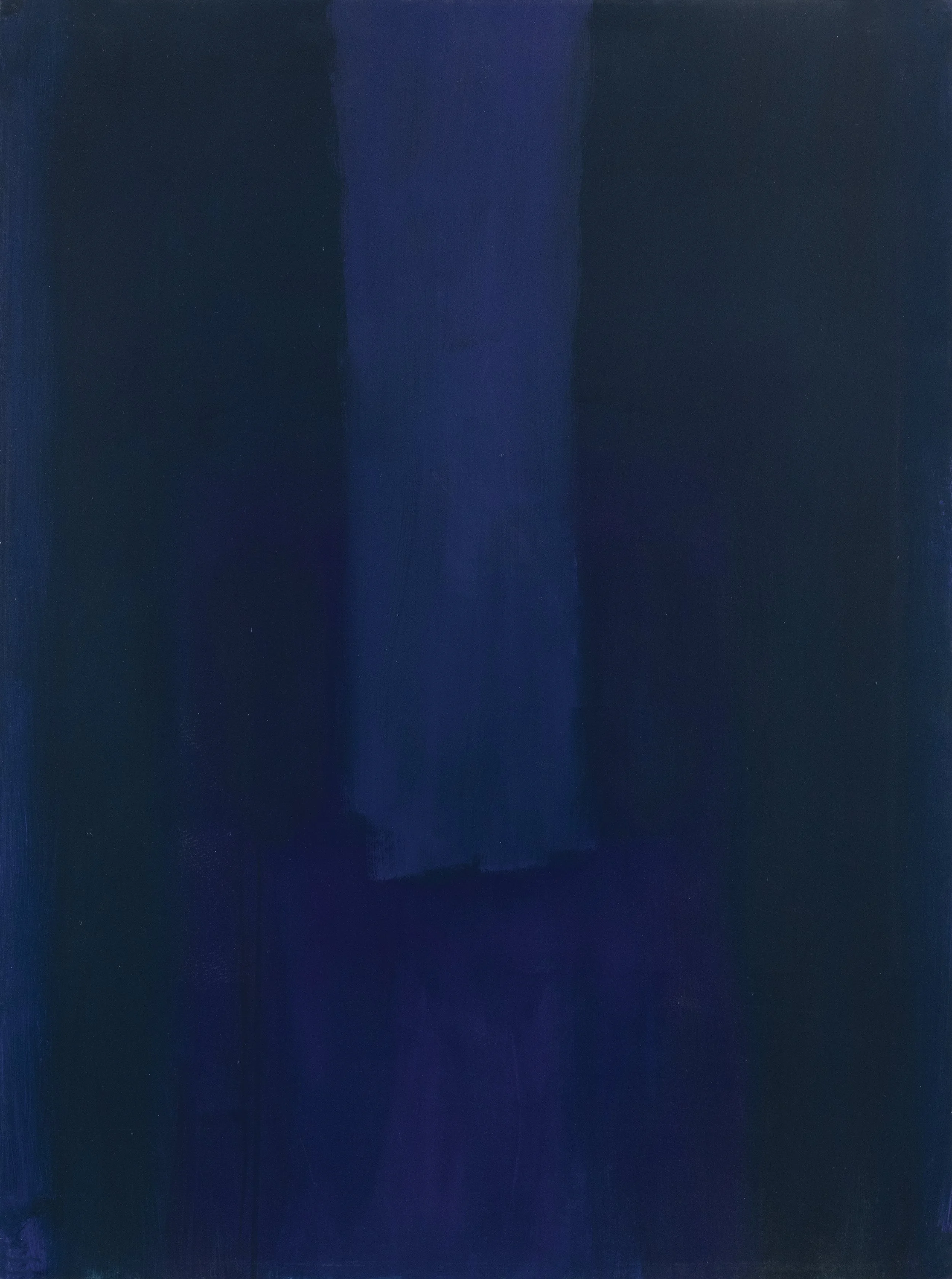
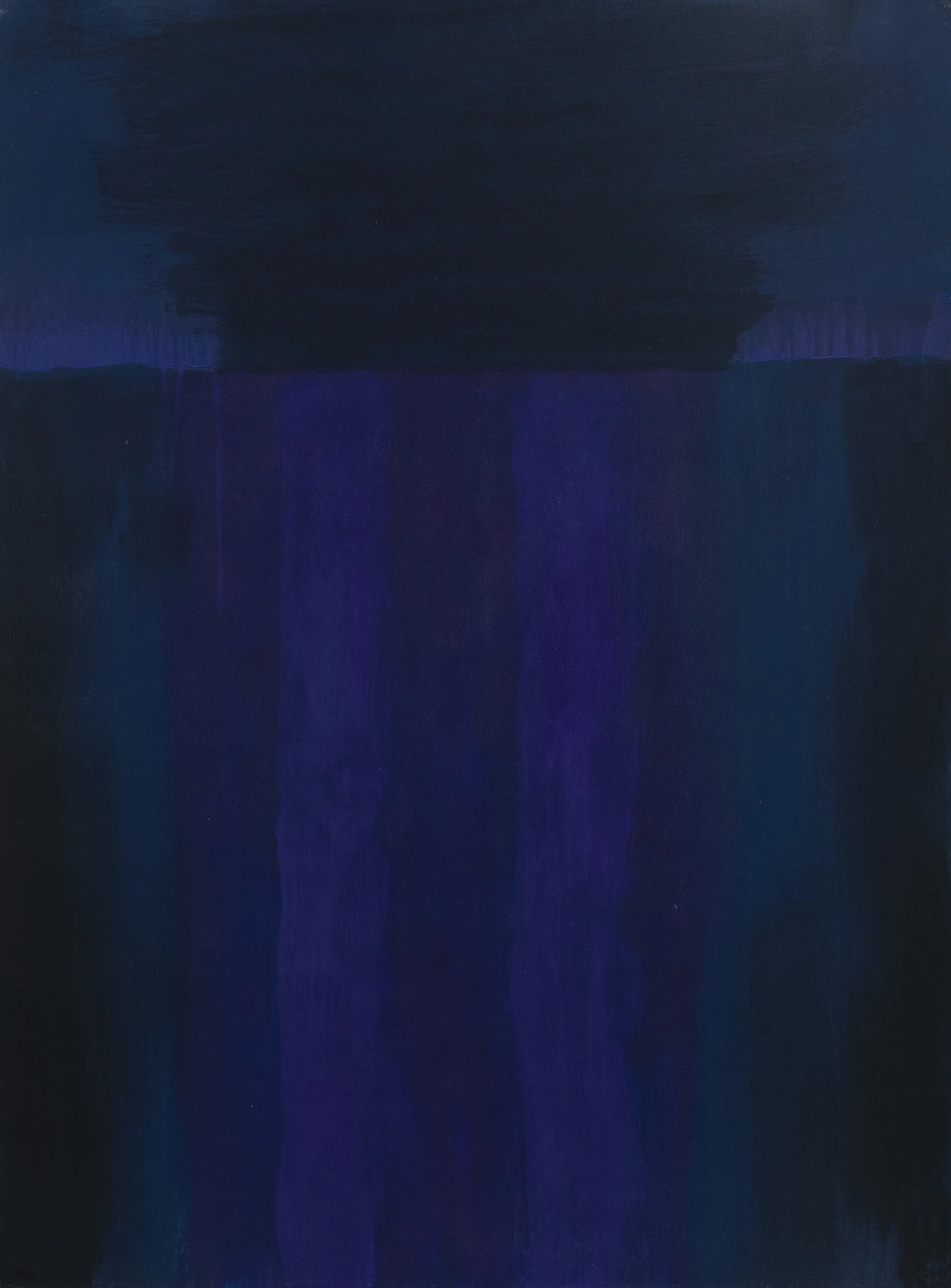
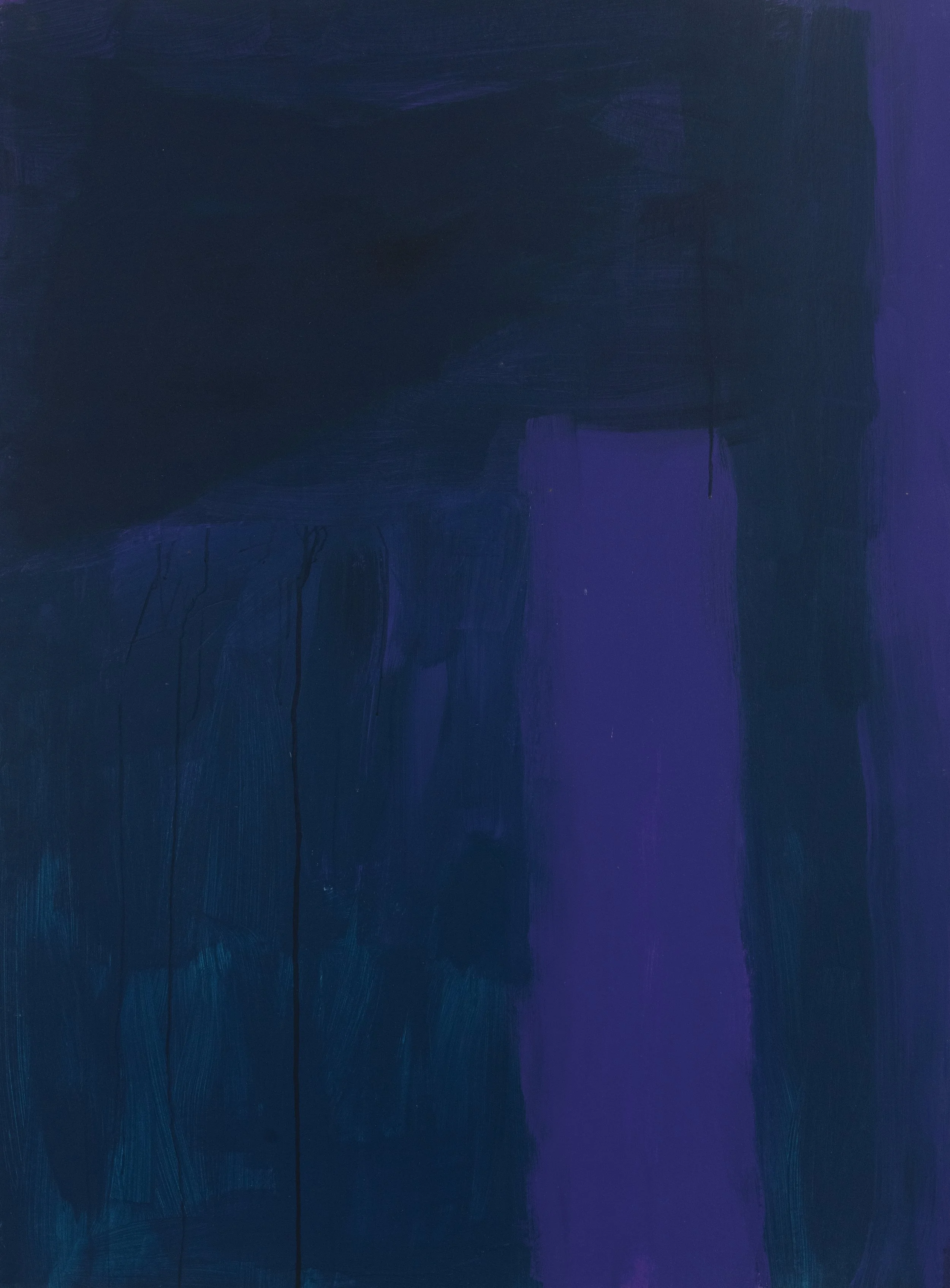
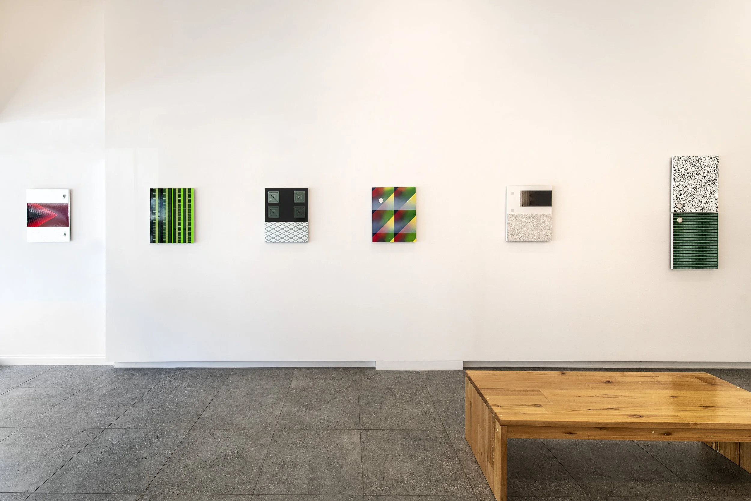
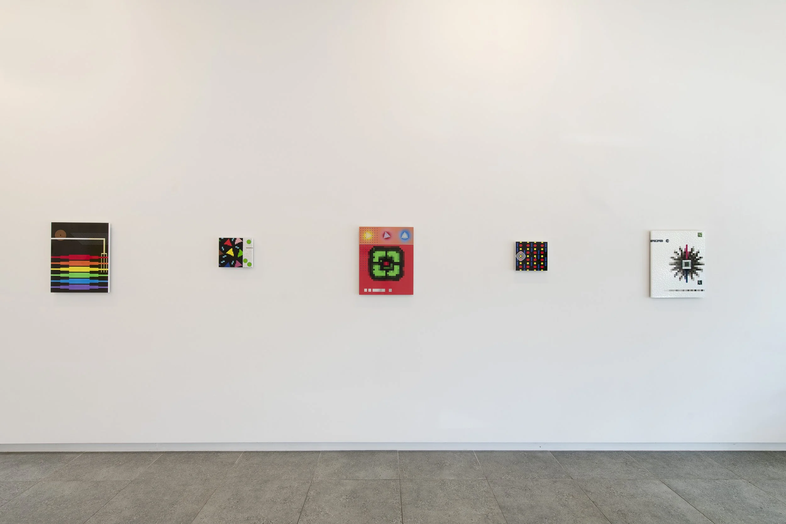
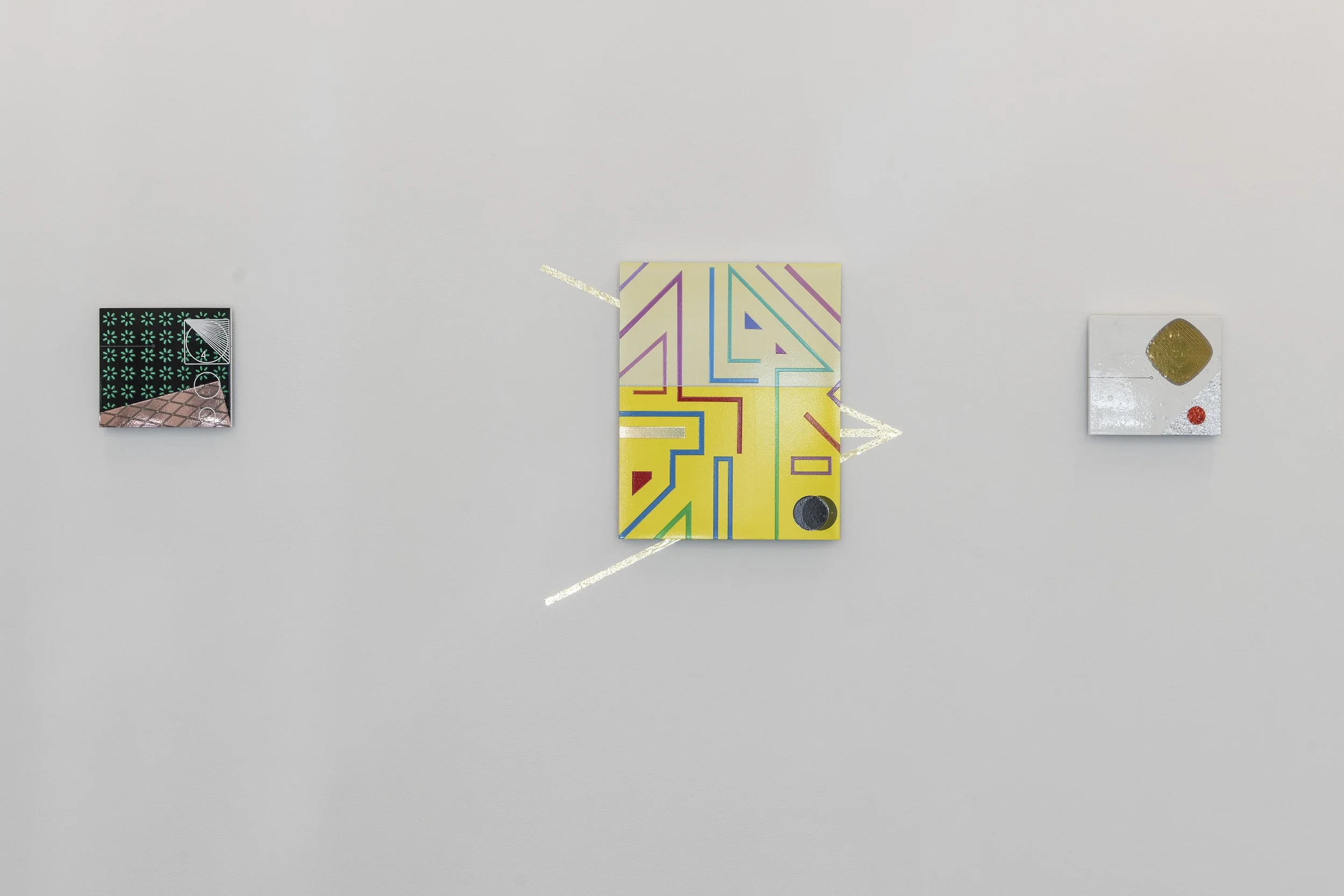
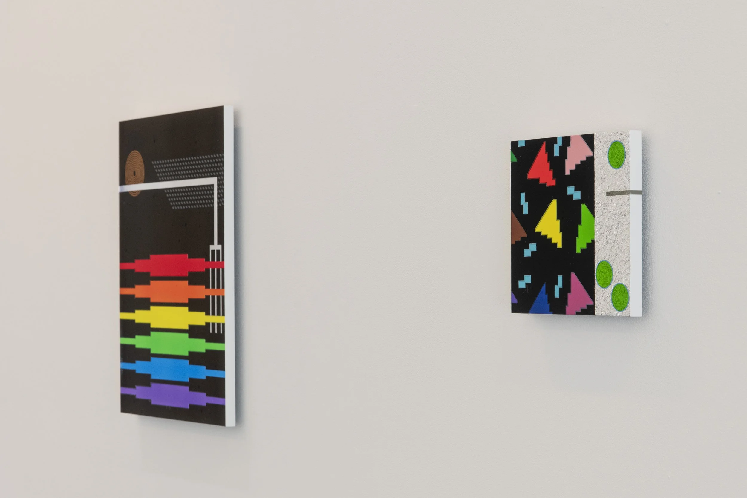
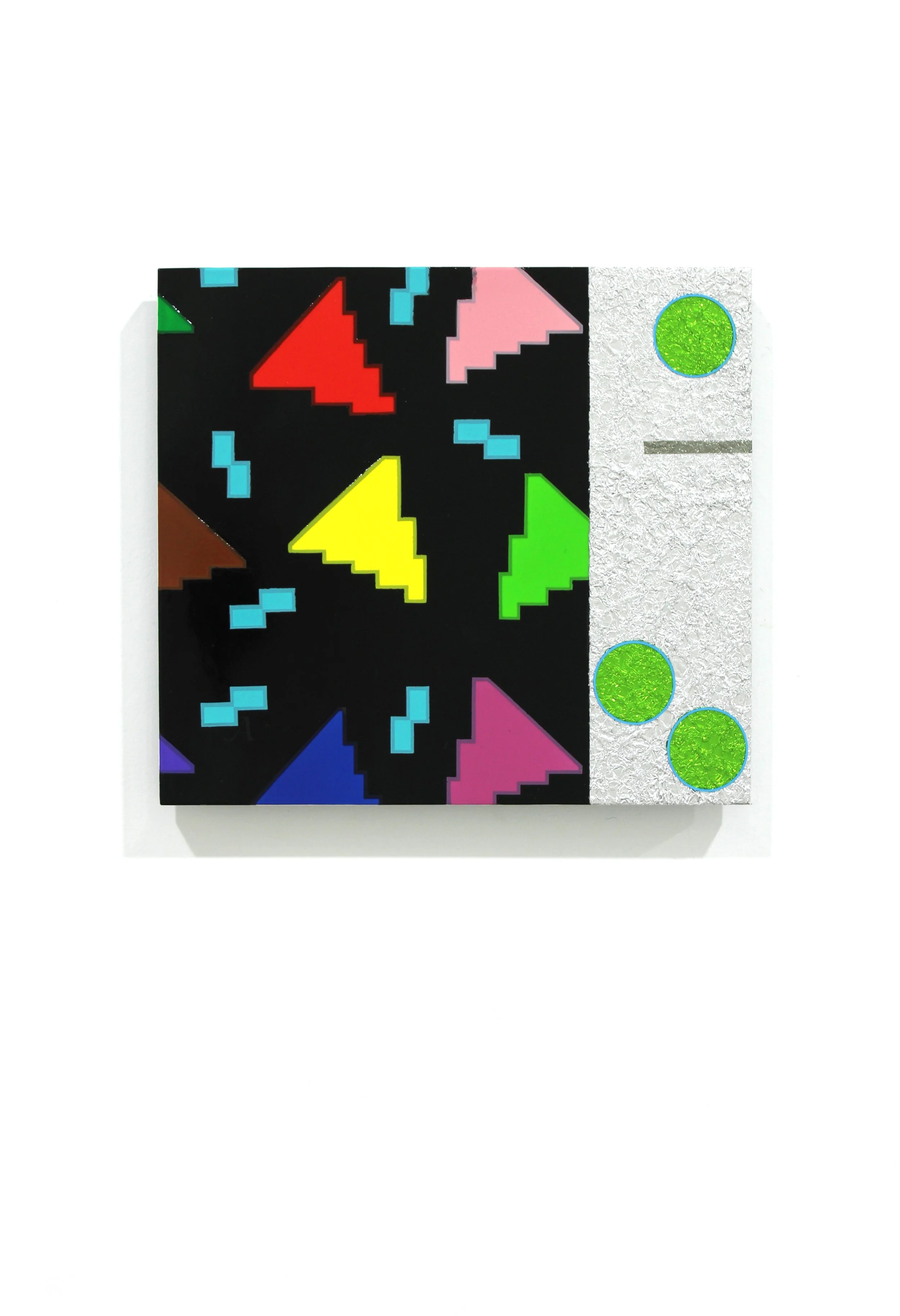
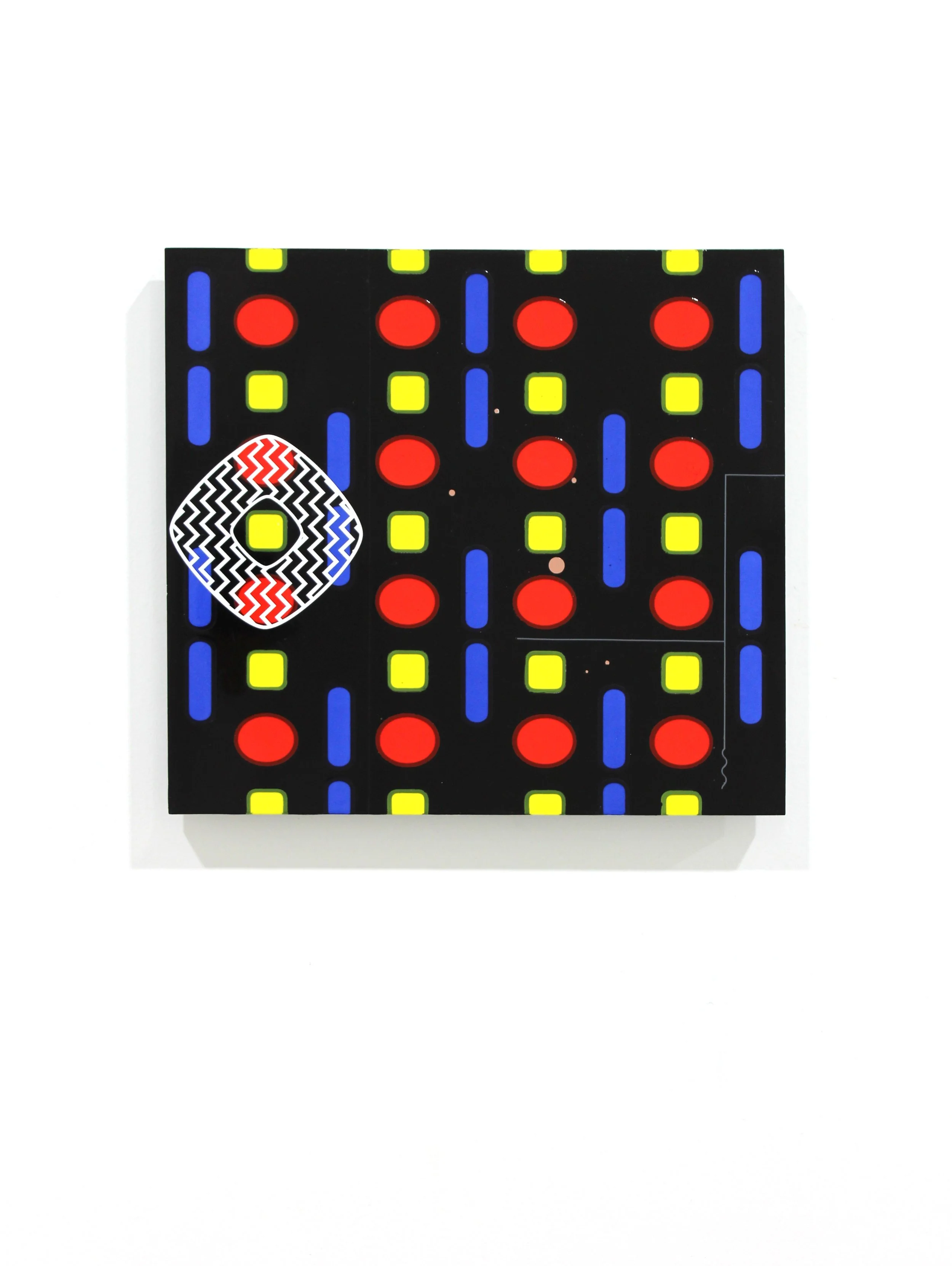
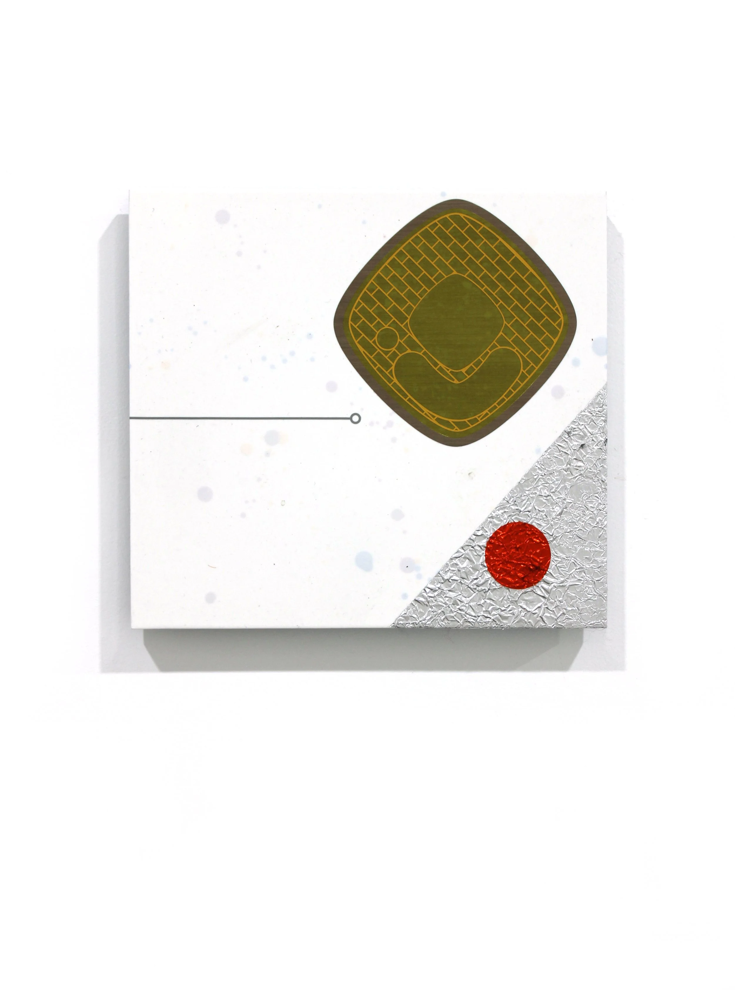
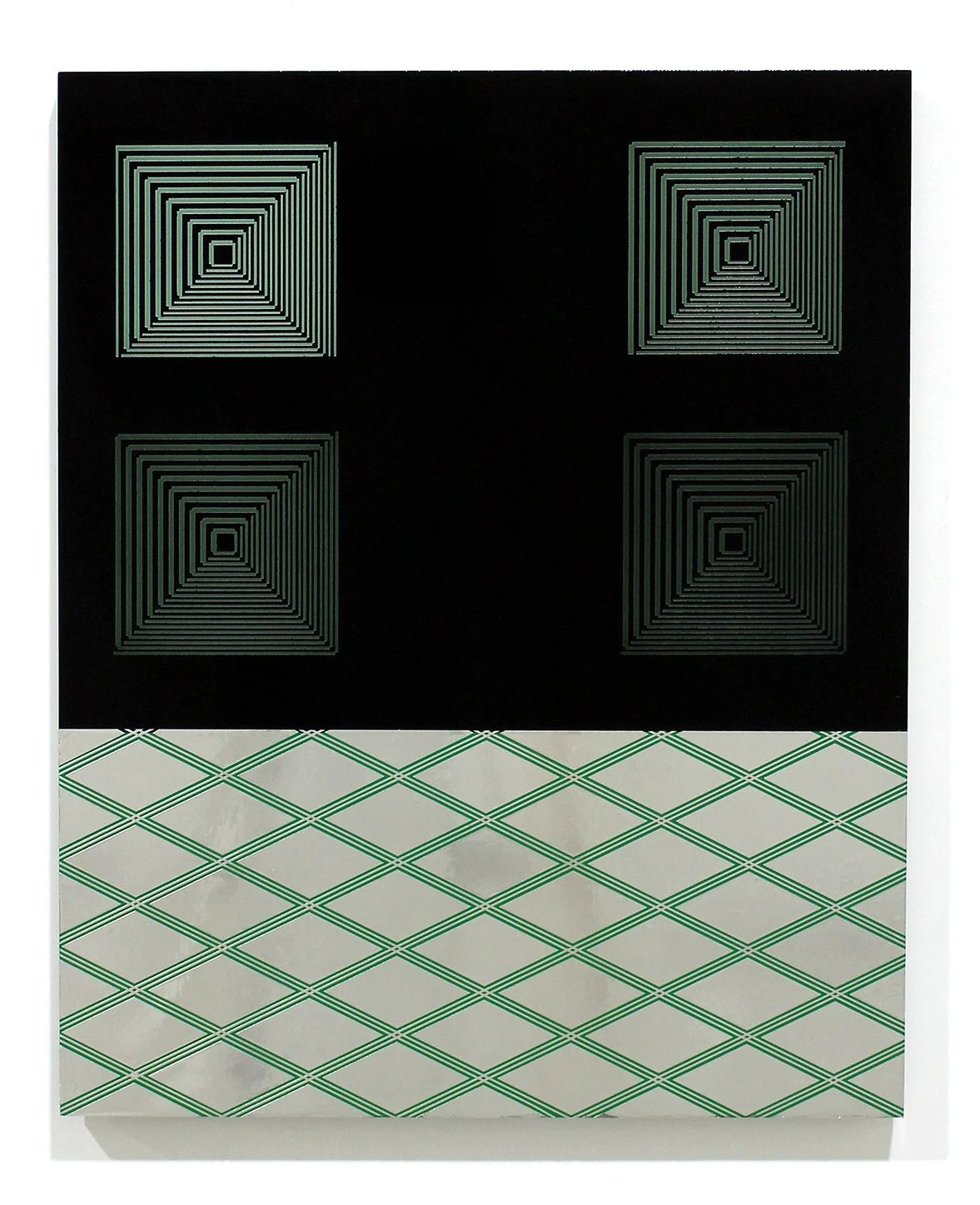
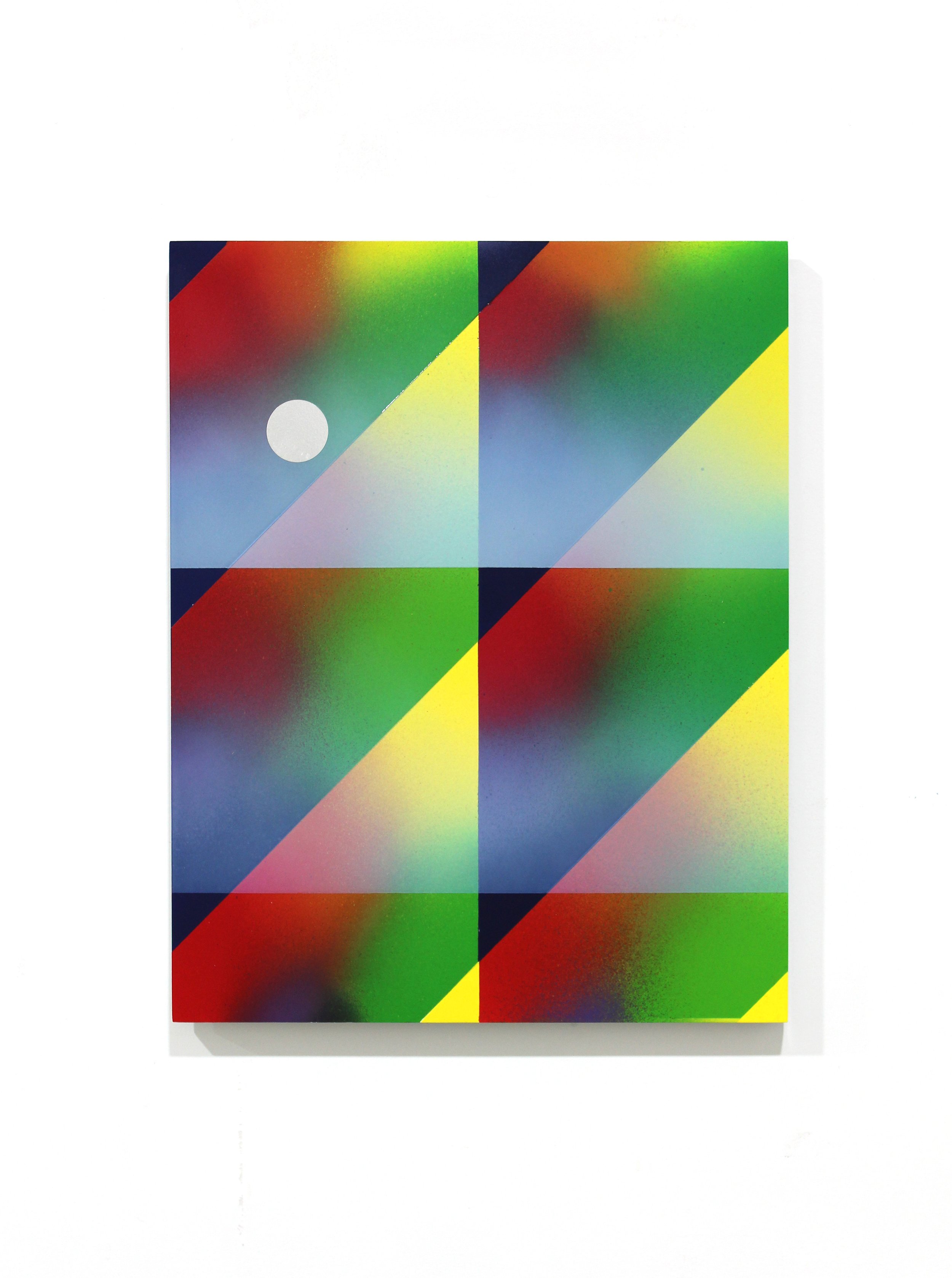
Known unknowns and unknown unknowns
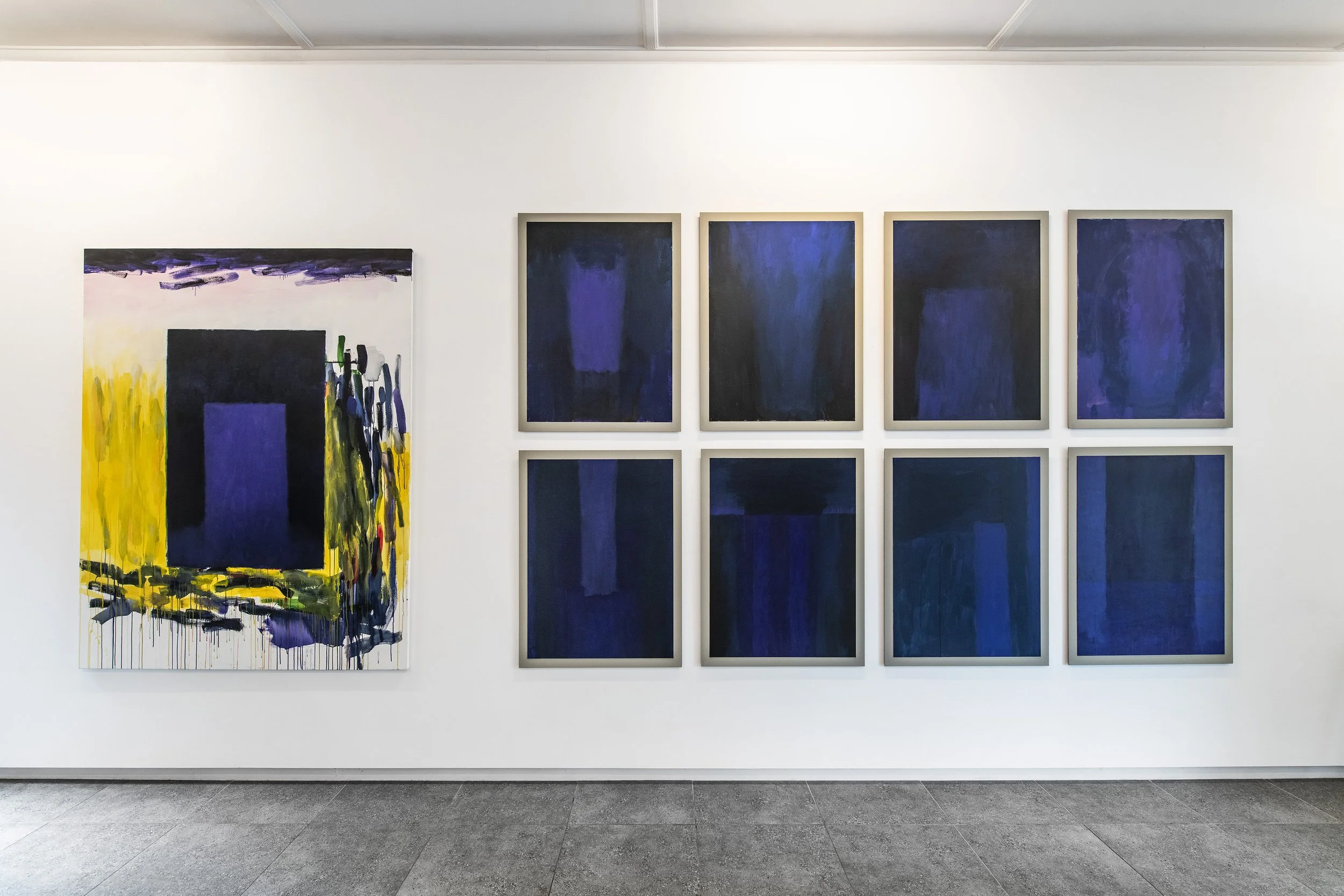
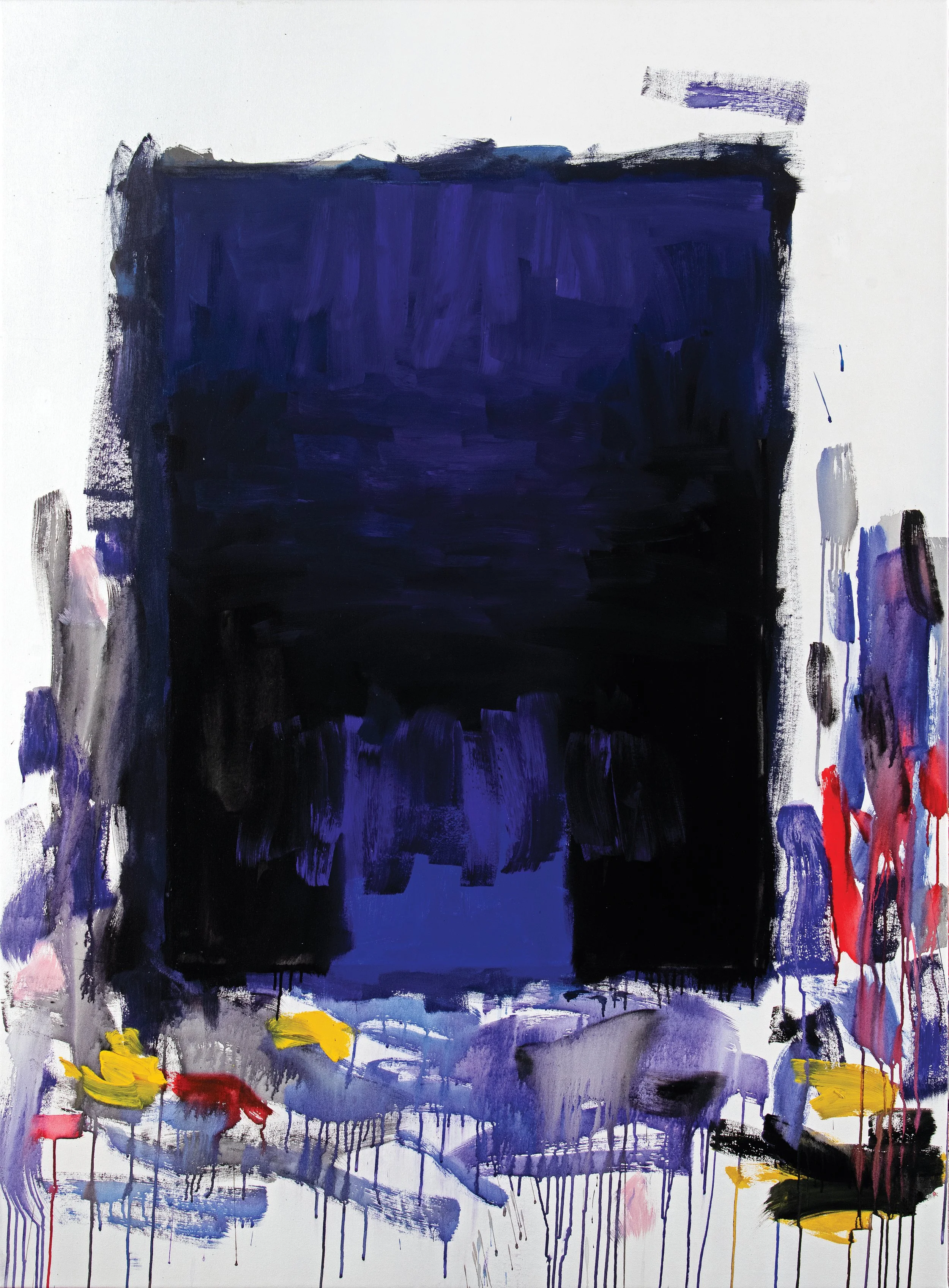
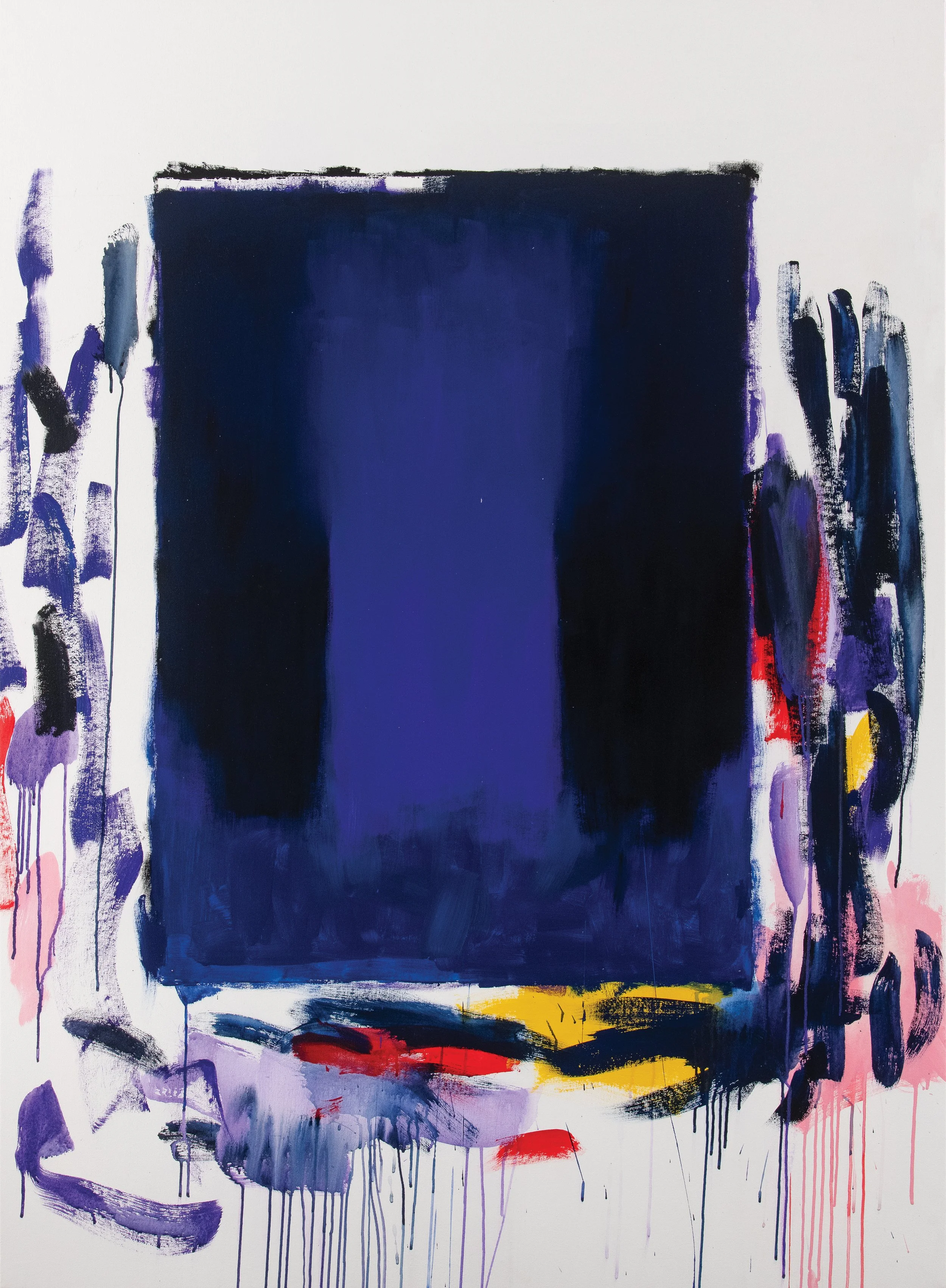
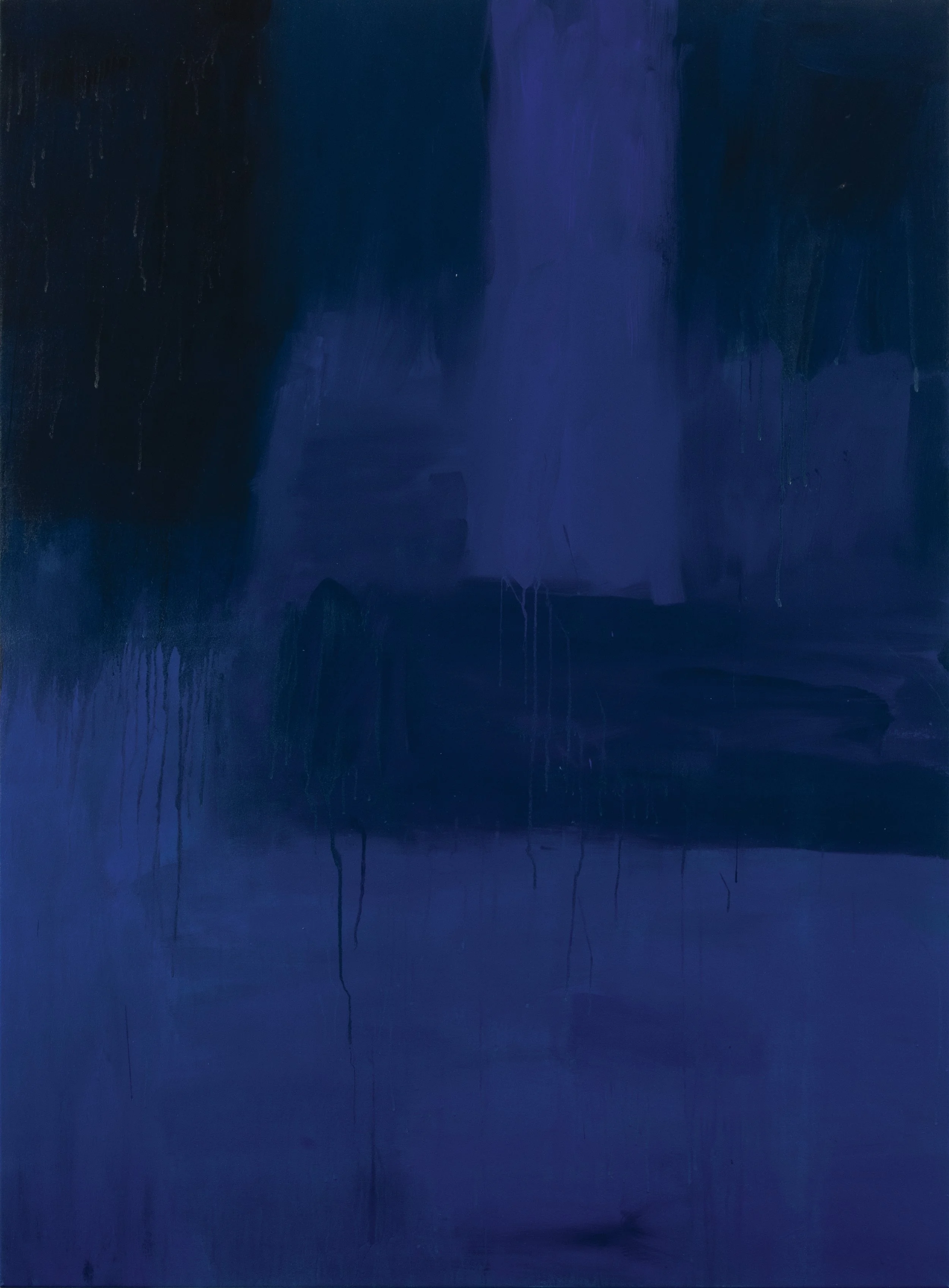
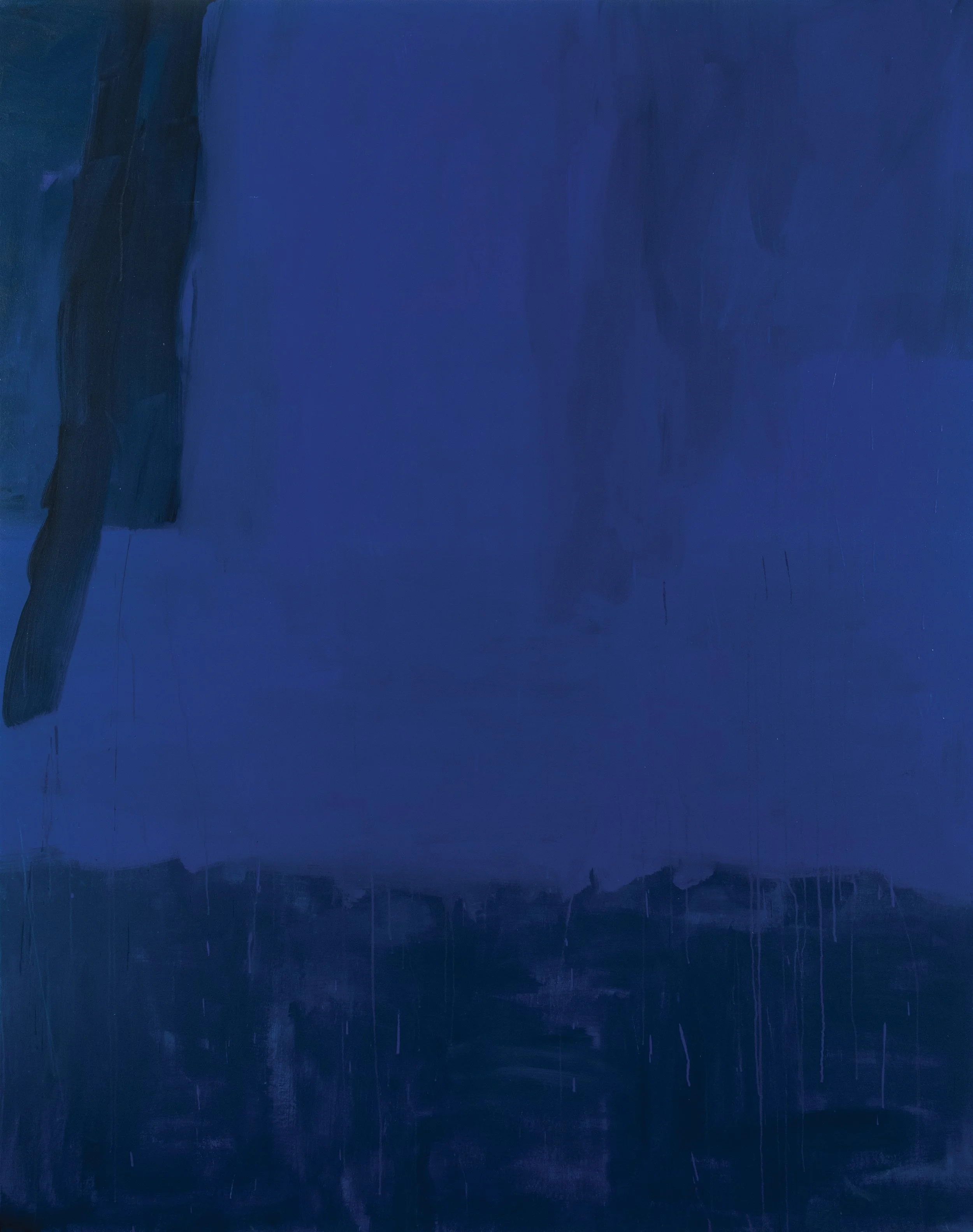
While the title of this exhibition suggests an assessment of some form, what is clear is that it signals a space where there are aspects of something that are unknown. Here, the terms ‘known’ and ‘unknown’ are borrowed from risk management terminology, where they are used in preparation for unpredictable circumstances that might involve danger or hazards. The need for us as a society to mitigate risk presents as an ever more urgent strategy given the general vibe of our time. Communities and societies increasingly recognise volatility as a key word, whether it relates to the environment, the economy, or various military contexts. Today the word ‘unknown’ seems almost pervasive as a way of appraising the world because many things are presented as questionable, including objective facts and verifiable data. Individually, it’s not uncommon for many of us to consider our lives as forming within an unrestrained, unpredictable collection of possibilities where almost anything might happen.
Peter Westwood’s exhibition parallels some of this uncertainty as he endeavours to convey how the world feels to him. However, there are two factors at play in this work, in that he also recognises that the human condition is marked by its own unsettling awarenesses between our desire for certainty and an acknowledgement of the random and chaotic nature of living, of being human. So, while the current state of the world is a catalyst for the uncertainty expressed in this work, he tries to capture the paradoxical nature of our human condition as one that arguably revolves around constantly navigating ambiguity and incertitude.
This exhibition coalesces into a mercurial atmosphere of changes in mood or direction where each work forms as an instance, much in the way we might think and feel as we experience our lives through a composite of variable moments that might be comprehensible, but to some degree, equally baffling. This is where we shift back and forth in our minds between recognition and cognitive dissonance. Westwood considers his paintings and editioned screenprints as a type of abstraction, subject to multiple interpretations, each of the works revealing broader concepts, devoid of conclusive meanings. This ambiguity allows for different experiences, values, or interpretations to permeate the works. Therefore, when we move through this exhibition, we do so without the aid of narrative, guiding principles or defined connections, arriving at conclusions that are formed in the risky business of feeling, experiencing and handling unknown and abstract encounters.
julia powles: born with the moon in taurus
JULIA POWLES: BORN WITH THE MOON IN TAURUS
03.06.26 - 27.06.26

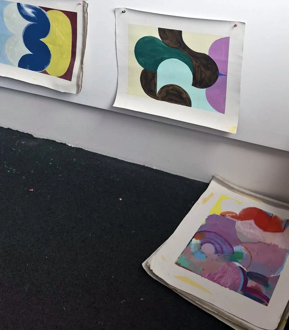

JULIA POWLES STUDIO IMAGES
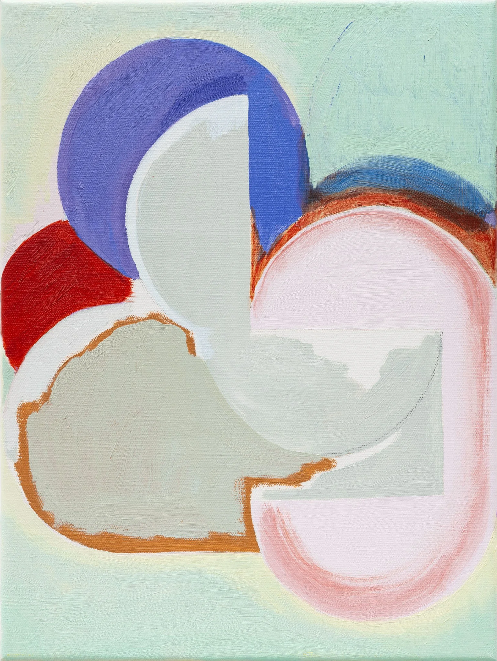
The body of work that forms the exhibition Born with the Moon in Taurus comprises a series of coloured pen drawings, paintings and a woven textile. The exhibition title refers to the astrological date, time and location of the artist’s birth. The position of the moon in an astrological birth chart is said to govern our subconscious mind, instinctive reactions, and our emotional needs.
Feeling is an important part of the way Julia Powles thinks about her work. Feeling, aligned with intuition and subjectivity – traditionally considered female qualities – is often contrasted against the more masculine theory of rationalism that posits an understanding of the world based in factual reasoning. The idea that feeling and reasoning are oppositional forces fascinates Powles as she works to integrate both sense-making systems in her artworks.
Her series of drawings, Born with the Moon in Taurus, is comprised of Venn diagrams that map her own family history. Adopted as a baby, she grew up with the knowledge that another, alternative version of her family could have existed. Each circle represents an individual: mother, father, brother, sister or child. In this, characteristics are inherited intergenerationally in much the same way as secrets and sorrows are covered up and later revealed. In these ‘charts’, individuals are examined in relation to the impact they have on each other. Moving across and through time, the different circles in these drawings coalesce into fecund female forms – part ancient fertility goddess, part microscopic cell division.
In the paintings, a grid structure is placed onto a canvas and then overlaid with irregular circles. Drawn using rulers and compasses, the forms are then hand-painted in an intuitive and direct manner. As circles and squares merge into new, irregular shapes, the formal merges with the subjective. In the same way, her drawings of circles form patterns and chart a topography of family relationships, each one a version of Powles’s own family history.
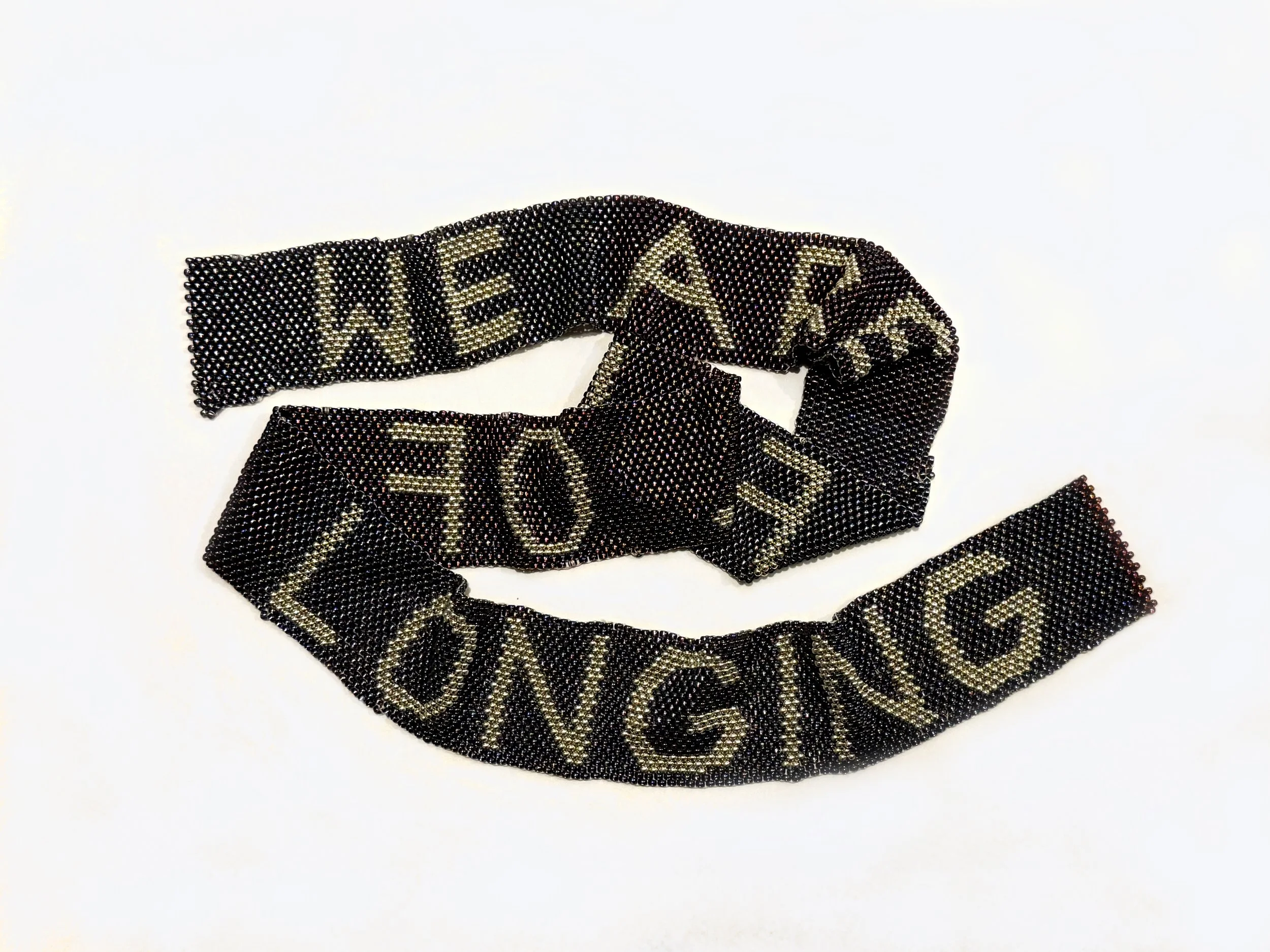
Made from glass seed beads painstakingly woven by hand We are full of longing is a declaration of a universal human feeling. Longing forms a fundamental part of our human condition, generating a desire for connection, but equally as an emotion that motivates us from within. To long for something or someone is to experience a particular type of ache, where both pain and pleasure coexist, and the individual finds themselves navigating the range of emotional complexities that ultimately unite us all.
BLOCKPROJECTS DIALOGUES: IN CONVERSATION WITH JULIA POWLES
BP: What can painting reveal that language cannot?
JP: Well, language can of course, reveal a lot. But painting operates across several sensory systems simultaneously; it is predominantly felt before it is thought. A different kind of understanding occurs through the sensation of experiencing painting. Words can often be fixed or definitive, while painting opens us up to overlapping emotions and complex ideas that can be many things – immediate, delayed, certain and contradictory. In this sense, painting echoes our engagement with the world, as something we can only really know as a sequence of ever-changing vantages.
BP: Looking across this exhibition, what do you see as the central question driving the work?
JP: How do we form connections to others?
BP: The circle appears repeatedly throughout these paintings. What continues to draw you back to that form?
JP: The circle has so many associations – unity, completeness, endlessness. So these thoughts are in my mind when I work. I think of the circle as a kind of body, where it curves like the human form against a grid or more rigid structure.
BP: Many of the works resemble maps, diagrams, or charts. What is being mapped?
JP: I map out my family structures across time or generations, and in terms of the consequences of being within a family. In this, I ask questions of myself like: What are the consequences of actions and individuals within families? What are the legacies we all carry within us?
BP: Your paintings feel highly structured, yet they never feel rigid. How do you balance system and intuition in the studio?
JP: They usually start with a system which then becomes corrupted through the making process via mistakes or changes. This assists me to retell a story or narrative more subjectively about the depth of interrelated human lives.
BP: Do these works begin with an idea, a feeling, a memory, or a form?
JP: Yes, often with all of those in mind.
BP: Family, relationships, and connection seem to move through much of your practice. When did these concerns first emerge in your work?
JP: I think it’s always been there, just increasingly so.
BP: Astrology is present throughout the exhibition. What role does it play within your thinking and making?
JP: I love astrology as an alternative way of understanding the world. I’ve been fascinated by astrology since I was a child, along with telepathy and other ways of communicating that are considered alternative. While I am devoted to science and reason, I recognise that what we consider to be knowledge is constantly in the process of being refined, cross-checked and amended, so astrology stands for intuition, or a different, older sort of knowledge.
BP: What interests you about systems of orientation, whether they are personal, familial, psychological, or astrological?
JP: I think we all need to make sense of who we are in the world. How we are orientated. In my case, because I am adopted and have recently made contact with one of my birth parents, I have had to reorient myself. My own map of the stars has changed, so I need to find a new way to navigate
BP: Your background spans making, curating, and education. How have these different roles shaped the way you approach painting?
JP: It’s impossible for me to separate out painting from everything else, they all seem to be part of the same life-long experiment, which is how do I answer the question who am I? How do I exist and how can I be connected to others?
BP: Looking at these works, I am aware of a tension between what can be known and what remains uncertain. Is uncertainty something you actively seek to preserve?
JP: Absolutely, yes. For me, for most of my life, there was so much that could never be known. I think it’s a fundamental human need to know one’s origins, and I was excluded from that knowledge, so I had no option but to make ‘non-knowing’ a companion. ‘Not-knowing’ was a kind of starting point from which I sprang forth, so not really knowing is very important to me.
BP: Certain forms recur throughout the exhibition. At what point does a shape become more than a compositional device?
JP: I never think about composition, as least not consciously. The shapes start out as forms that are intuited into being – they kind of just ‘feel’ their way into existence, then the compositional problems emerge.
BP: How important is memory within your practice?
JP: Very important. My own memory holds me prisoner at times. I wish I could forget certain things, but I can’t, so instead I use the memories in the work, but not literally, more as prompts for problems. For example, I remember being told as a child that I did not look like anyone else in my family, so that memory, which is on one level very slight and another level very painful, can be used to contemplate shapes and how they correspond with each other. Does this shape look like it fits in?
BP: What did you learn from these paintings that surprised you?
JP: Always, the paintings themselves surprise me. How the colours and forms and textures bump up against each other is a constant surprise -cs sometimes it’s quite shocking actually.


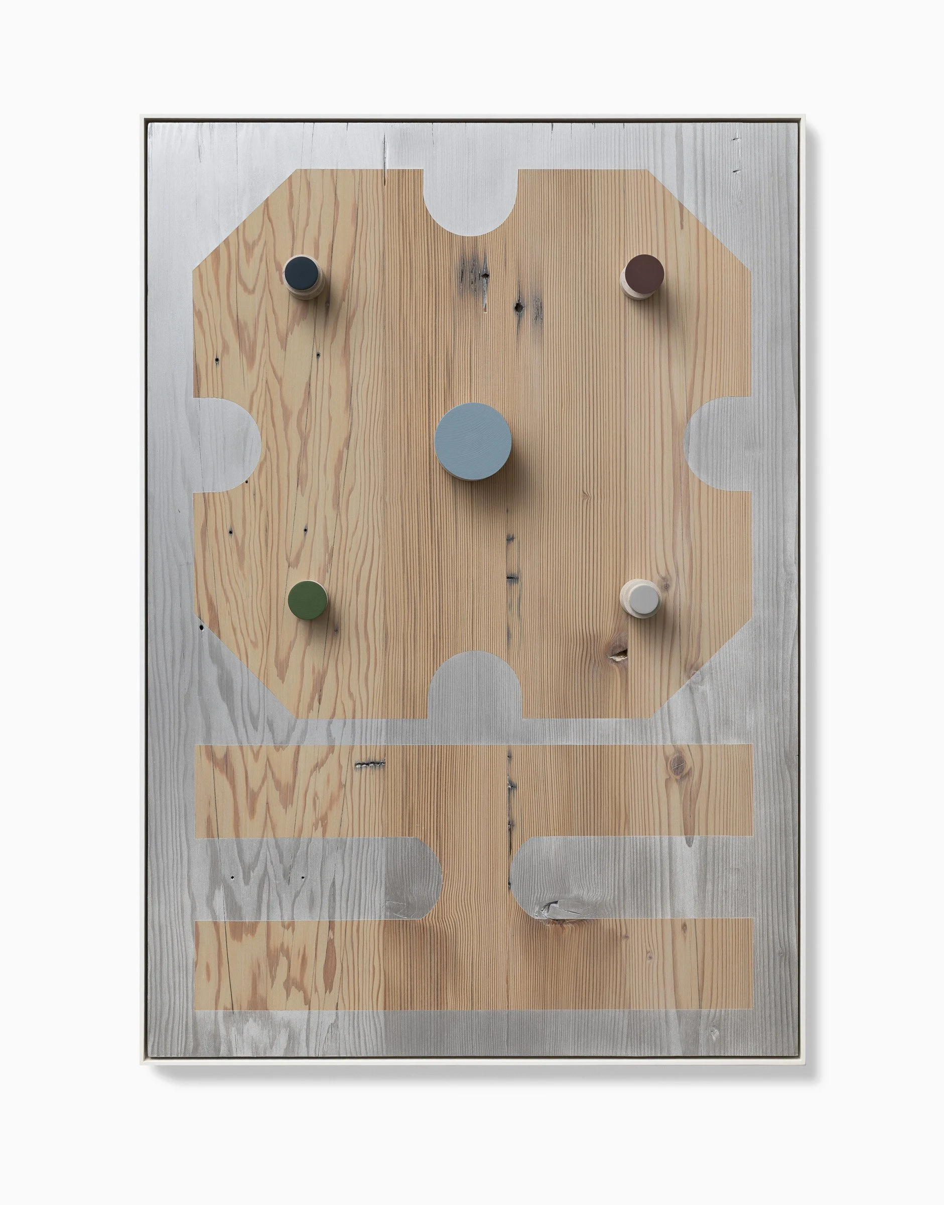
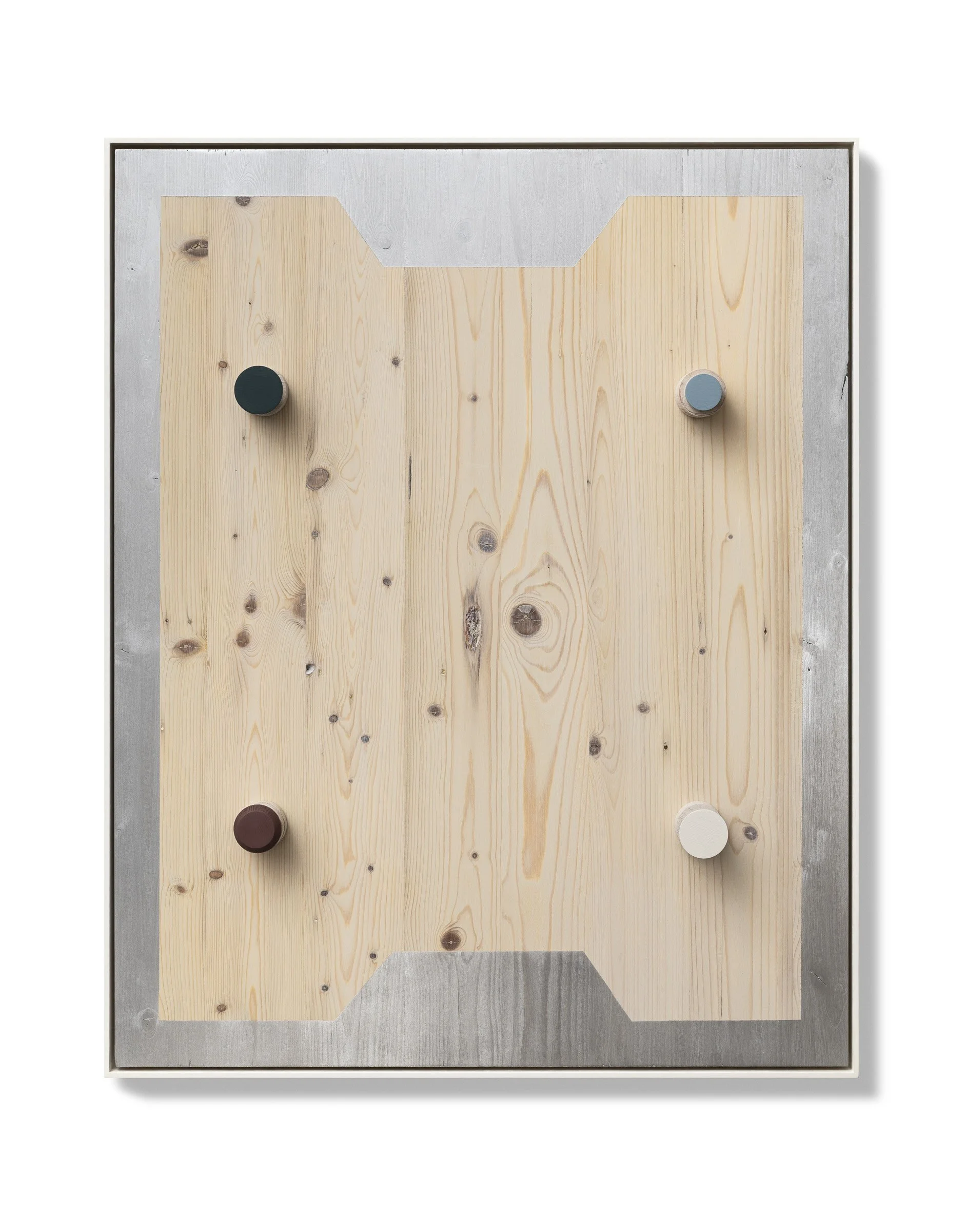
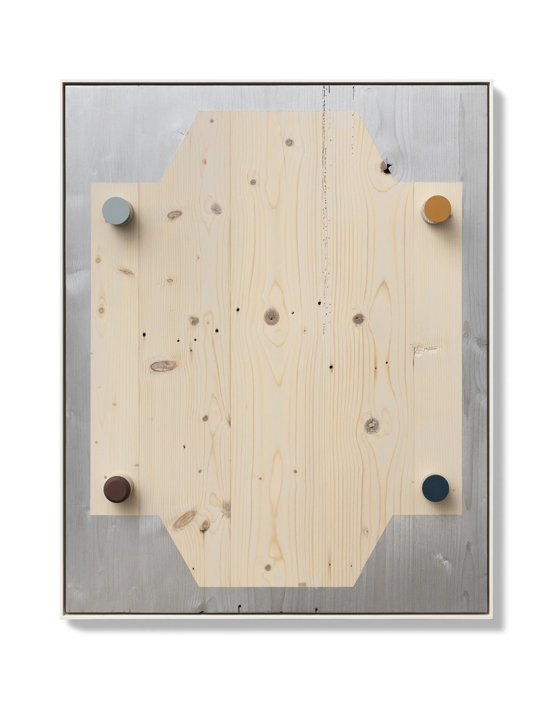
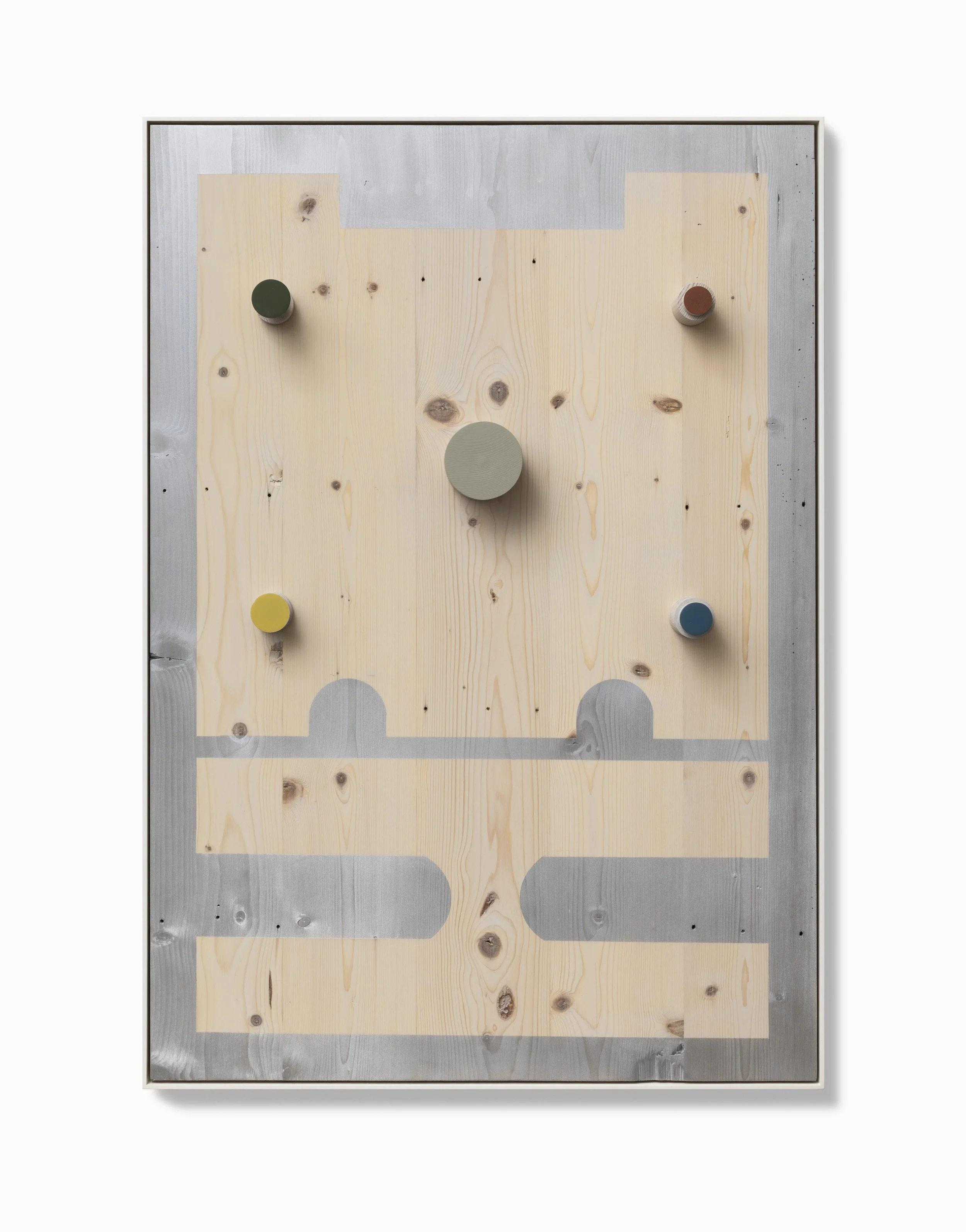
JO WILSON: OF LINE AND EDGES
JO WILON: OF LINE AND EDGES
JAMES CLAYDEN
06.05.26 - 30.05.26
Installation images
The Cool Arrangement
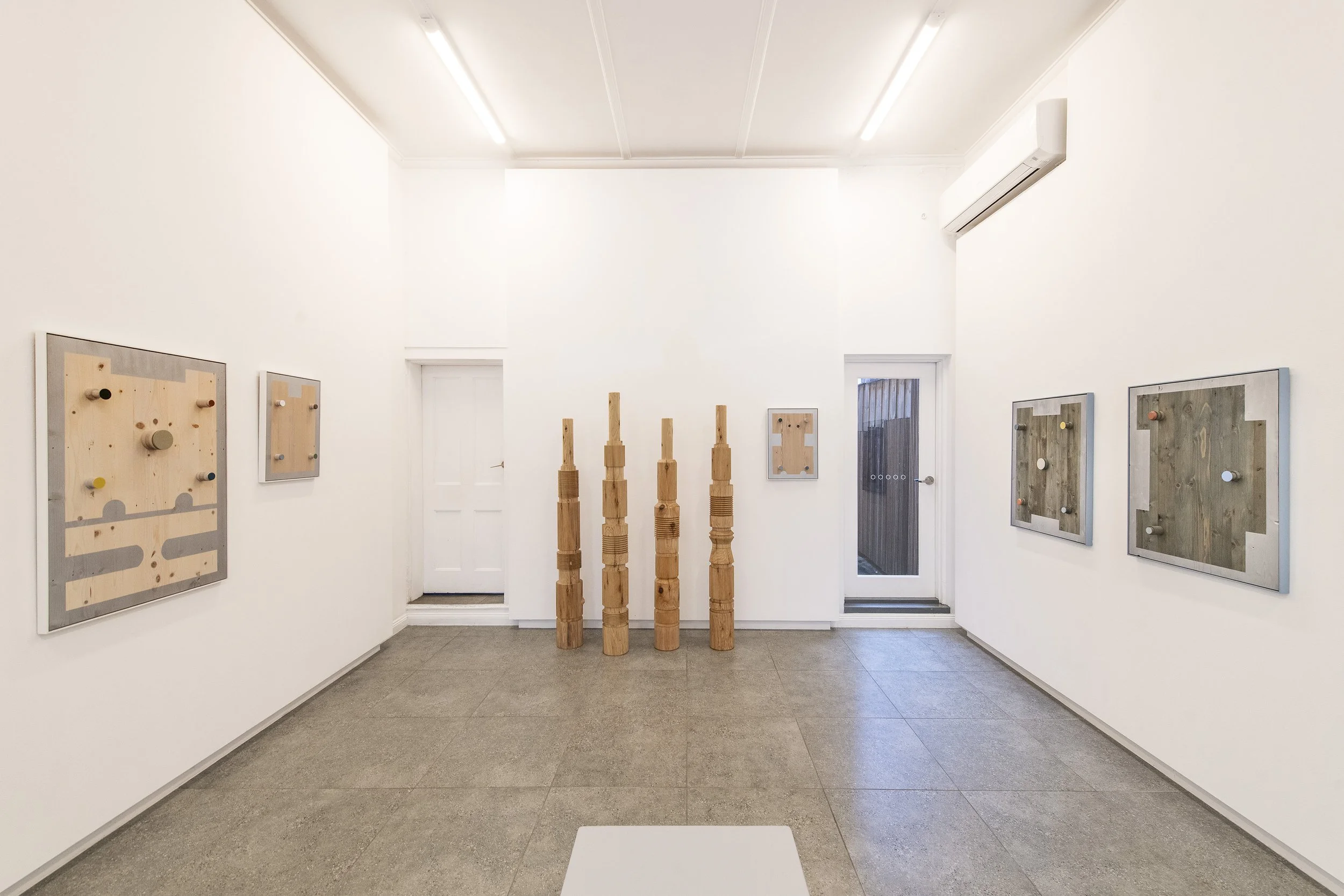
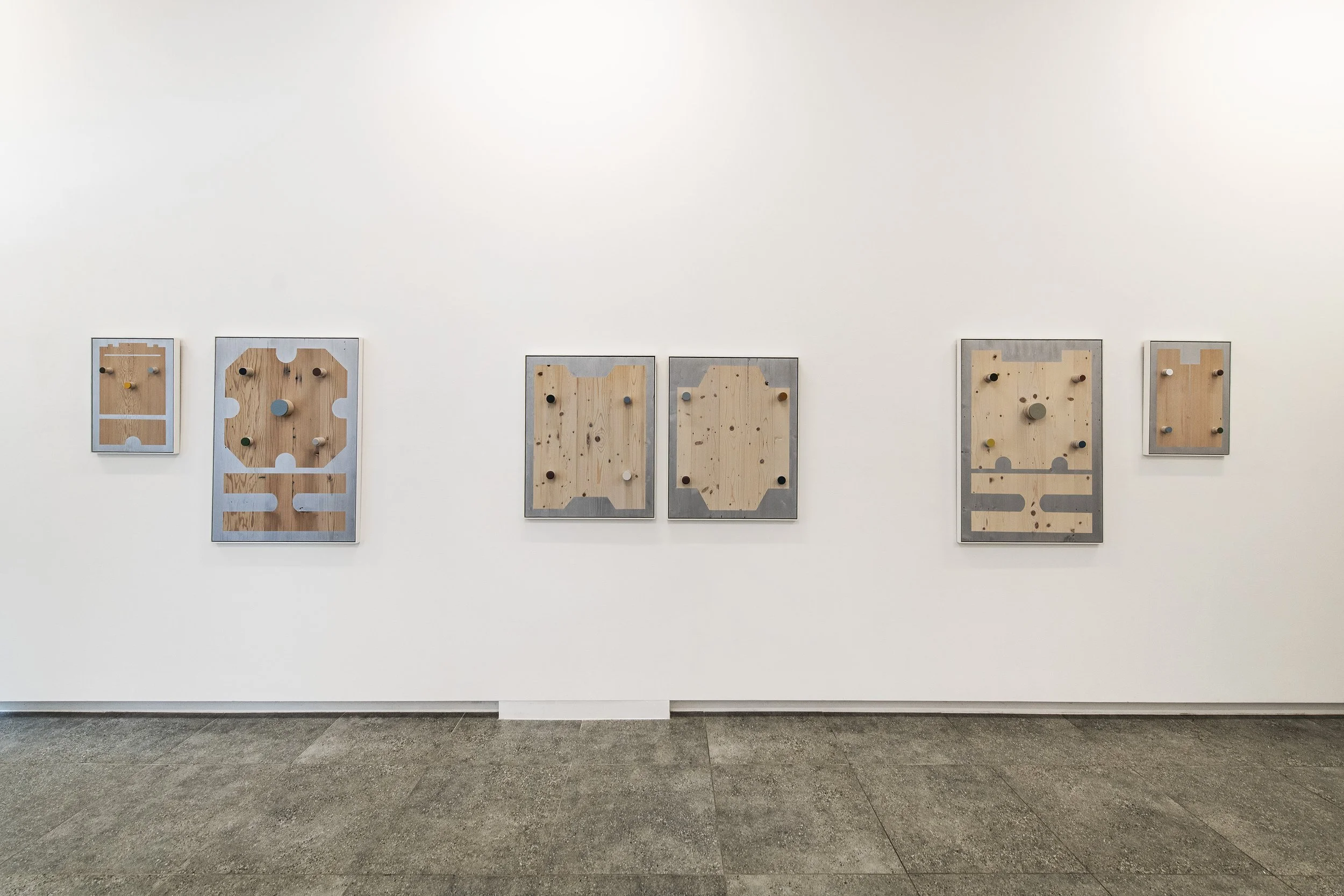
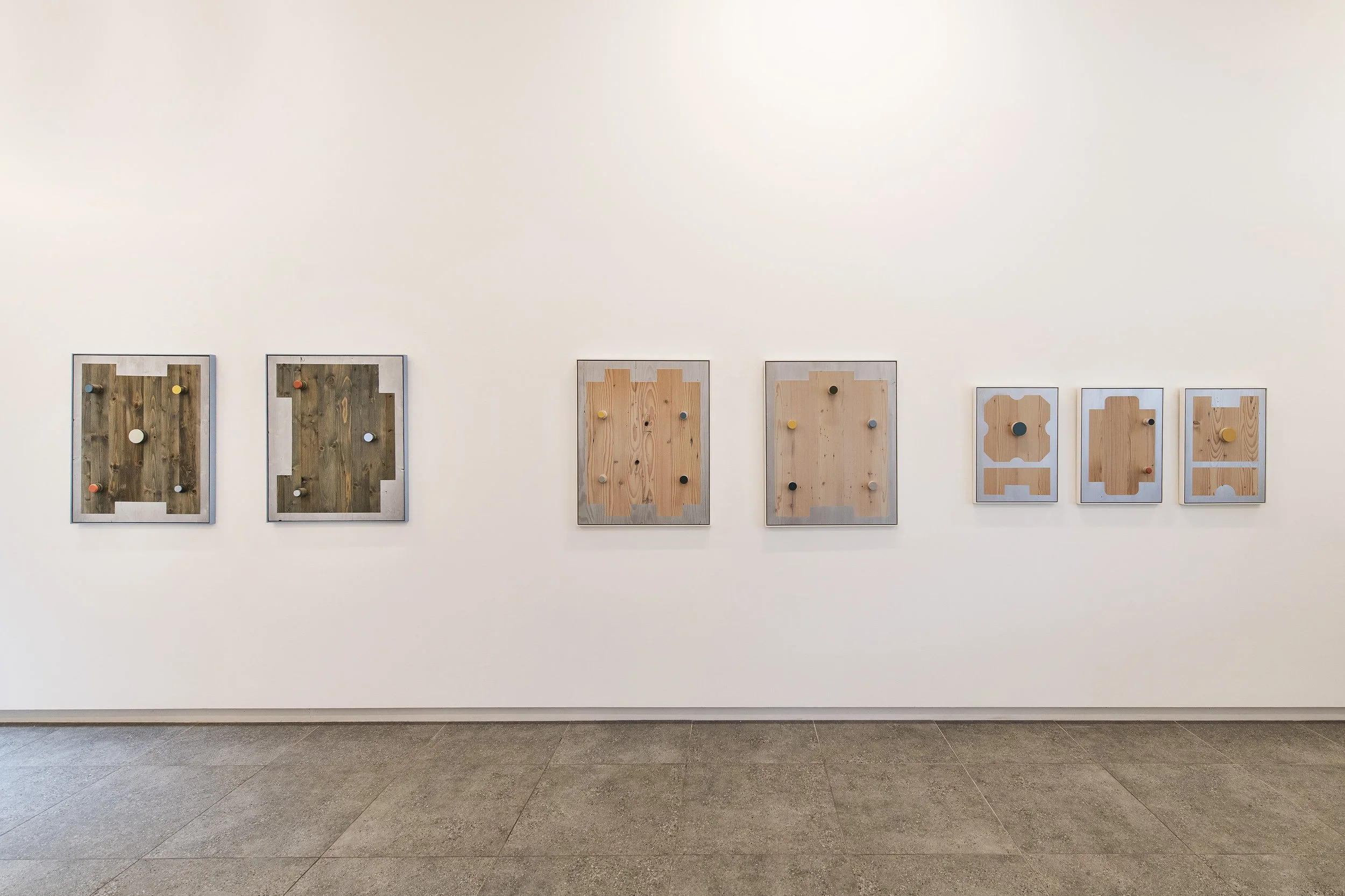
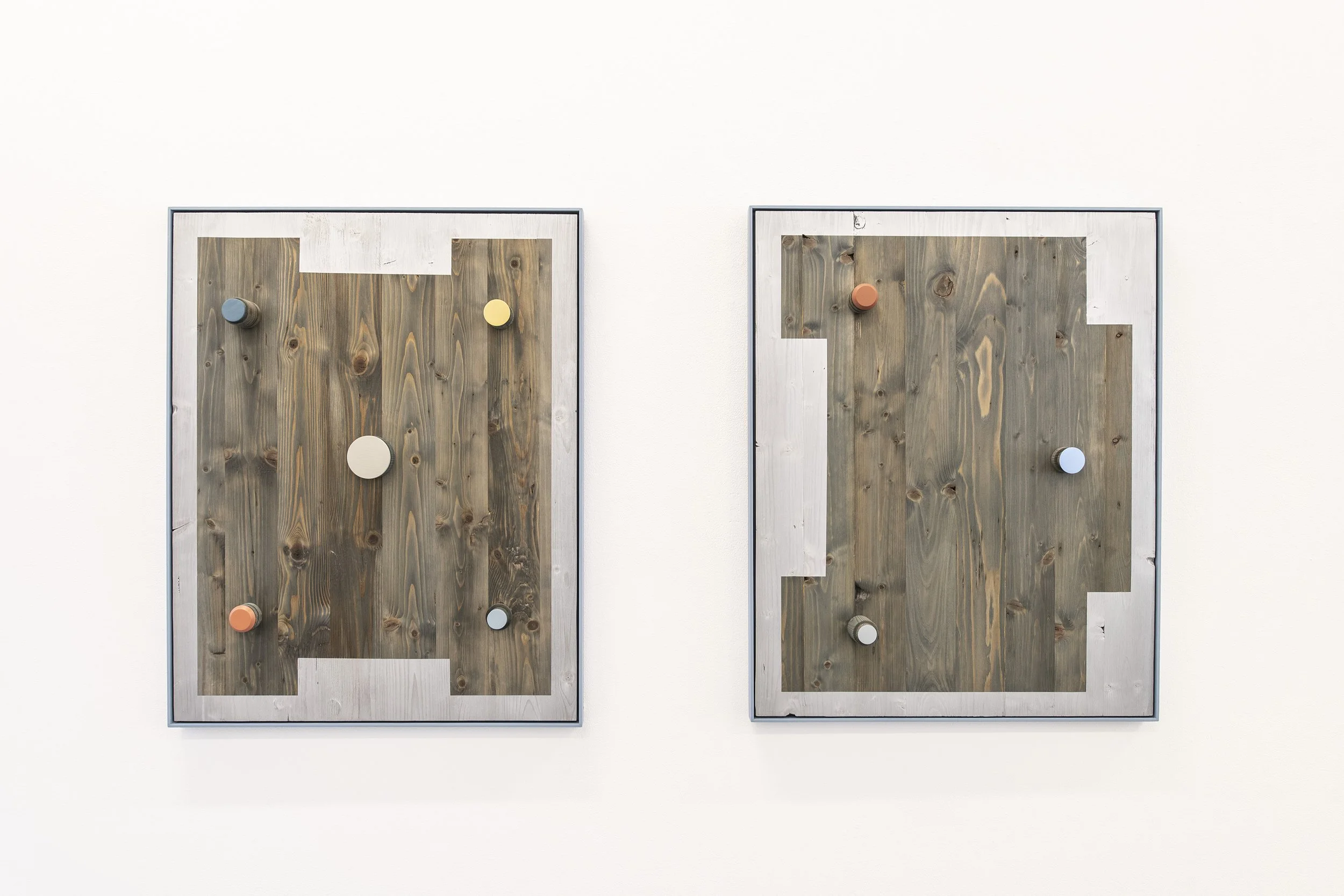
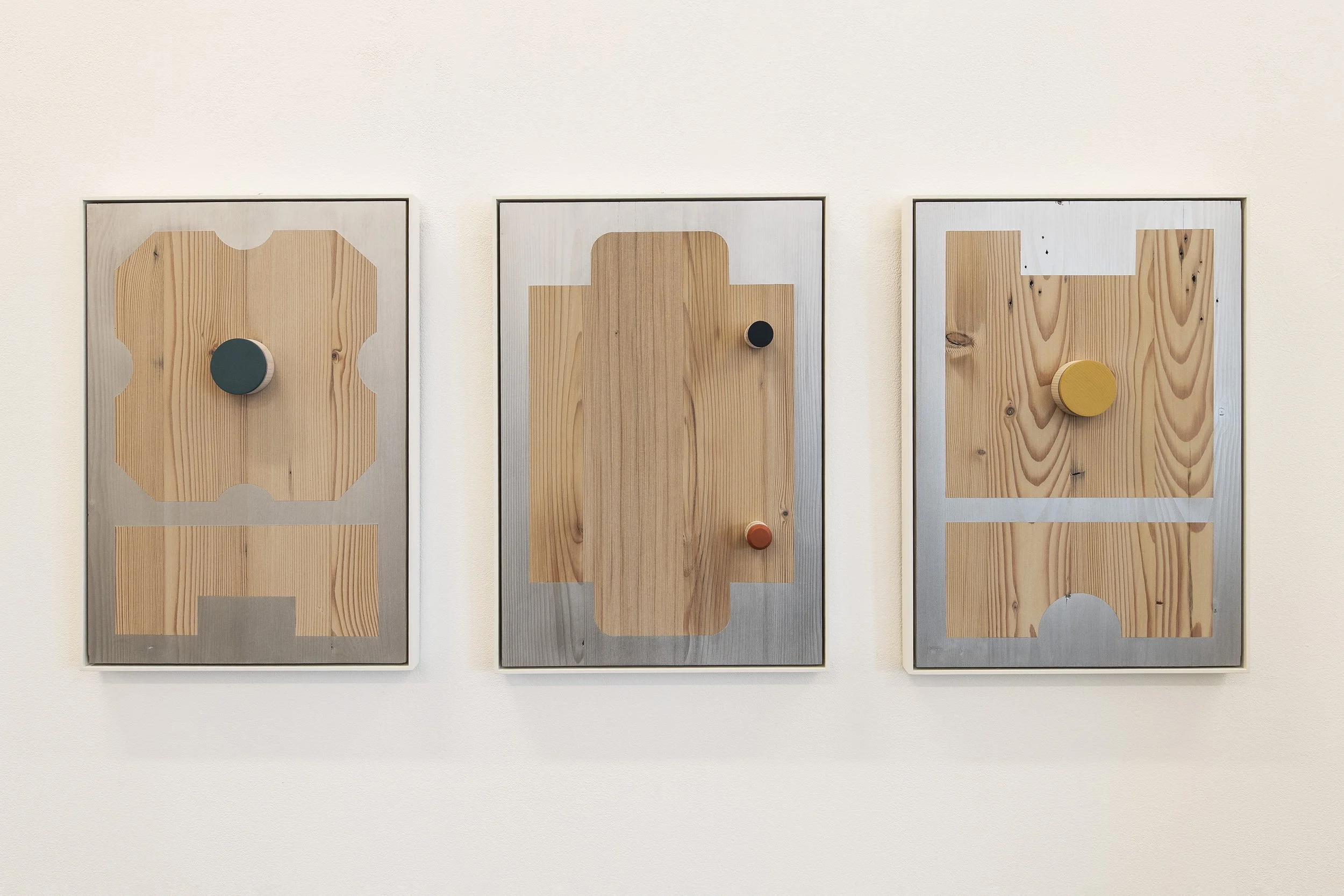
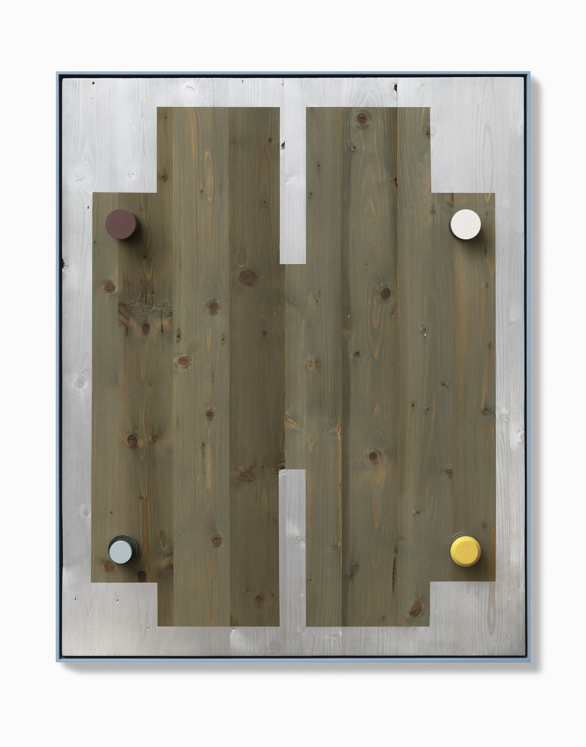
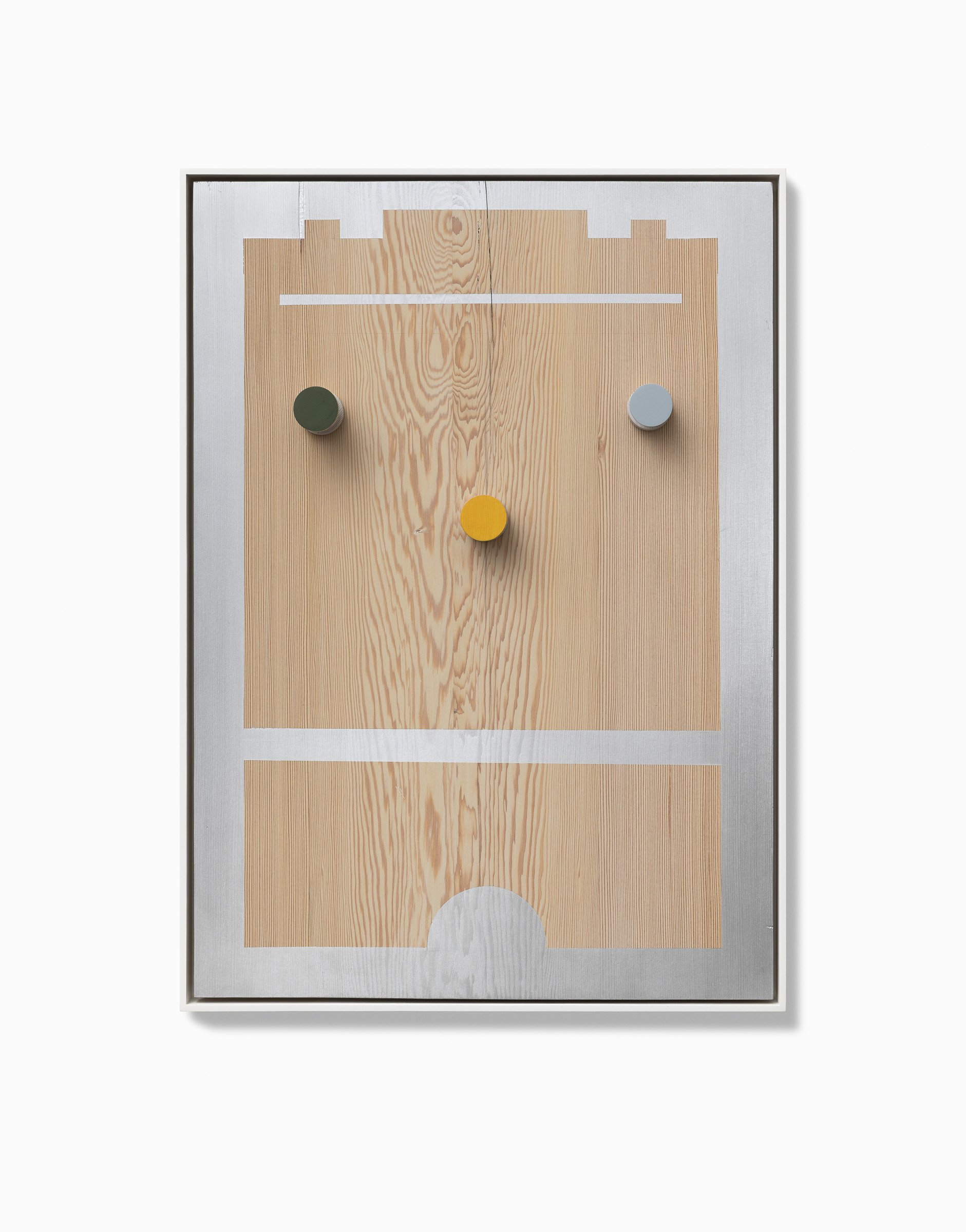
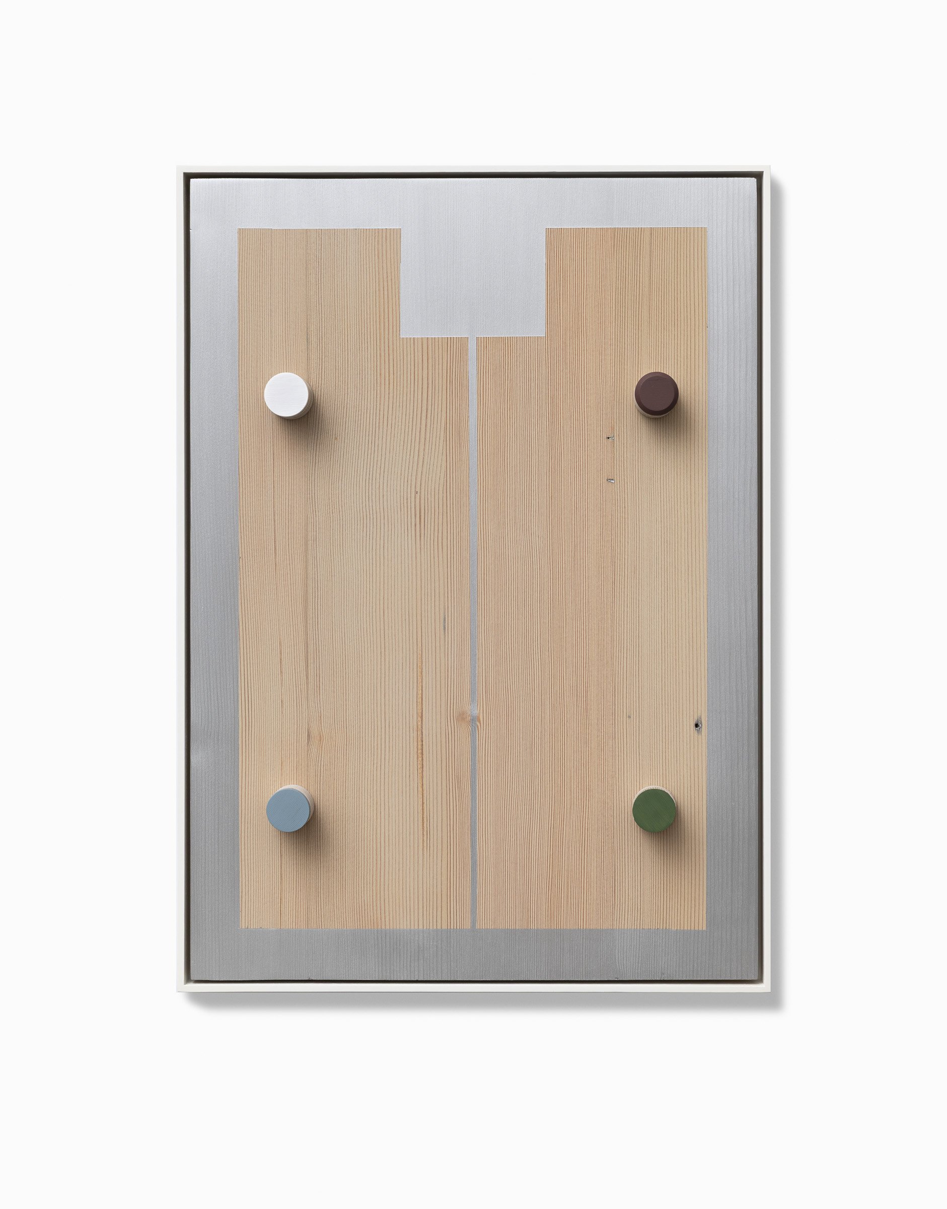
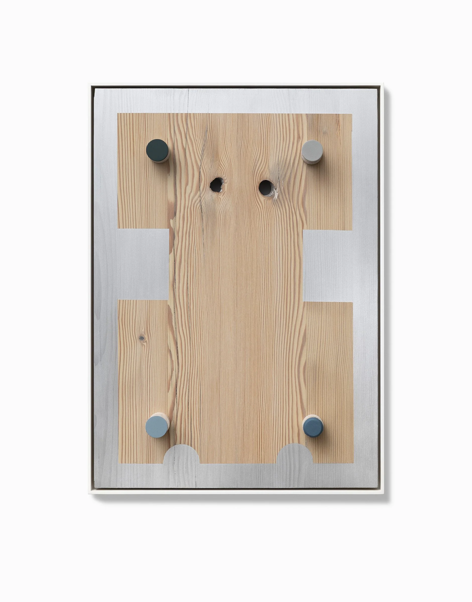
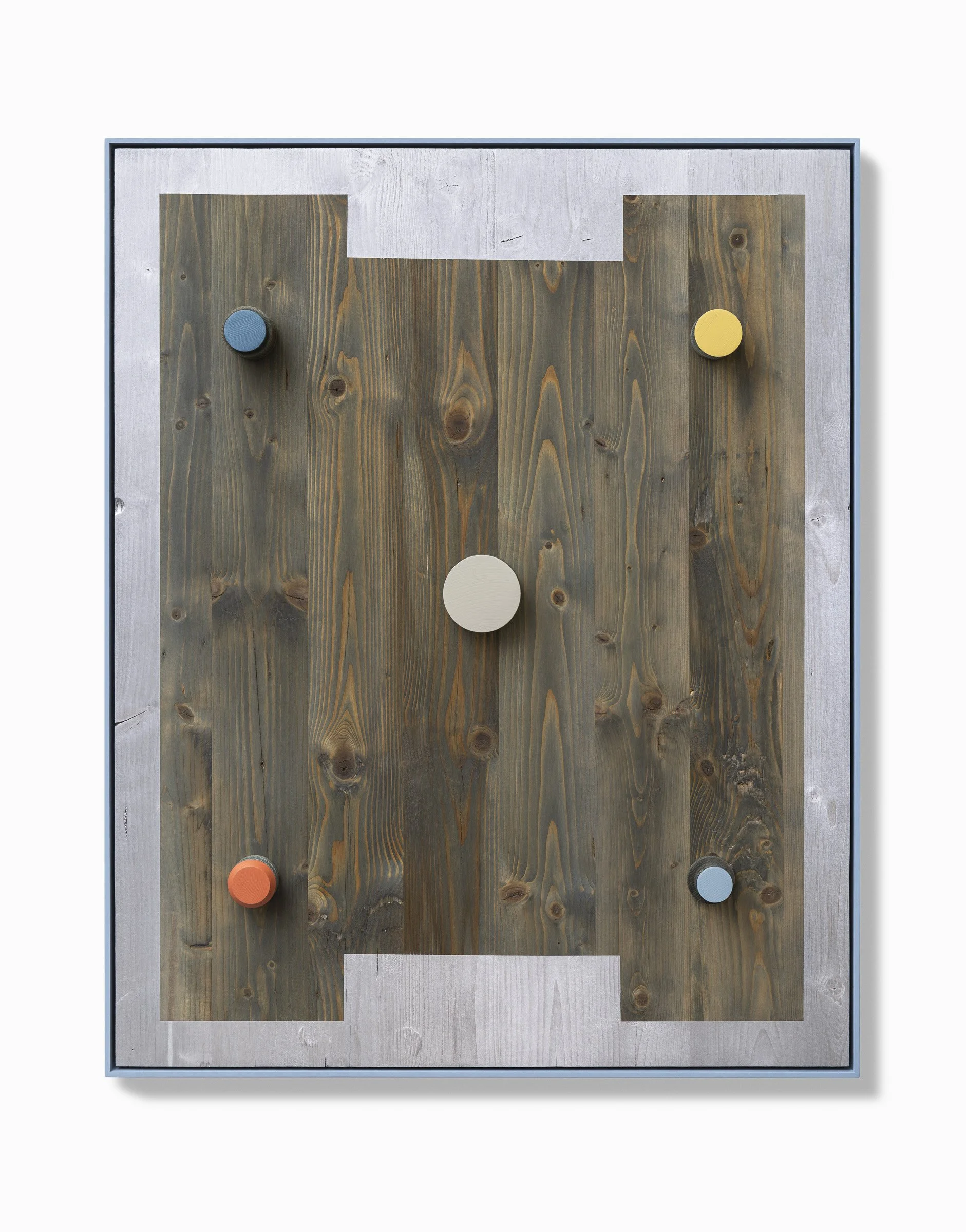
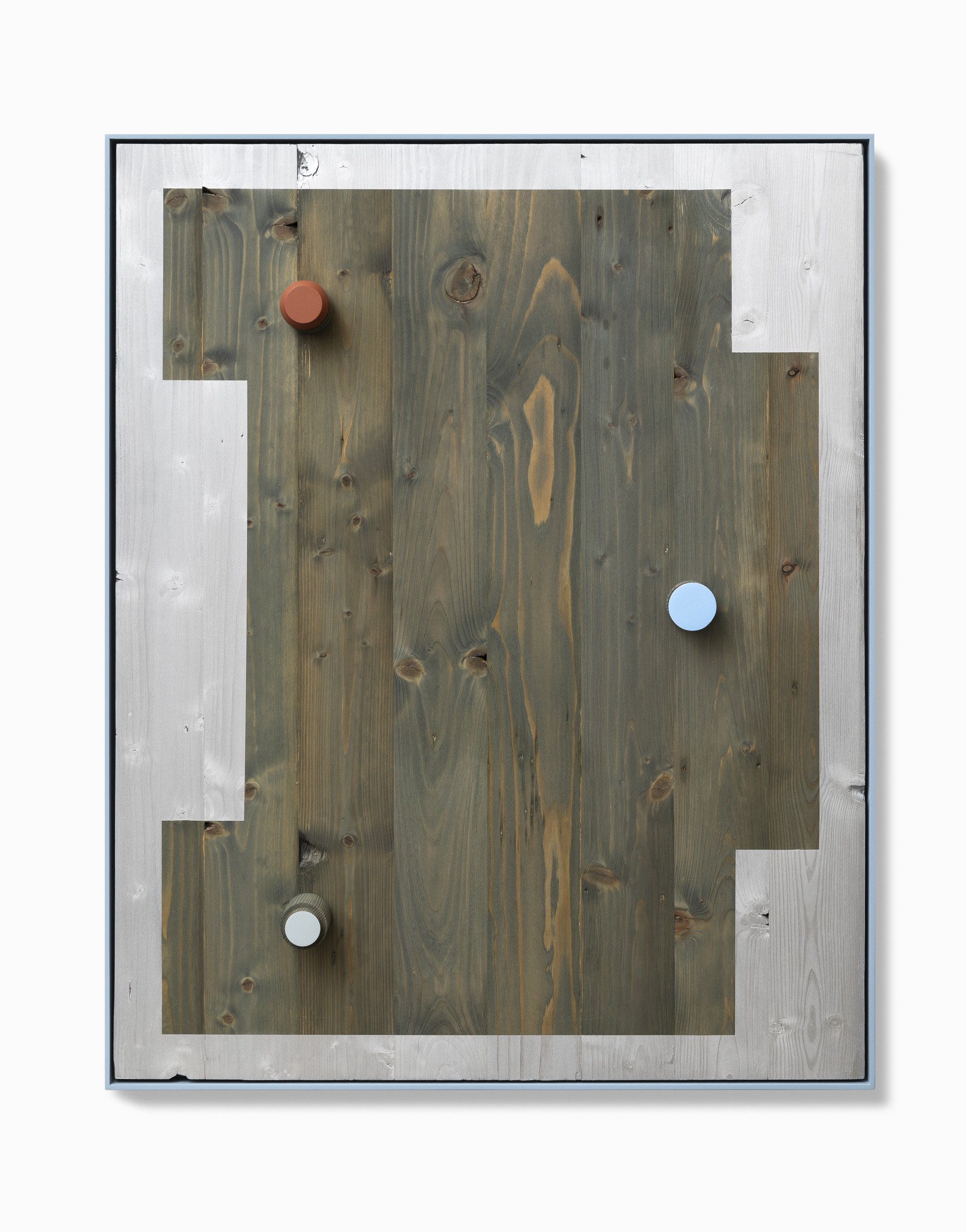
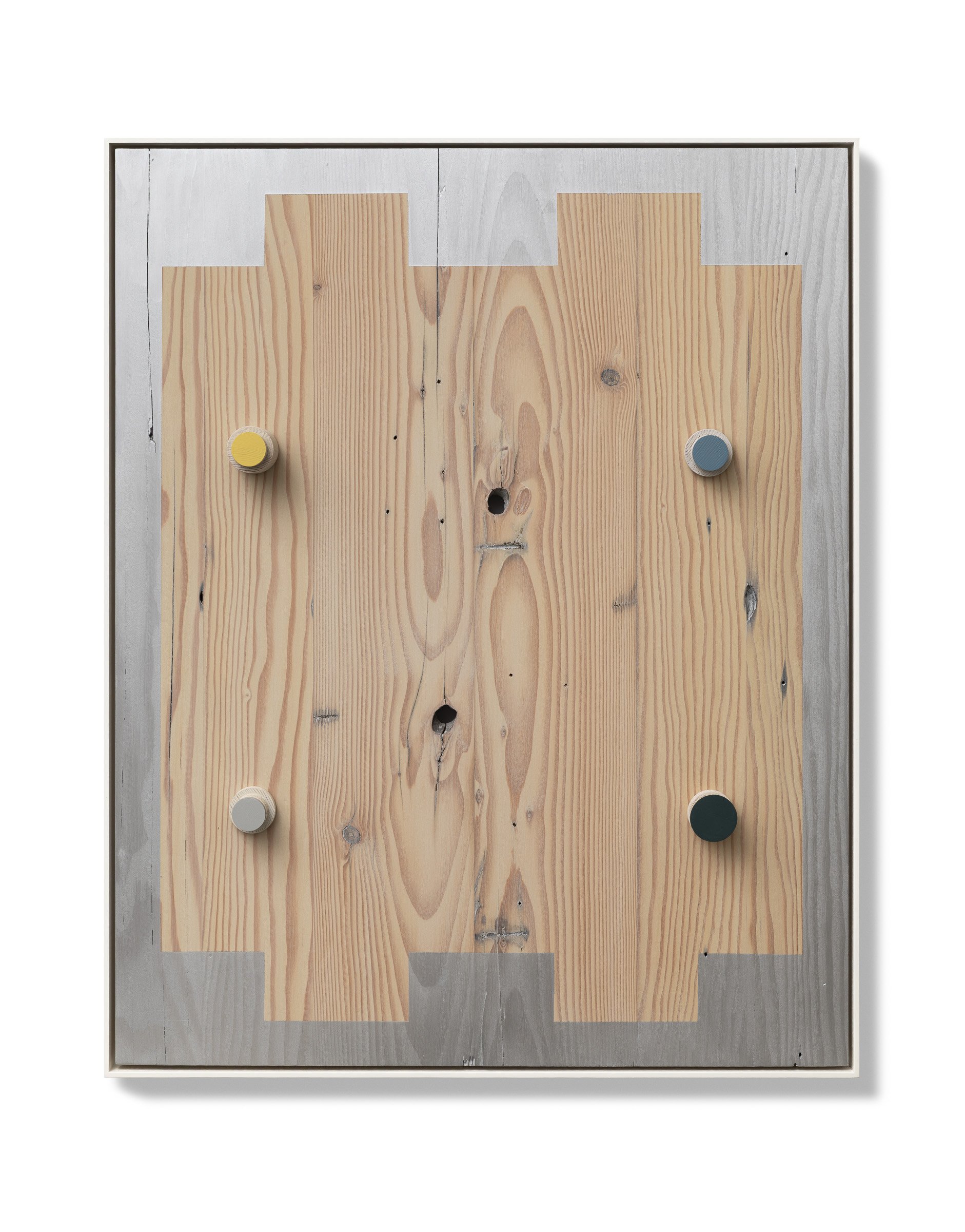
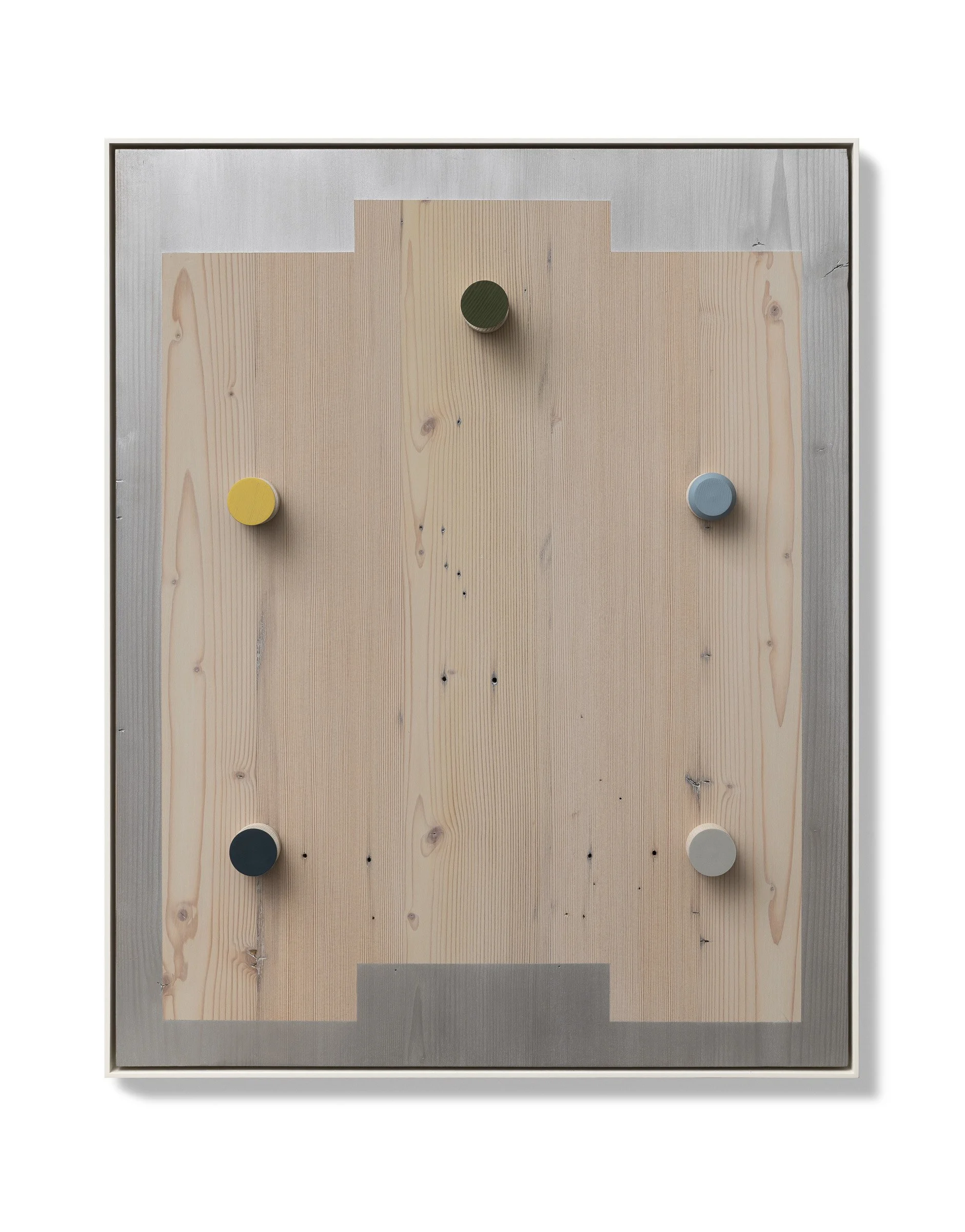
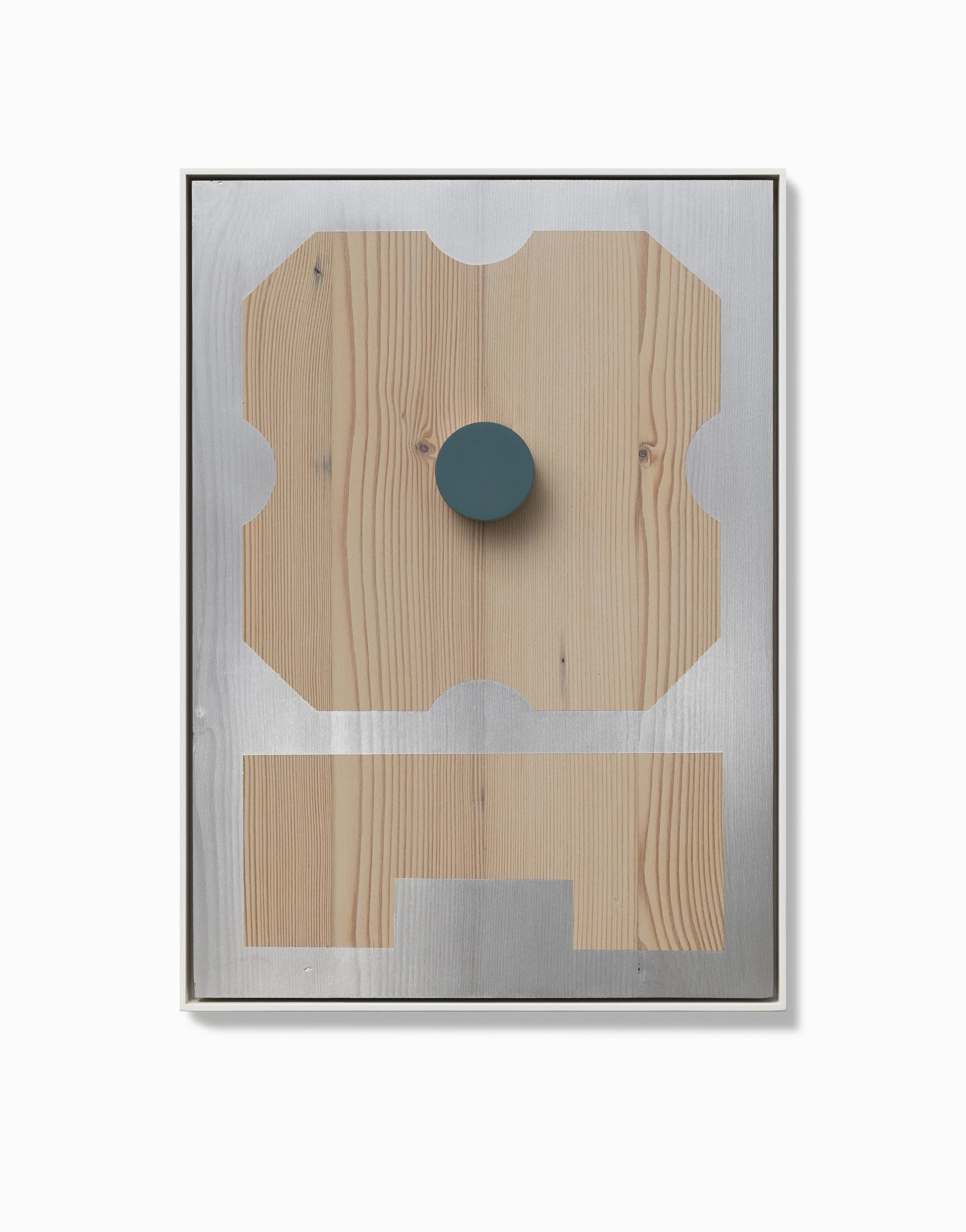
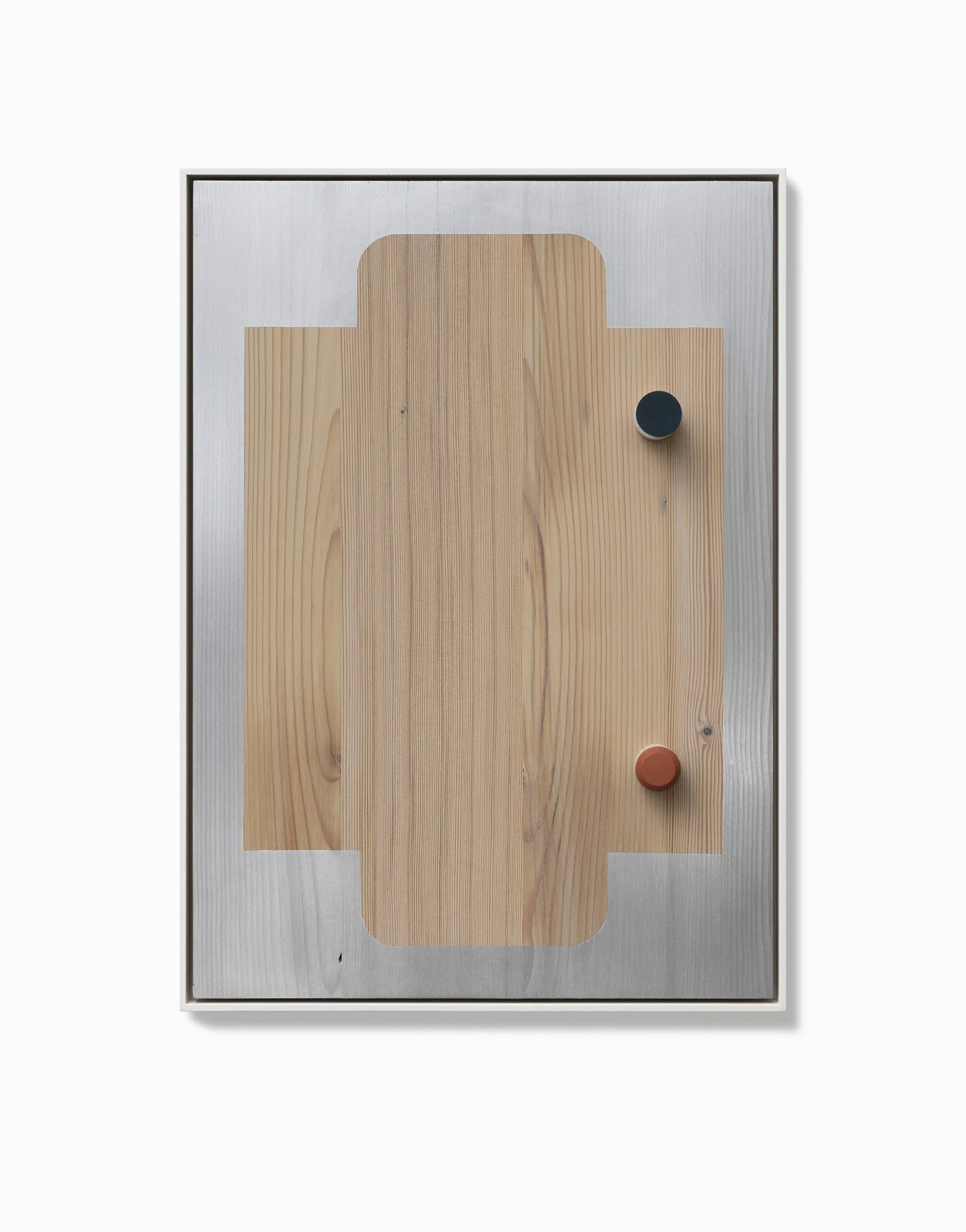
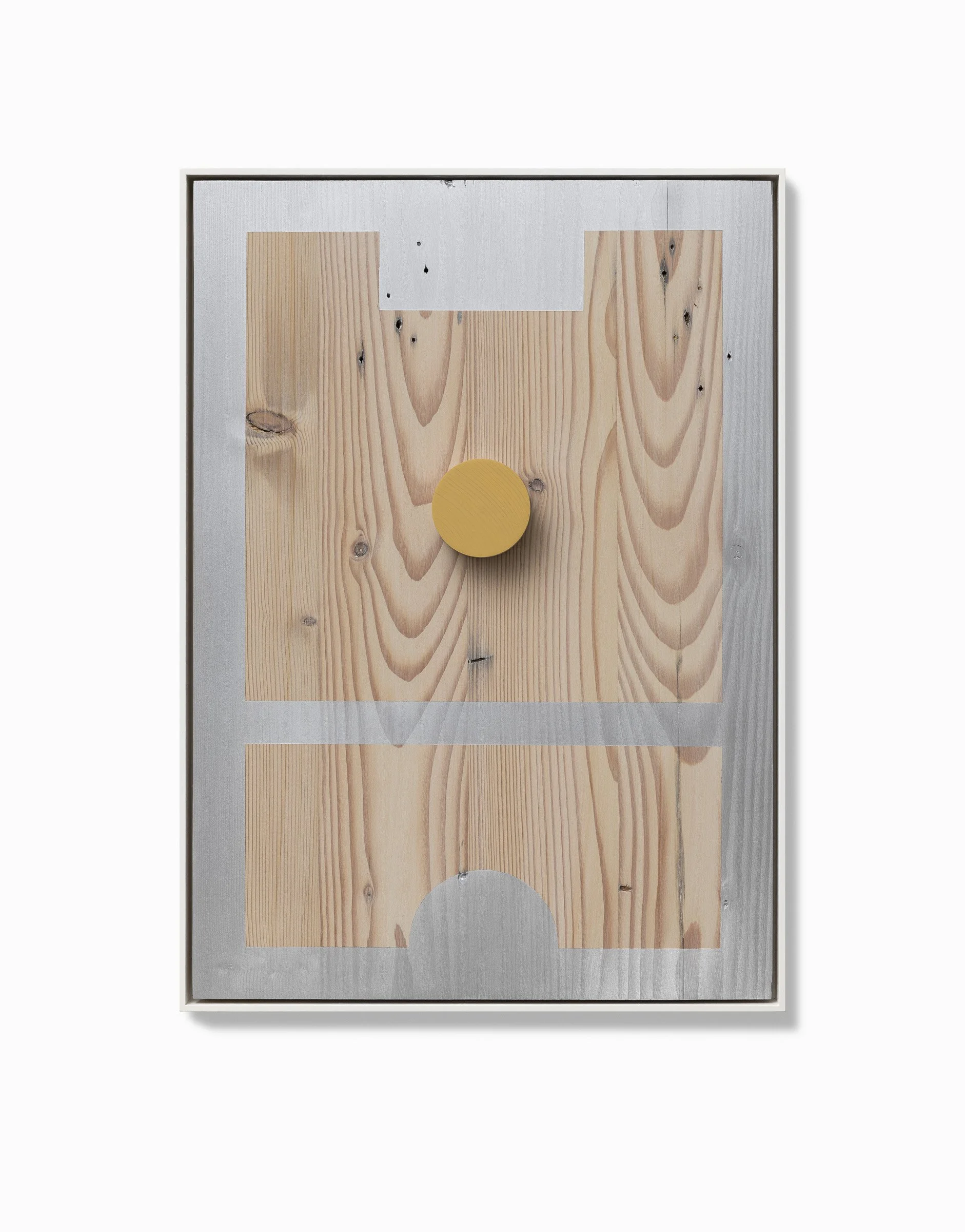
Jo Wilson’s recent works examine the relationship between geometric abstraction, industrial form, material history, and the reconstruction of reclaimed timber. Formed from Baltic Pine dado boards and Kauri Pine weatherboards salvaged from former heritage homes in Daylesford and South Melbourne, the works retain knots, fissures, nail holes, stains, and structural irregularities. Formed through the sands of time. Rather than concealing or correcting these nuances, Wilson integrates them into the compositional logic, making the material and visual instability central to its abstract structure.
Historically associated with formal reduction, geometric abstraction is here reconfigured through materials that retain evidence of labour, weathering, and architectural wear. Drawing on more than three decades of engagement with printmaking, Wilson employs the visual language of platens, moulds, nozzles, and industrial dies as recurring compositional devices. Repeated contours, geometric divisions, and framing structures establish frameworks associated with alignment, pressure, containment, and mechanical precision.
Yet, the geometric order of the works is continually disrupted by the organic nature of the timber itself. Knots interrupt the picture plane, grain patterns drift unpredictably across the surface, and tonal inconsistencies resist the sleekness historically associated with hard-edge abstraction and post-minimal coolness.
Wilson’s use of finely milled timber surfaces and architectural framing devices positions the work within a unique dialogue surrounding postminimal and neo-conceptual abstraction. The layered timber substrates and spatial divisions recall aspects of Peter Halley’s constructed paintings, particularly in their deployment of geometry as both spatial system and organisational logic.
Unlike Halley’s sealed and semiotic surfaces, Wilson’s compositions resist formal closure through the persistent visibility of material irregularity and historic wear. Colour similarly operates structurally rather than illusionistically.
Restrained chromatic interventions, including hand-painted pins and concentrated colour accents, interrupt the flatness of the surface while evoking familiar points of contact associated with everyday objects such as door handles, fixtures, and hooks. These elements function less as devices of pictorial depth than as markers of orientation and tactile recognition.
Questions of objecthood and display are equally central to the works. Their status as wall-based constructions invites comparison with Haim Steinbach’s shelf works and Donald Judd’s wall constructions, in which acts of framing and presentation operate in a system of cool arrangements. Whereas Steinbach’s practice frequently engages systems of commodity circulation and display, Judd’s wall constructions retain the spectre of industrial intervention and design. Wilson’s wall works remain tied to the physical history and residual labour embedded within reclaimed timber. The material is a contradiction to the idea of the cold, ever-expanding plane.
The assembled and modular logic of the works recalls aspects of John Nixon’s provisional abstractions and constructed surfaces, while their emphasis on material presence shares affinities with Kishio Suga and the wider Mono-ha movement, in which materials resist complete formal acceptances and retain a degree of ephemeral. Wilson’s works hover between organic form, design object and fine art.
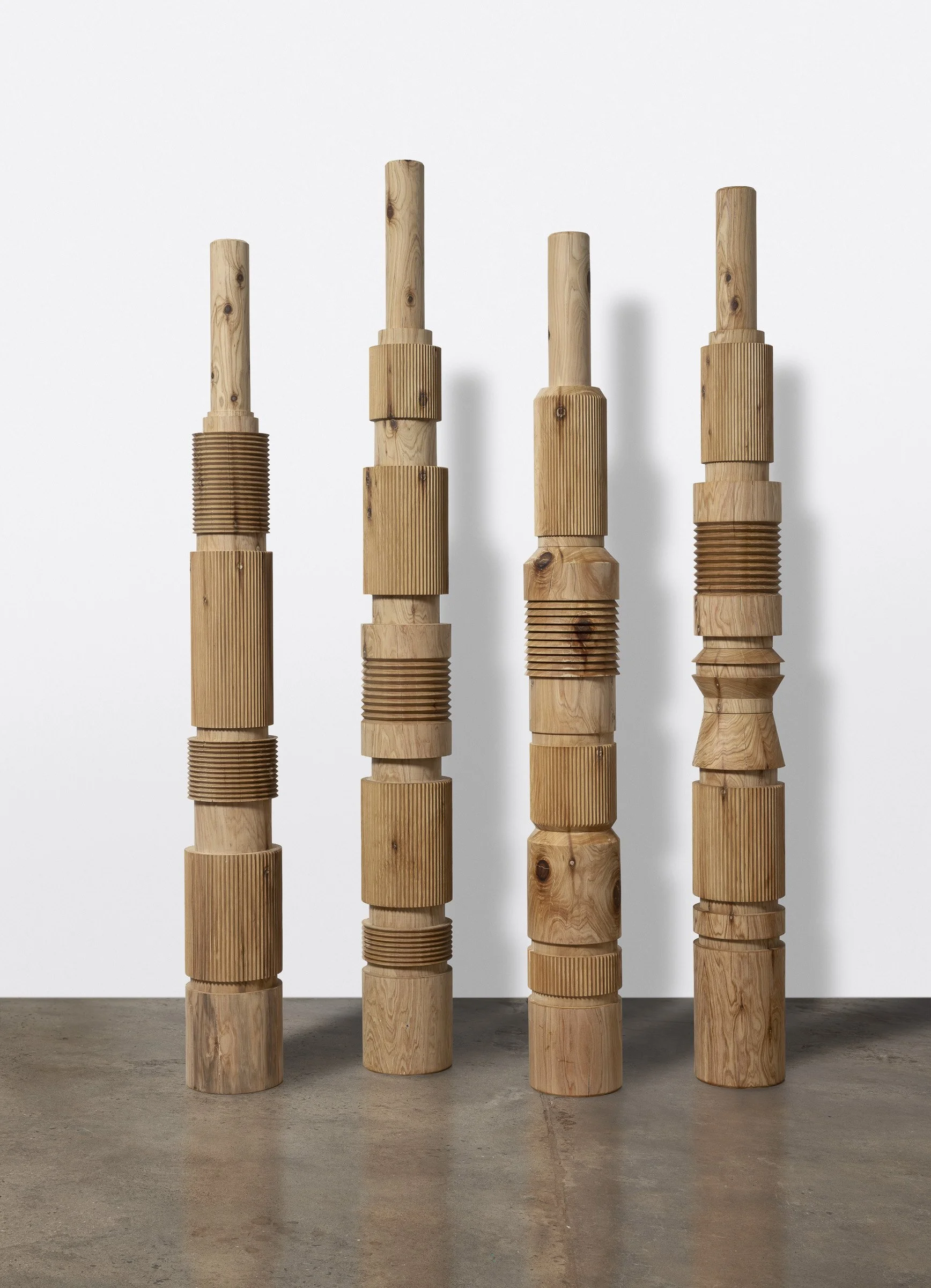
The vertical sculptural works extend the history of the totem-like object. Their stacked cylindrical forms suggest machine components, architectural fragments, or ritual structures, yet resist fixed categorisation. Precision cut grooves and repeated profiles establish serial rhythms repeatedly complicated by variations in density, grain, and surface irregularity. Across the exhibition, abstraction emerges not as a withdrawal from material reality but as a means of registering the tension between time, geometric order, human systems, and the foreboding temporal conditions embedded within matter itself.
Jeremy Kibel 2026
OF LINE and EDGES
The timber used in these works originates from my photographer’s former heritage homes in Daylesford and South Melbourne. During a photoshoot, he mentioned he was beginning to clear out these materials from his studio, where they had been stored for many years. Next, we were loading my car with his collection of beautiful old Baltic Pine dado boards and Kauri Pine weatherboards from the 1800s. These timbers carry a strong connection to local history. They have been reworked and reimagined into this new series of wall works. I have loved giving them a second life.
Within this body of work, platen, moulds and industrial components serve as primary references for outlines, borders, and contours. A platen is a flat plate used in machinery and printmaking to apply pressure and hold materials. It is often the heaviest and most critical component of a press, ensuring precision. In metal forming, a platen is the component that houses the mould for forging the required shape, the movable and stationary platens are in the dies (custom, sharp-edged tools) located inside an injection moulding machine. The titles of my recent works reference this essential industrial and printmaking component, marking a connection between its industrial function and my background of over 30 years in printmaking.
After careful laminating and preparation, the timber substrates are layered with wood washes, acrylic paint, pigments, and hand-turned pins. The pins introduce a play of colour, mapped through an open enquiry into the geometry found in nozzles and bolt holes within industrial dies. The sweet spot emerges intuitively, as all elements come into balance.
My aim is to allow the timber to breathe and shine, often leaving large, centred open margins. As much as possible, honouring the marks of time. Boundary lines establish a structural silhouette, holding the composition in place.
Linework is central to the totems. Linear elements define each form, with alternating direction and orientations. These works draw on core principles of form, edge, and contour; referencing the profiles found in industrial tooling and machinery. At the same time, the linear rhythm of the woodgrain plays with our perception, reminding us timber is a living material.
I aim to create works that feel positive to experience. Ideally, the viewer is drawn closer and compelled to touch. Wood, by its nature, invites connection: its scent, surface, and subtle vibration create an object that we’re compelled to connect and engage with.
J/W 2026

paul newcombe: conspiracy of ravens
PAUL NEWCOMBE: CONSPIRACY OF RAVENS
JAMES CLAYDEN
08.04.26 - 02.05.26

Installation images
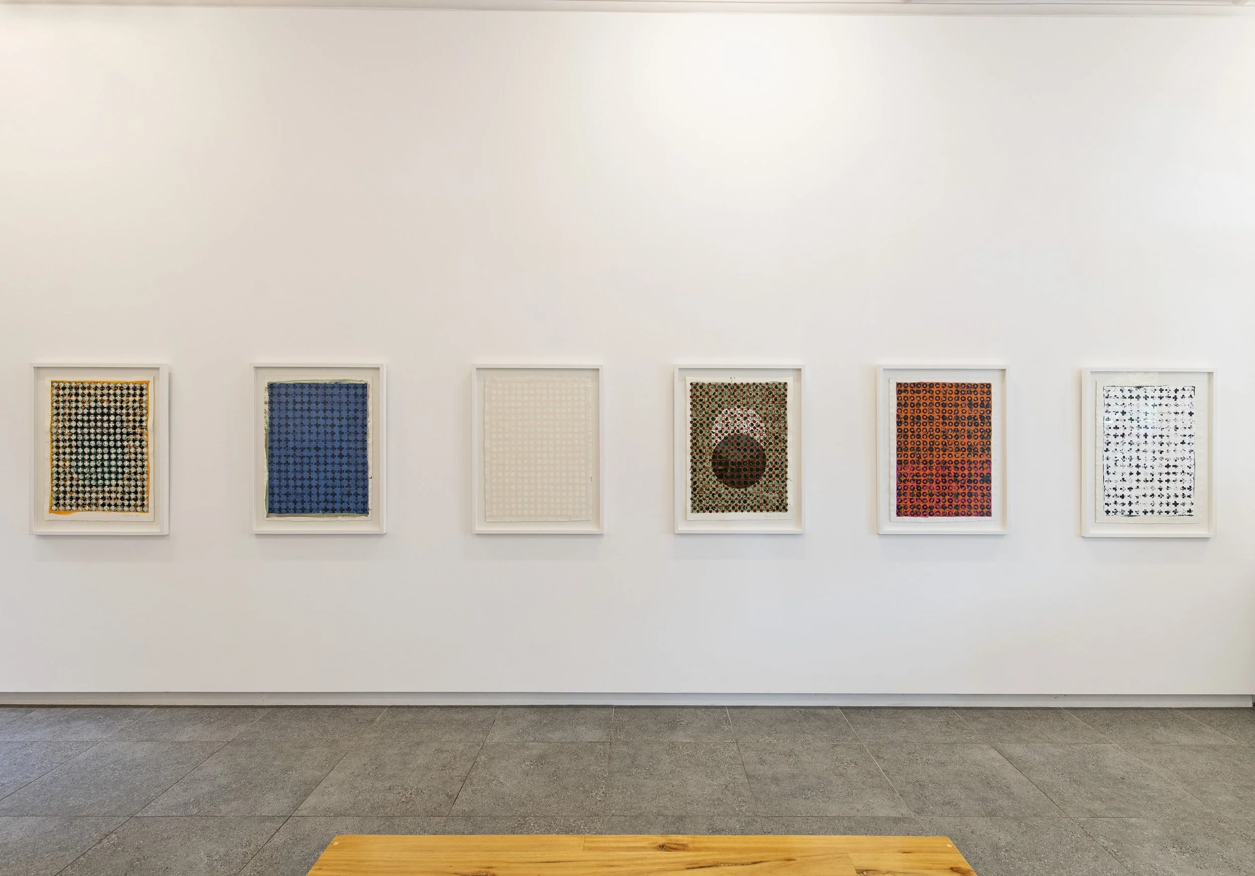
Pattern Recognition
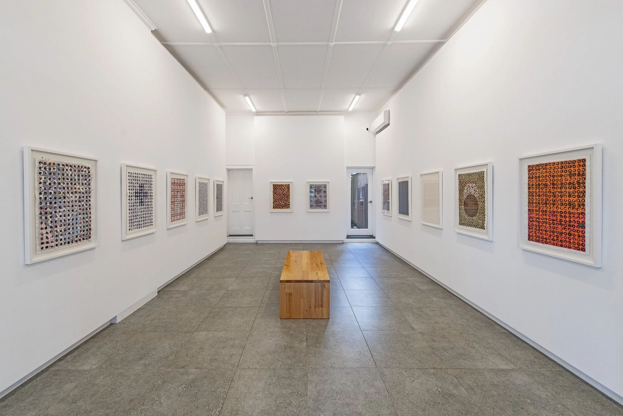
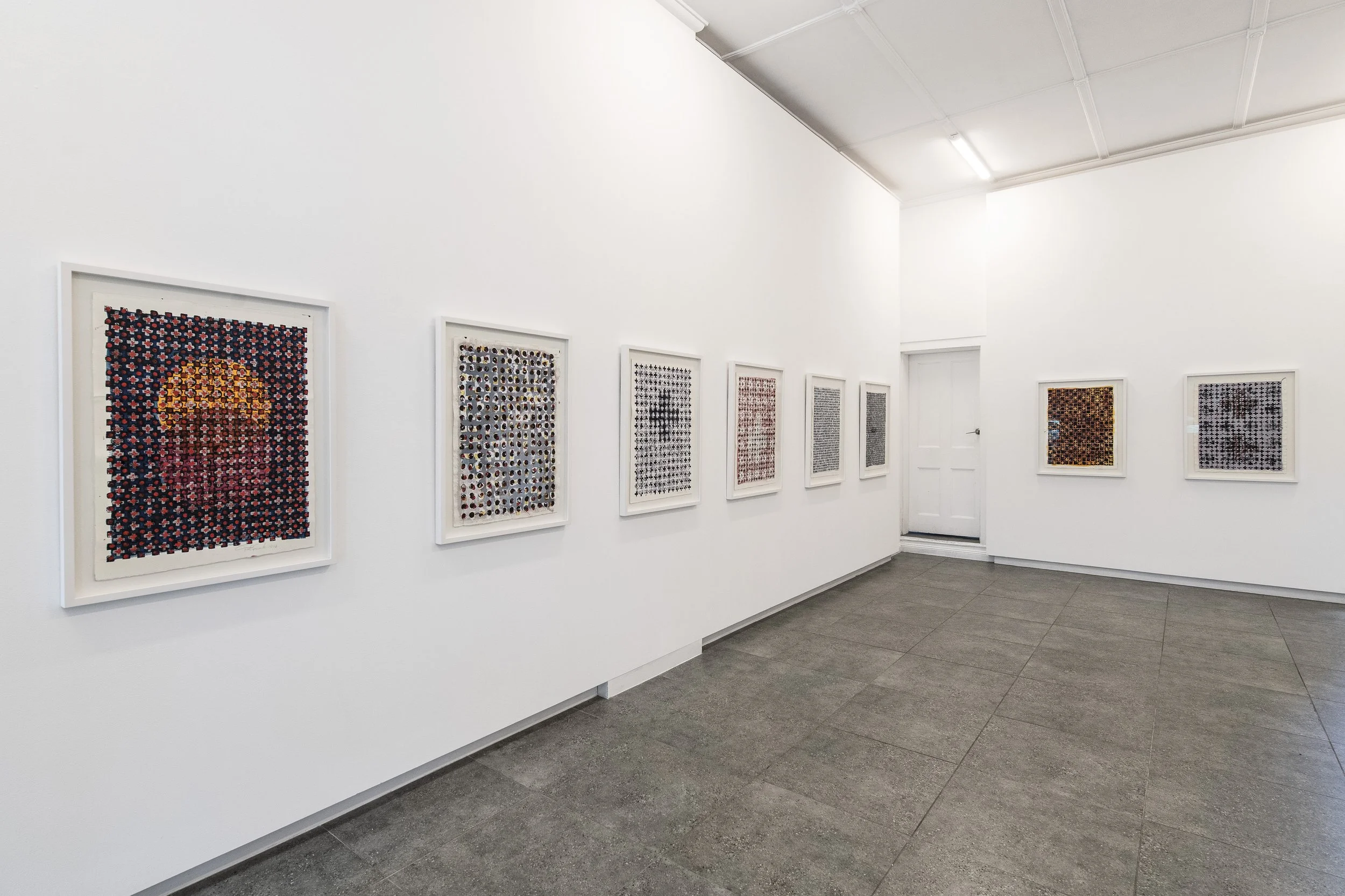
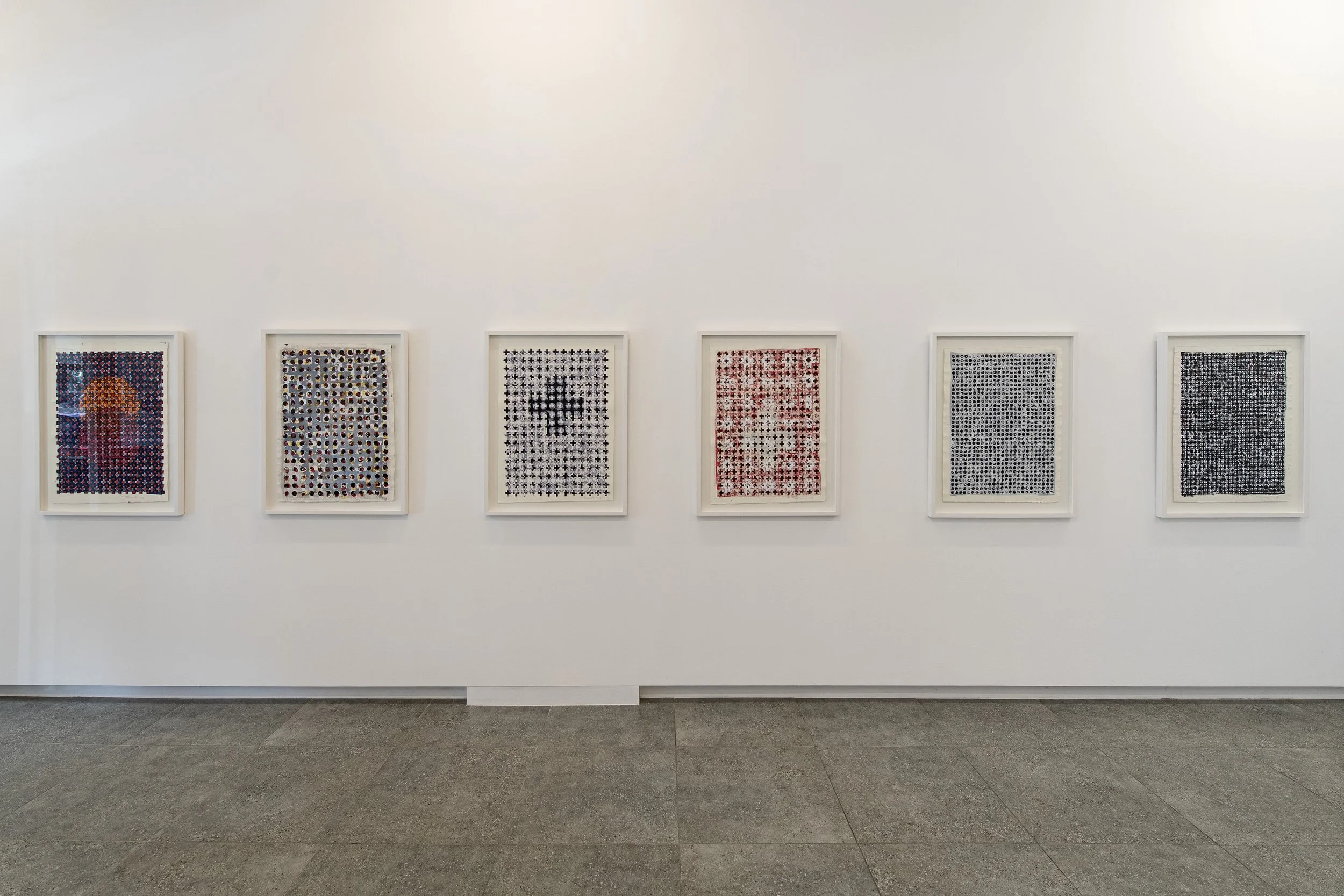
Patterns are a worthy footnote to Paul Newcombe’s paintings and his exhibition Conspiracy of Ravens. Patterns in the everyday and in art provide a ground by which to notate repetition. In contemporary life, pattern recognition determines activity and pathways that anticipate future outcomes. In art, patterning is also critical, but less defined and less inclined to systematic ends.
Take, for example, Persian and Oriental rugs. Their beauty runs tandem to their function, but their common ancestry, their genus, presides over cultures that venerate and represent traditions in graphic form. Rugs are an art, but one that can withstand man’s footprint.
The same qualities of pattern and repetition are seen in Newcombe’s paintings. They have a sound that persists and replays at a frequency that is systematic. It is stylistic. I would think - Motorik, the artist’s beloved Can, is the refined muffle beneath these surfaces. Music is listened to while painting, and the patterns emerging are as assured as the beat that informs them.
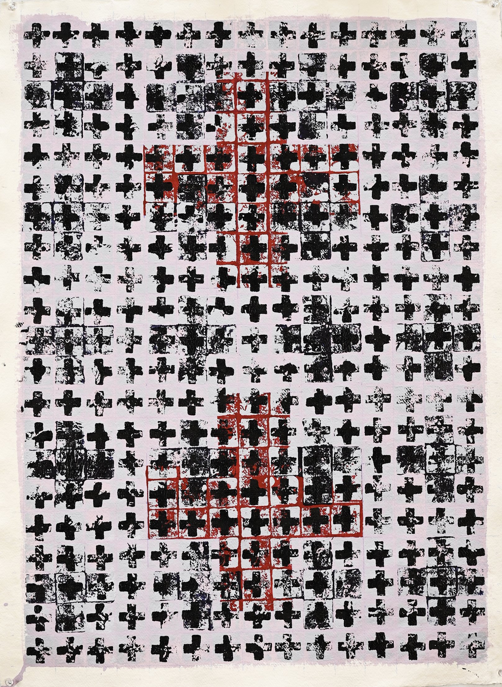
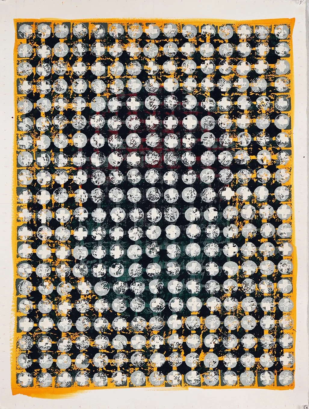
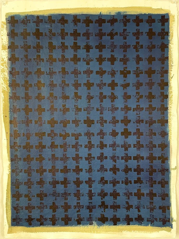
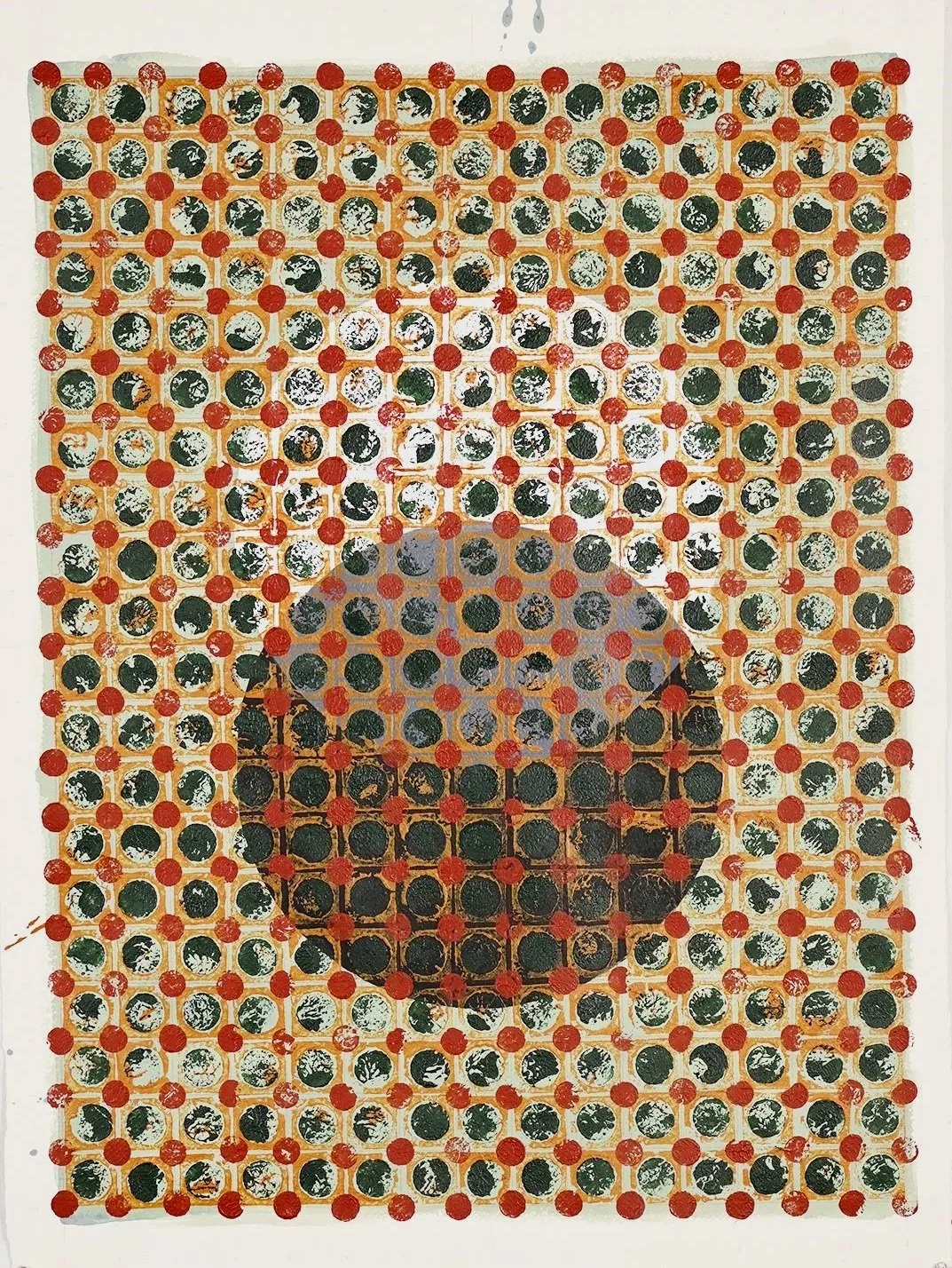
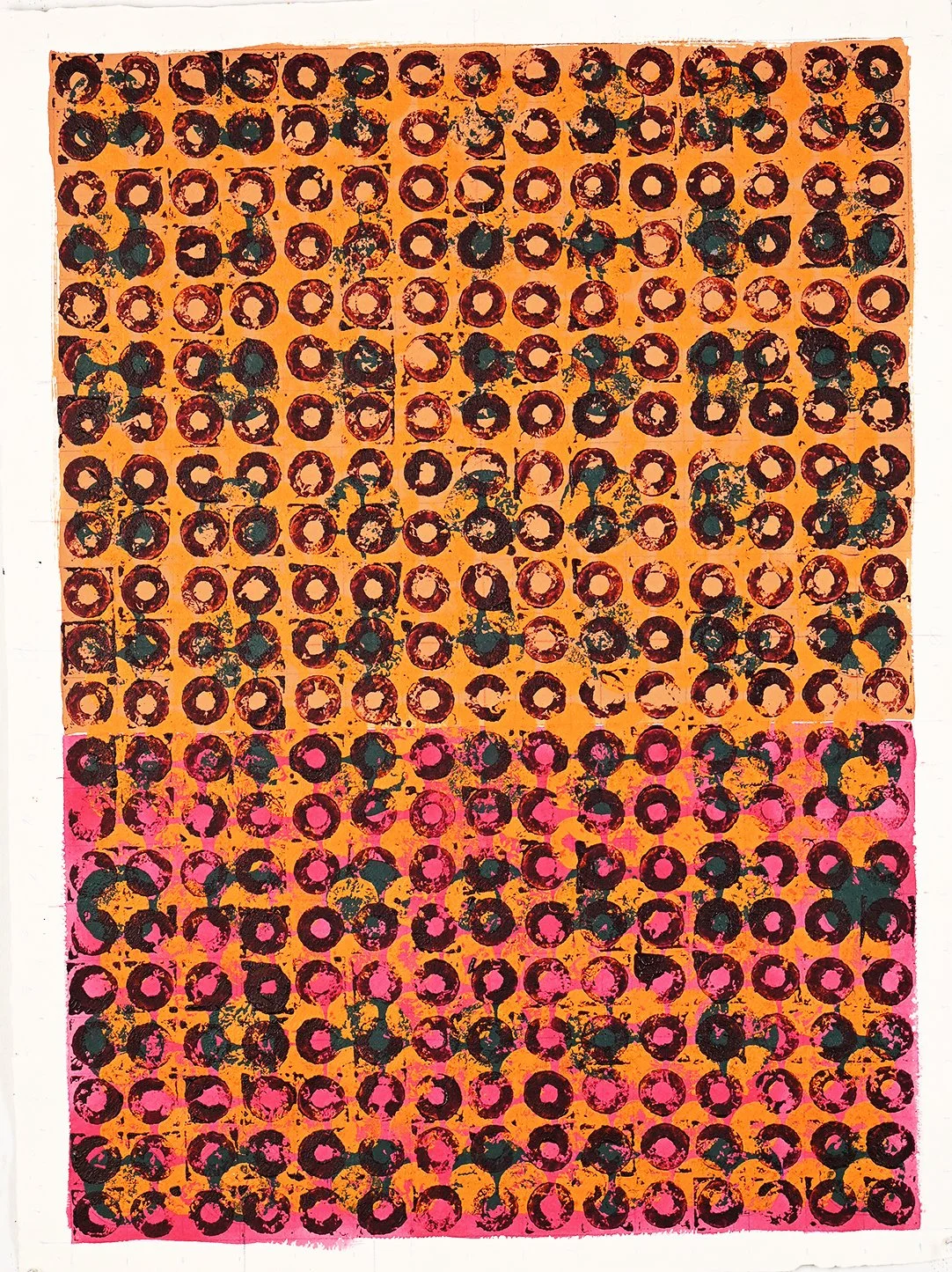
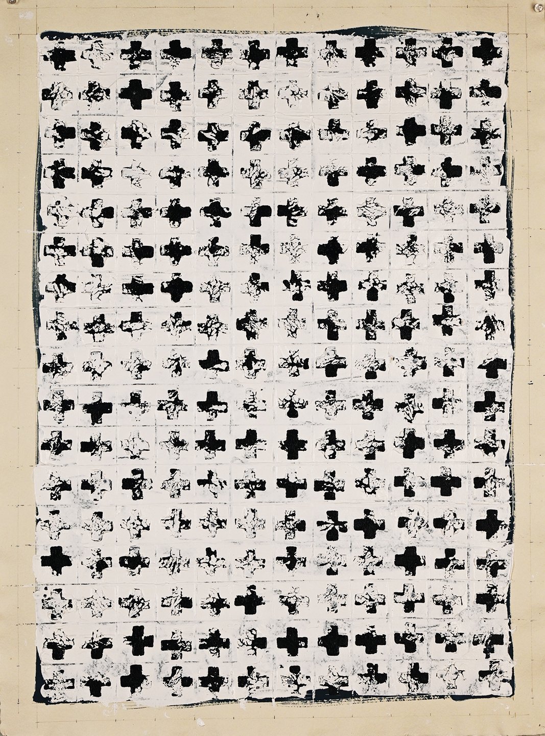
One can only marvel at the intricacies and nuances of the paintings in the series. The sameness of size and the repetition of marks redouble the artist’s efforts to affect an overall symmetry. Newcombe has a long-standing commitment to process painting. There is a degree of conceptualisation to these paintings and a repetition of the grid pattern. Thus, the paintings have a stand-up, wall-painted, trellis-like effect, with a lattice to let light in, and borders loosely edged.
Paul Newcombe’s technique challenges perceptions of abstract painting, but the questions that postwar abstract painting posed remain. At one level, abstract painting appears easy, unencumbered, because appearance is the pursuit of figurative art and relies on recognition. Abstract painting is an uneasy art and if to be successful demands a considered sideways glance and a reasoned take on visuality.
Complexity and sensation are the bywords of this exhibition. Each small square of activity bursts with energy and adds to the greater picture. The world is a wicked place, evinced by Newcombe’s exhibition title and confirmed by our daily reality. Patterns emerge and recede. We grasp each reality and find surety in repetition. It is a resonance that echoes through these paintings, the colour patterns a reassurance, enlivened with light that takes us on a complex journey.
Brett Ballard
Brett Ballard is formerly Head of Art at Menzies Art Brands, Sydney. Prior to joining Menzies, Brett held the position of Senior Specialist, Art, at Sotheby’s Australia (Smith and Singer) for 10 years and was previously Gallery Manager at Rex Irwin Art Dealer in Sydney between 2003 and 2011. Brett works closely with clients, consulting on collection management and the buying and selling of art in the secondary market and at auction. He is an experienced curator who advises on all aspects of collecting both in Australia and abroad. Brett has published numerous articles and has written extensively on art for catalogues and exhibitions.
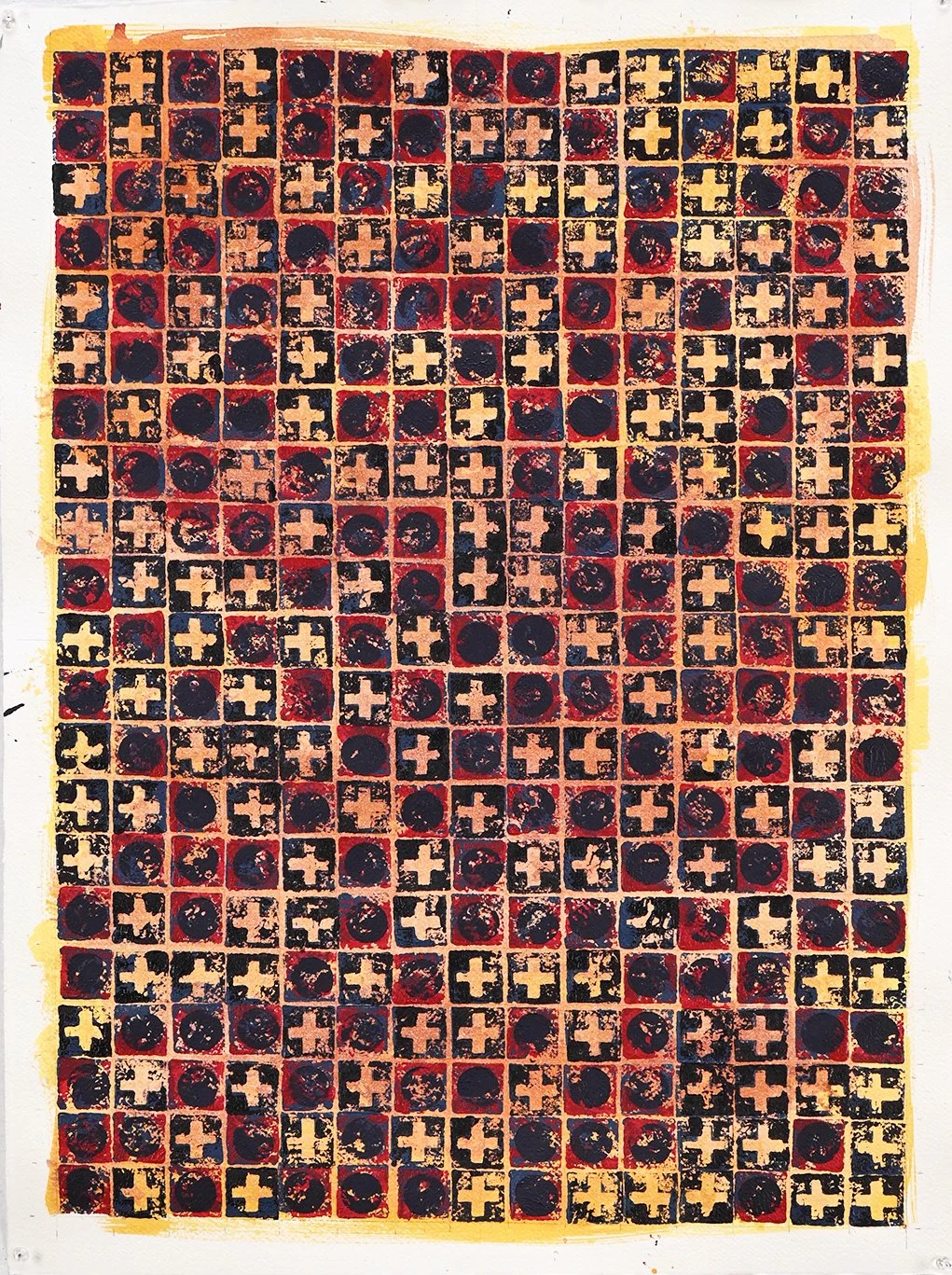
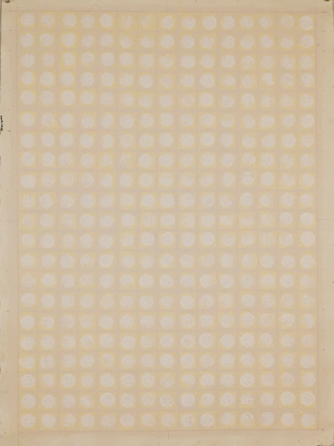
Q&A with Paul Newcombe
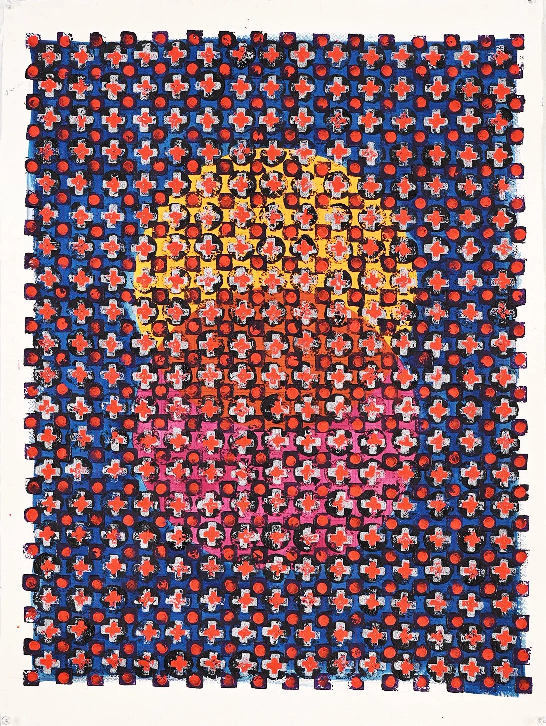
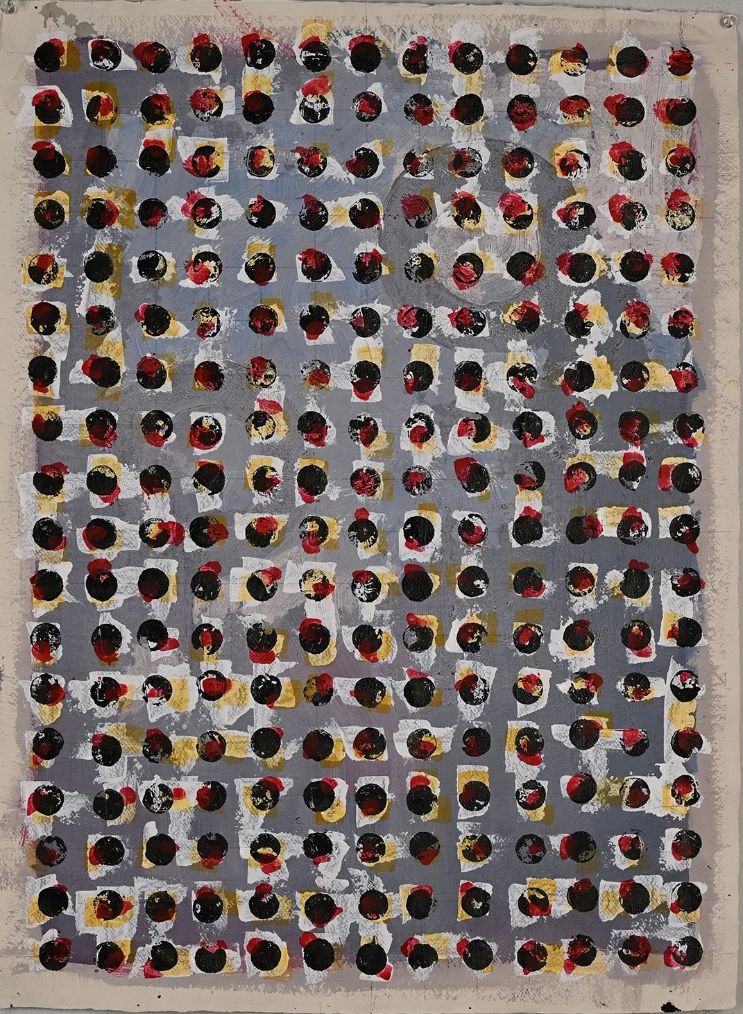
BP: Your work begins with the grid, but it never feels fixed. What happens to that structure over time?
PN: The grid is where every piece begins; it sets the logic of the work in motion. From there, each painting finds its own path. In some works, the grid is gradually submerged beneath layers of the handmade stamps and colour; in others, it holds firm, asserting itself through to the finished surface. Often there's an underlay of paint before the grid is even established, so the structure is already in dialogue with something looser from the very start.
BP: The repetition feels bodily rather than mechanical. How conscious are you of the physical act of mark-making as the work accumulates?
PN: Entirely conscious as it's inseparable from the work. The stamp becomes an extension of my body, and the rhythm of applying marks is as much the subject as whatever appears on the surface. I work in series, and this exhibition represents roughly two years of sustained development. Before any finished piece, there are months of pre-works and drawings that refine both the idea and the physical gesture. By the time I come to a painting, the mark-making carries real knowledge in it.
BP: Each unit resists standardisation. Are you seeking variation, or does that instability emerge on its own?
PN: Both, but I do push it deliberately. I might produce a small run of works with a shared intention, then consciously force a shift, a change in the density, the scale of the mark, the colour logic. I'm constantly drawing alongside the paintings, and those drawings are where I test new directions. Every finished work has preliminary drawings behind it. The variation is pursued, but always within the discipline of the series. The intent stays, the look evolves.
BP: What role does duration, or even exhaustion, play in the work?
PN: Duration is built into the process. Each piece in this series took around seven days, and most carry more than ten layers of paint. I work on several pieces simultaneously, so there's a sustained immersion. Over time, you become deeply competent at the process, and paradoxically, that's usually the signal to stop. When the making becomes too fluent, too easy, the work risks tipping into mere repetition. The end of a series arrives when mastery threatens to replace discovery.
BP: Your motifs hover between sign and noise. Do you resist meaning, or does it dissolve through repetition?
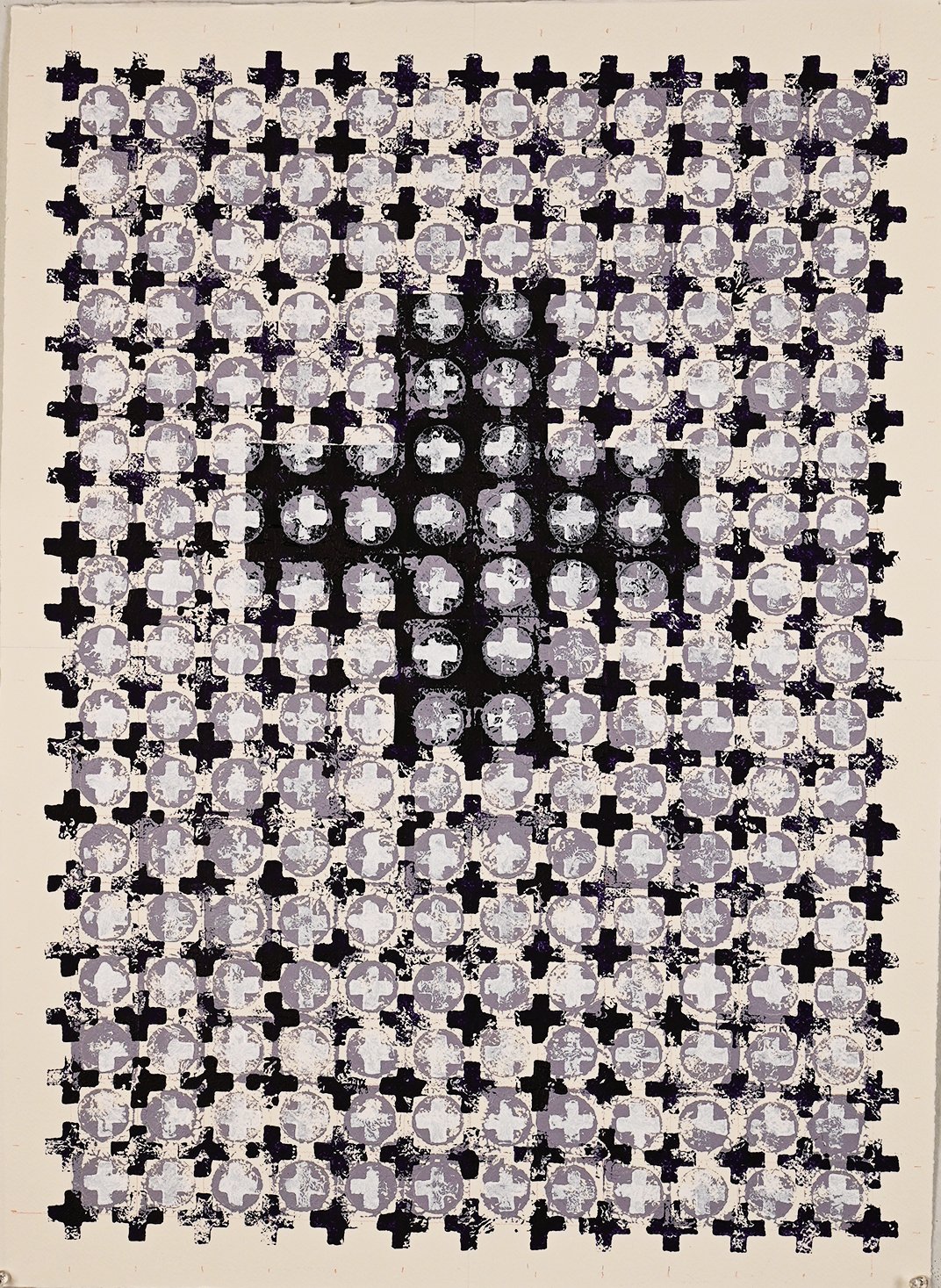
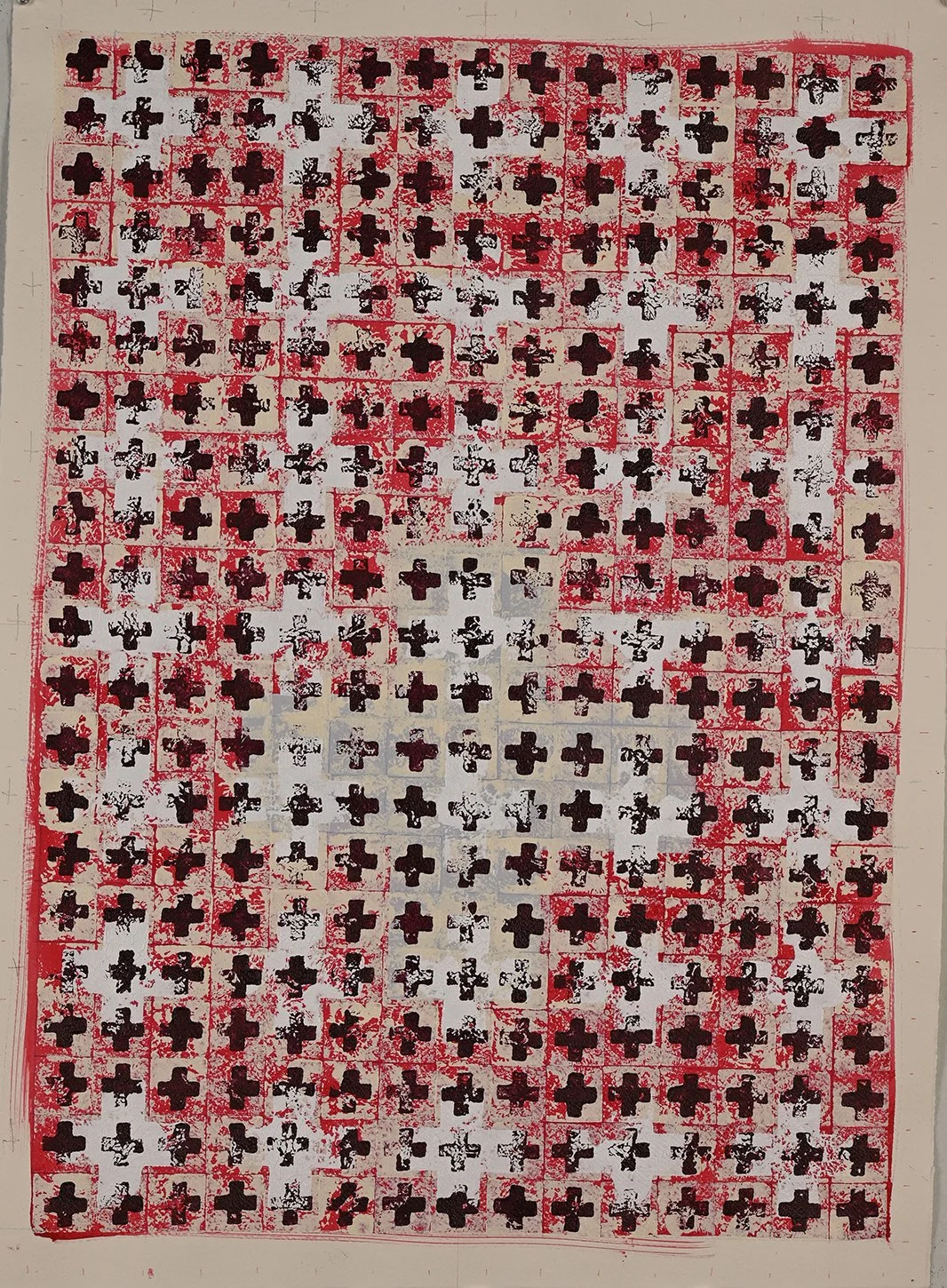
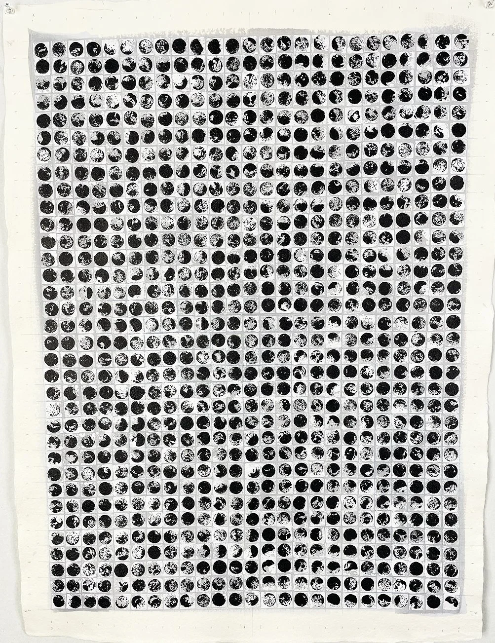
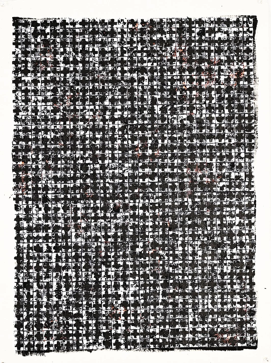
PN: I don't resist meaning so much as refuse to assign it. The cross has been part of my vocabulary for many years — it's a shape that inevitably conjures associations, but I work with it free of ideology. What interests me is its formal character: the intersection, the symmetry, the way it occupies space. The circle is the purest form I know, and I love the quality of mark it produces. Squares help define the grid. These three motifs are all I use. Through repetition, they shed their symbolic weight and become something closer to pure visual experience.
BP: In the darker works, the grid reads as unified at a distance but breaks apart up close. What happens in that shift?
PN: That shift is central to the work. I build in a level of detail that can only be discovered at close range, so that it rewards sustained looking. The darkness itself comes through colour choices and the sheer density of accumulated marks, and it's always deliberate. I want the work to function on both registers: as a cohesive field from a distance, and as a complex, almost teeming surface when you step in close.
BP: The repeated cross carries historical weight. At what point does returning to it risk becoming habit?
PN: I consciously avoid any contextual or symbolic reading of the cross. My work is pure abstraction. I'm not making philosophical or religious statements as the cross is a shape, nothing more. The risk of habit is something I guard against through the series structure itself: once the making becomes automatic, the series ends, and I move on.
BP: Working on paper exposes hesitation more directly. How does the material shape or limit your decisions?
PN: I love paper for its immediacy. Paint behaves differently on paper, there's less forgiveness, which means every mark carries a certain sureness and finality. That directness is what draws me to it. You get an instant definition that canvas doesn't offer in the same way. Rather than limiting my decisions, paper sharpens them.
BP: In the studio, how do you pace a work, continuous, or built through intervals?
PN: It's built through intervals, partly by necessity. After applying a layer of colour, I need to leave it for around twelve hours before laying the next round of marks. That's one reason I always have several works in progress at once. The enforced pauses become part of the rhythm as each return to a piece brings fresh eyes and a slight distance, which keeps the decision-making alert.
BP: For someone living with one of these works, what continues to unfold over time?
The work keeps revealing itself. There's a hypnotic quality to the surfaces, and the repetition draws you in. The longer you look, the more the layers and subtle variations come forward. I think you discover the true complexity of the work gradually, over weeks and months of living alongside it. It doesn't give everything up at once, and that's by design.
james Clayden: breath paintings
JAMES CLAYDEN BREATH PAINTINGS
JAMES CLAYDEN
04.03.26 - 02.04.26
Installation Images
Of patience, penance, prayer WORLD-MOTHERING AIR, AIR WILD, WOUND WITH THEE, IN THEE ISLED, FOLD HOME, FAST FOLD THY CHILD
Gerard Manly Hopkins
…
Last year while restoring some earlier works on paper l was drawn back into the unique poetry of Gerard Manly Hopkins, for l had taken certain words from his verse as titles for eight large paintings exhibited at Deutscher Brunswick St in 1990. The eleven studies were made in preparation for the larger works on canvas and can be found on the last pages herein.
The Breath Paintings came out of that contemplation. This document is to give some background for anyone that's interested in such stuff.
JAMES CLAYDEN
peter booth: works on paper
PETER BOOTH
Peter Booth Works on Paper
07.02.26 - 28.02.26
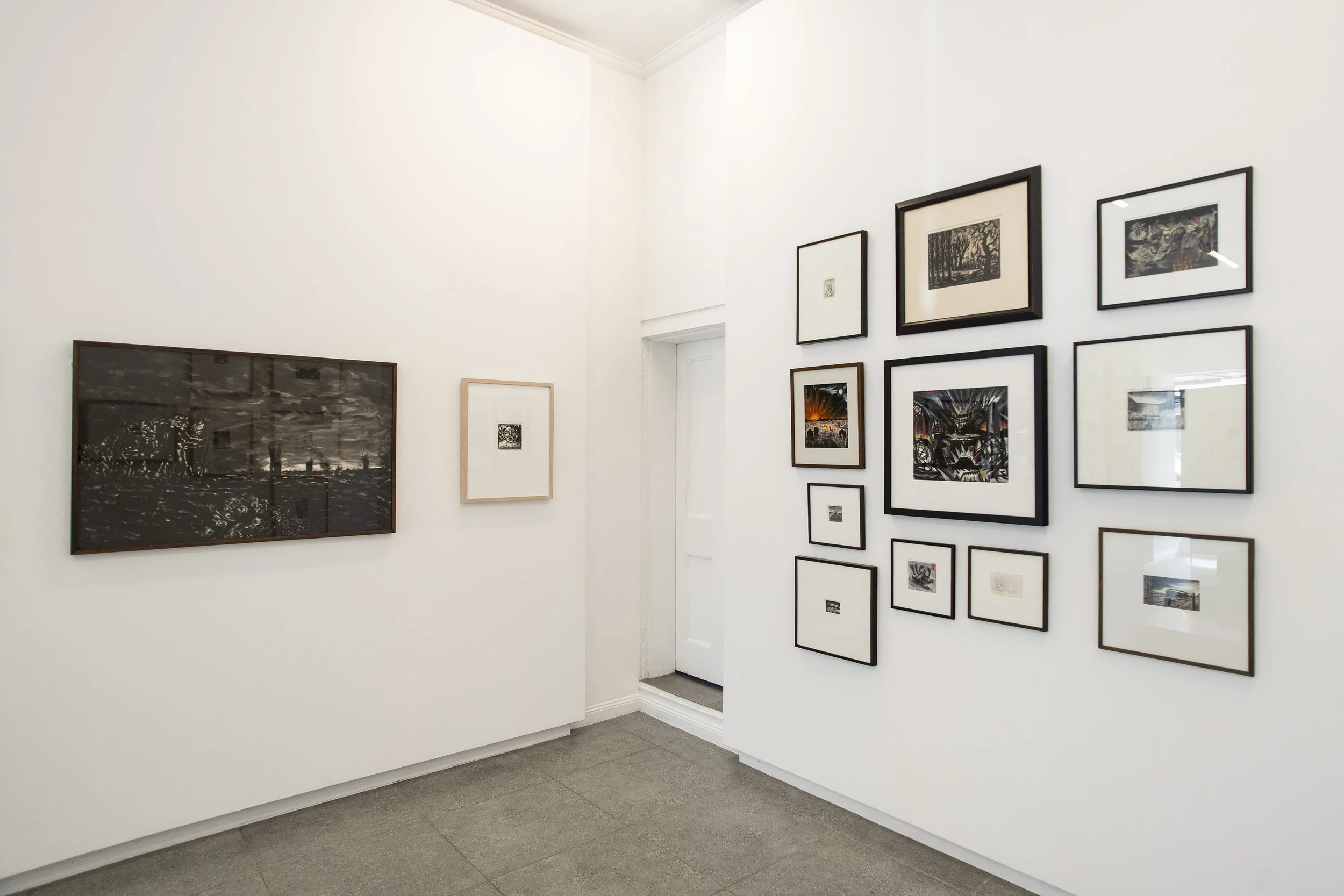
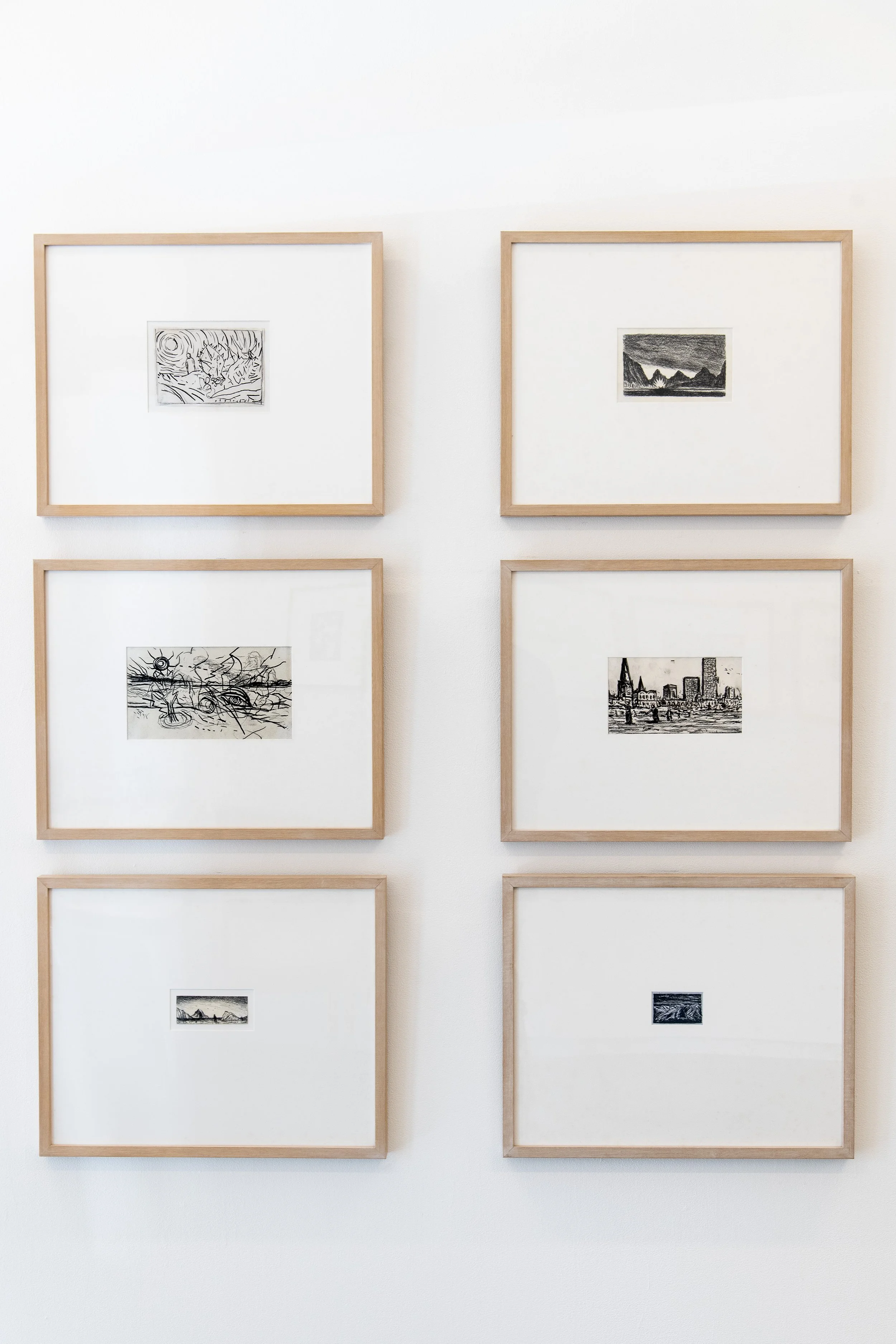
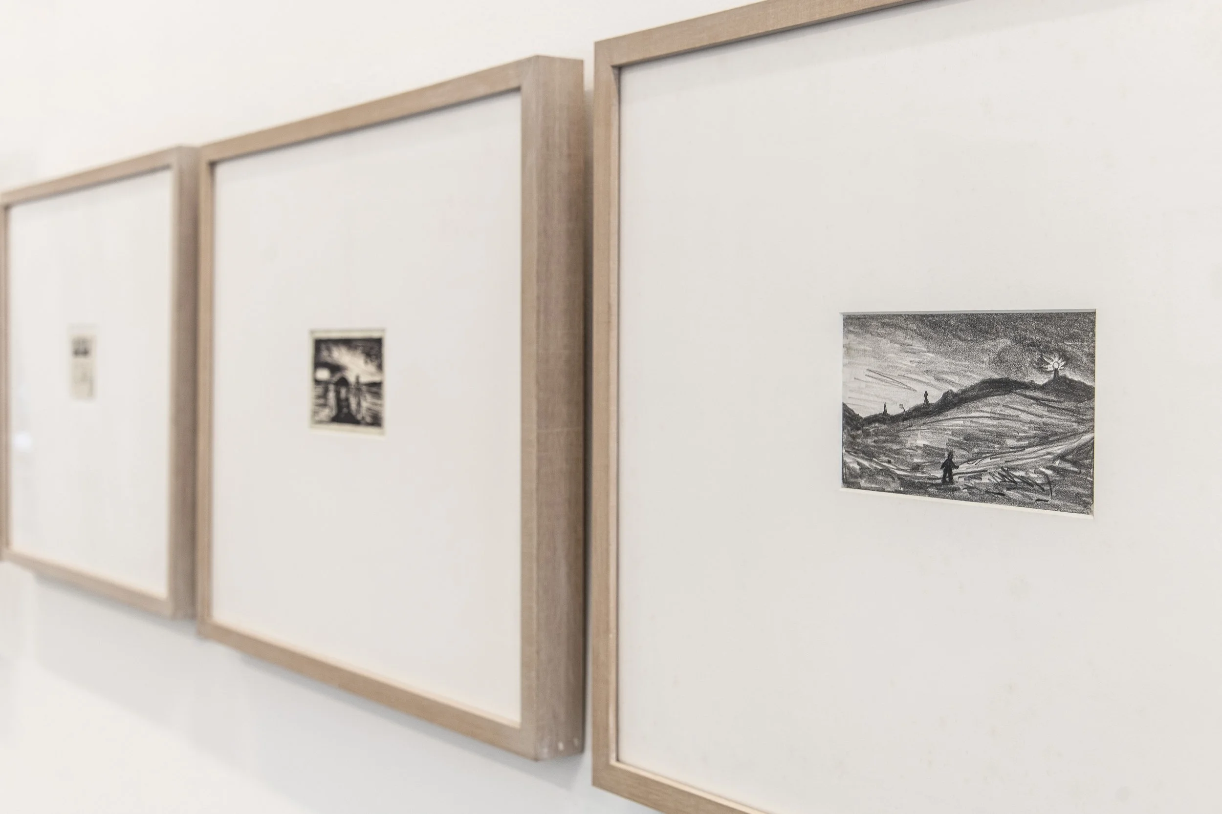
Installation Images
Peter Booth: WORKS ON PAPER
“What's ultimately so impressive is Booth's ability to imbue his smallest drawings or most lyrical landscapes with a sense of mystery, and often dread.”
McDonald J, ( March 7, 2003), Art Column, Peter Booth
…
The Return of the Uncanny
Flaming rivers, figures, sun, and cactus are the subject of a Peter Booth drawing, among many. The narrative of his drawings is unclear, yet his subjects are familiar. The look of things and our familiarity with it returns in Booth’s drawings as un-homely, febrile, what Freud termed unheimlich - the uncanny.
Large insects, crashed planes and burning trees are Booth’s world as they are ours but until we have them back, we have no idea how to constitute them, as images. Startling as they may be, to view these early Booth drawings is to lean into a set of complexes and considerations that the artist is at pains to make. The drawings are not a predication for the artist; they are not ipso-facto the basis of any one painting but the ongoing daily ritual of drawing - Booth’s letting go of images.
From the dark, where light is at the edges, where flatness and abstraction were once Booth’s domain, comes a rush of subjectivity, the world suddener and nearer. No longer is this Booth’s speculation, an art measured by colour and form, it’s now a whirl of imagery, a new figuration that sears the body and does little to comfort the soul.
The vision runs hot as it does cold, and without any given location, it is a message that settles in the mind and turns from quiet despair to salvation but with stops and inevitable byroads. The key to Booth’s art is humanness and our innate fallibility, what Saul Bellow has called ‘faulty humanity.’ It is everywhere in the Booth’s landscapes and no less in the predicament of his characters, skewered as they are by their own subjectivity and alienation.
The landscape, Booth’s stage, its foreground and deep space, serve to give the characters breath. They are part Commedia dell'arte - part Beckett. His characters walk alone, sometimes in lines; they stumble and often fall, disappear, and inevitably rise with bloody noses and a rictus grin. If the subject is a portrait head, then the game is upped because the predicament is there in the upper torso and face. Imagine the role call, the MO of these heads, the sweetness of a tragedy well told and a story for another time.
Speculate then as to these drawings as they tumble forward, and inevitably, as a hot day proceeds rain, the pathetic fallacy of nature and feeling goes out the window. There is no surety as to outcome in an uncertain world, and Booth’s outlook, his prophetic practice, will always be essential. The fates await us all, and no less the characters in Booth’s world, where pleasure comes but not without some pain.
Brett Ballard
Brett Ballard is formerly Head of Art at Menzies Art Brands, Sydney. Prior to joining Menzies, Brett held the position of Senior Specialist, Art, at Sotheby’s Australia (Smith and Singer) for 10 years and was previously Gallery Manager at Rex Irwin Art Dealer in Sydney between 2003 and 2011. Brett works closely with clients, consulting on collection management and the buying and selling of art in the secondary market and at auction. He is an experienced curator who advises on all aspects of collecting both in Australia and abroad. Brett has published numerous articles and has written extensively on art for catalogues and exhibitions.
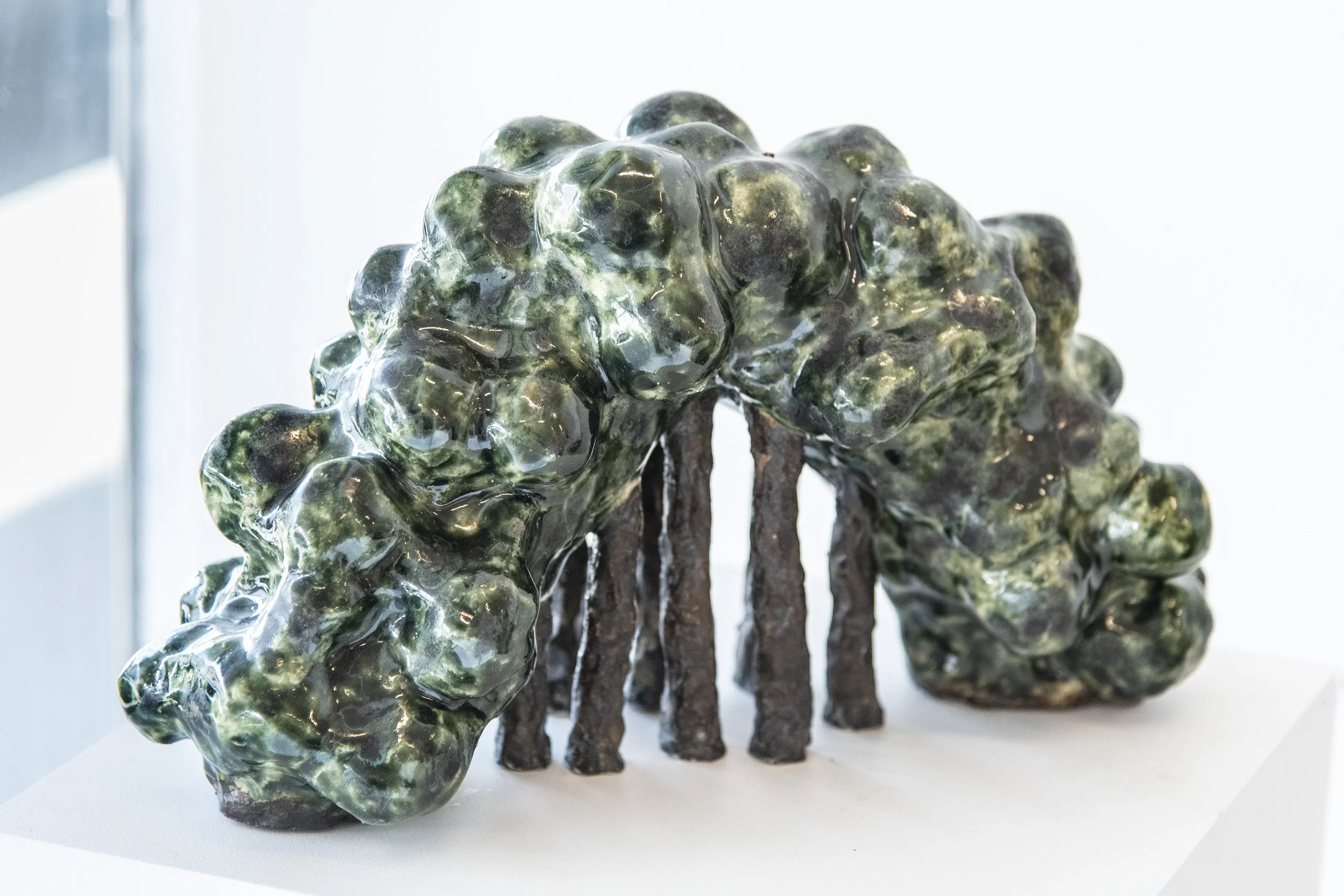
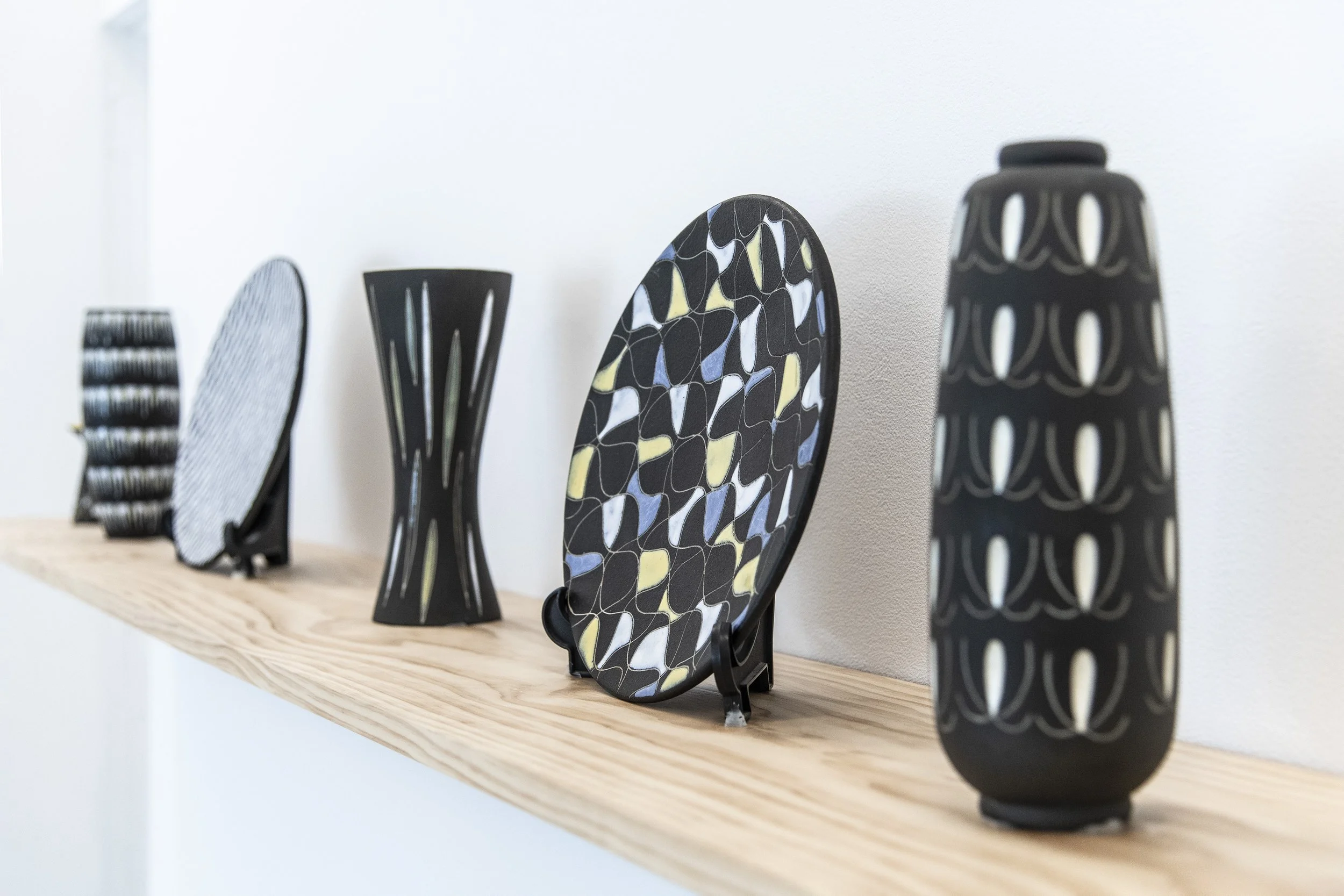
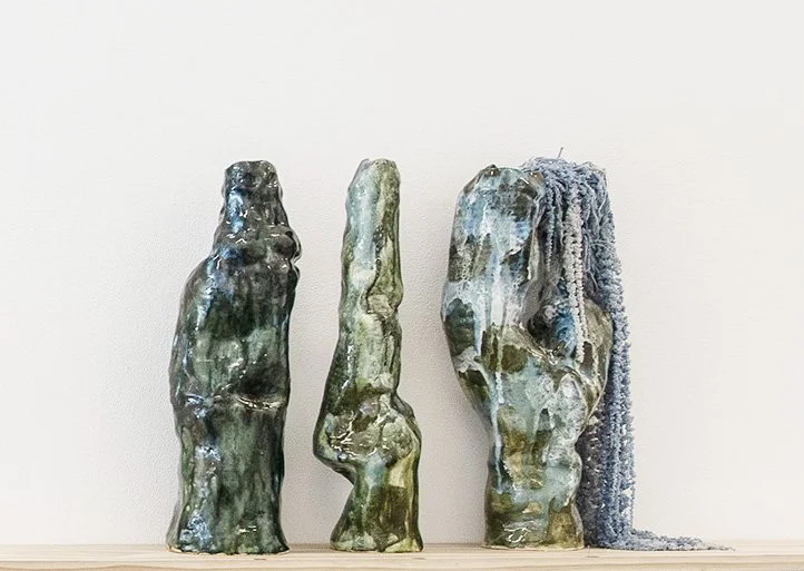
OPUS FICTILE : BIANCA BRZEZEK, GUNDARS LUSIS, PAMELA MILLER
opus-fictile-bianca-brzezek-gundars-lusis-pamela-miller
29.11 – 20.12.25 RE-OPEN 14.01.26 - 31.01.26

Opus Fictile
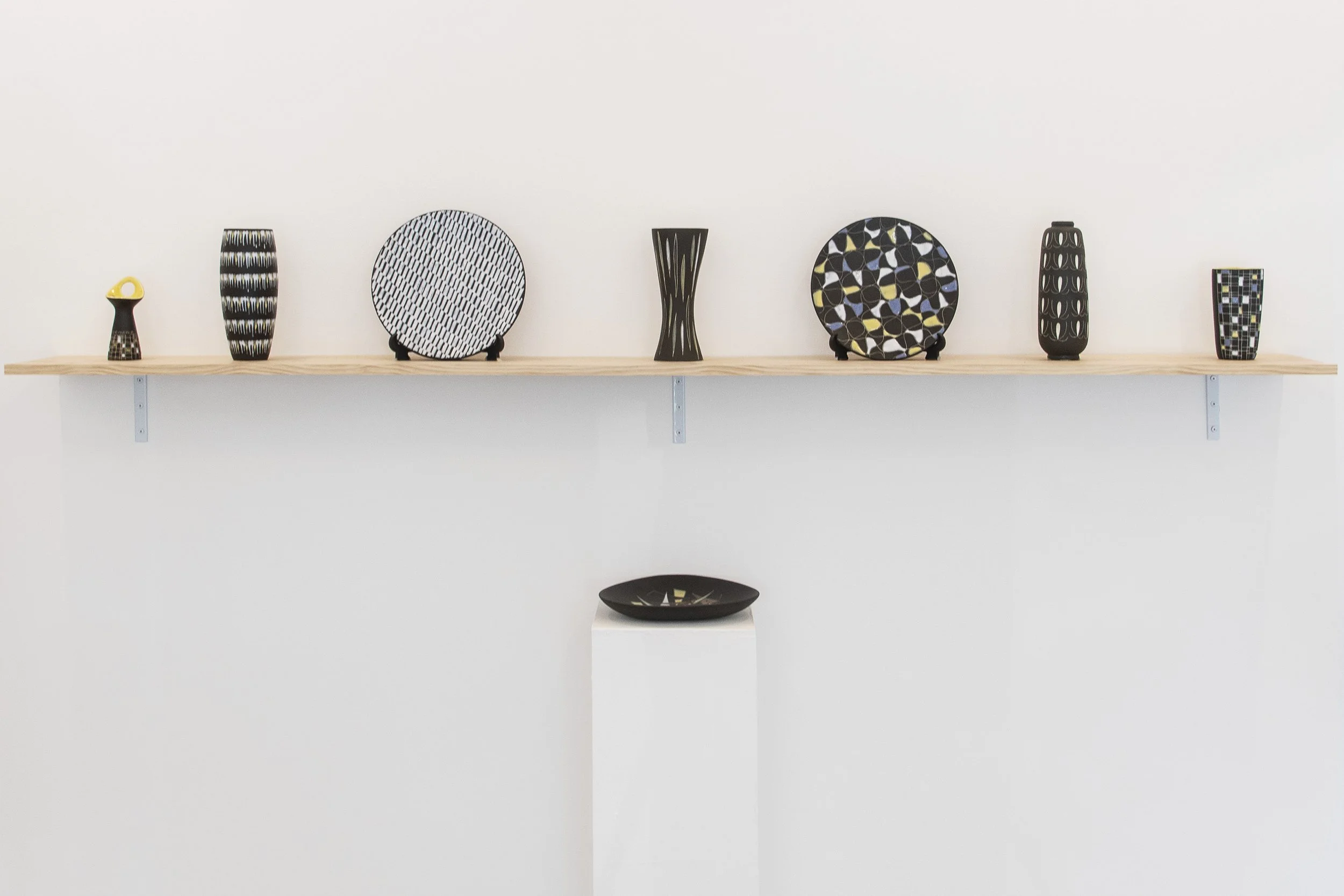
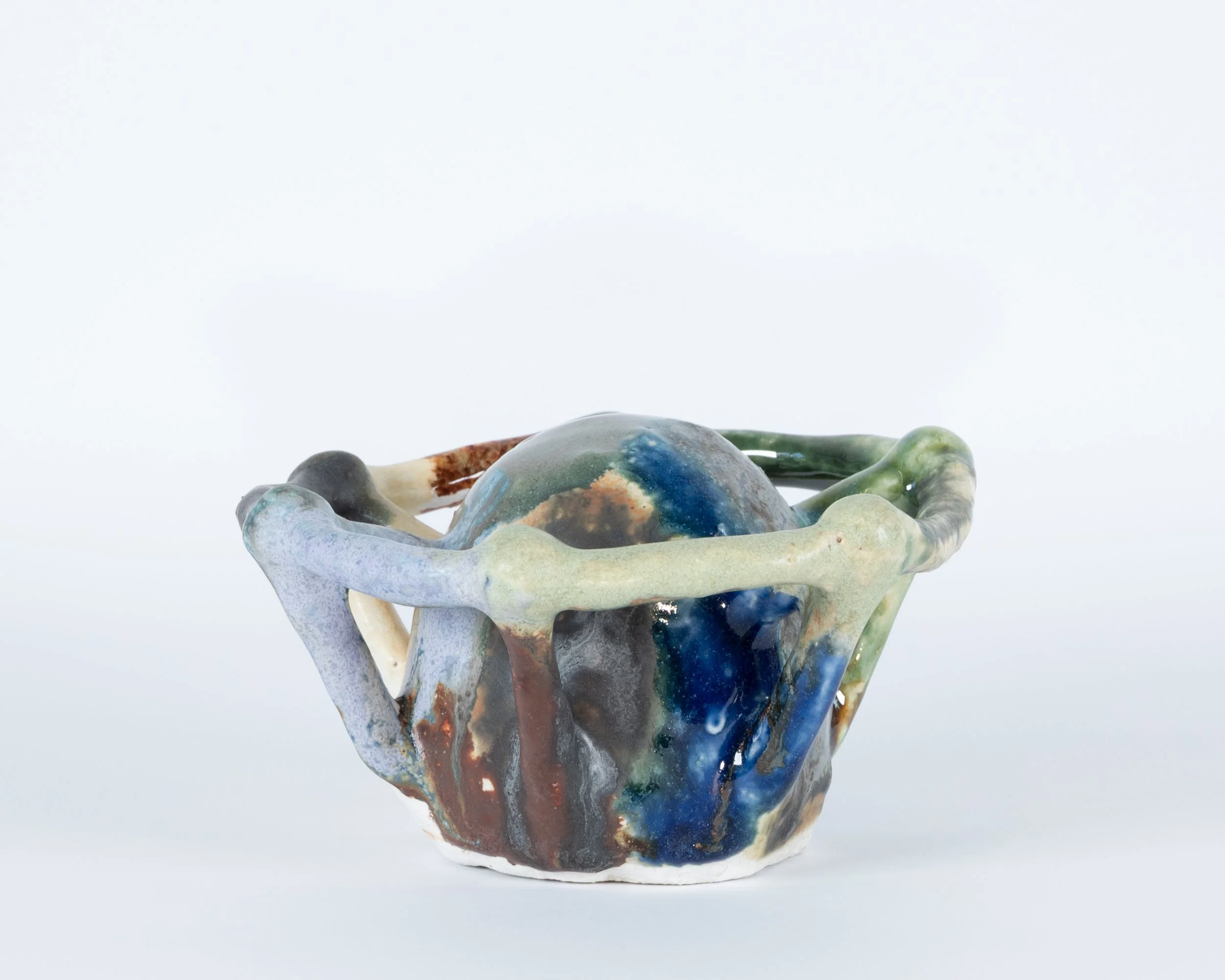
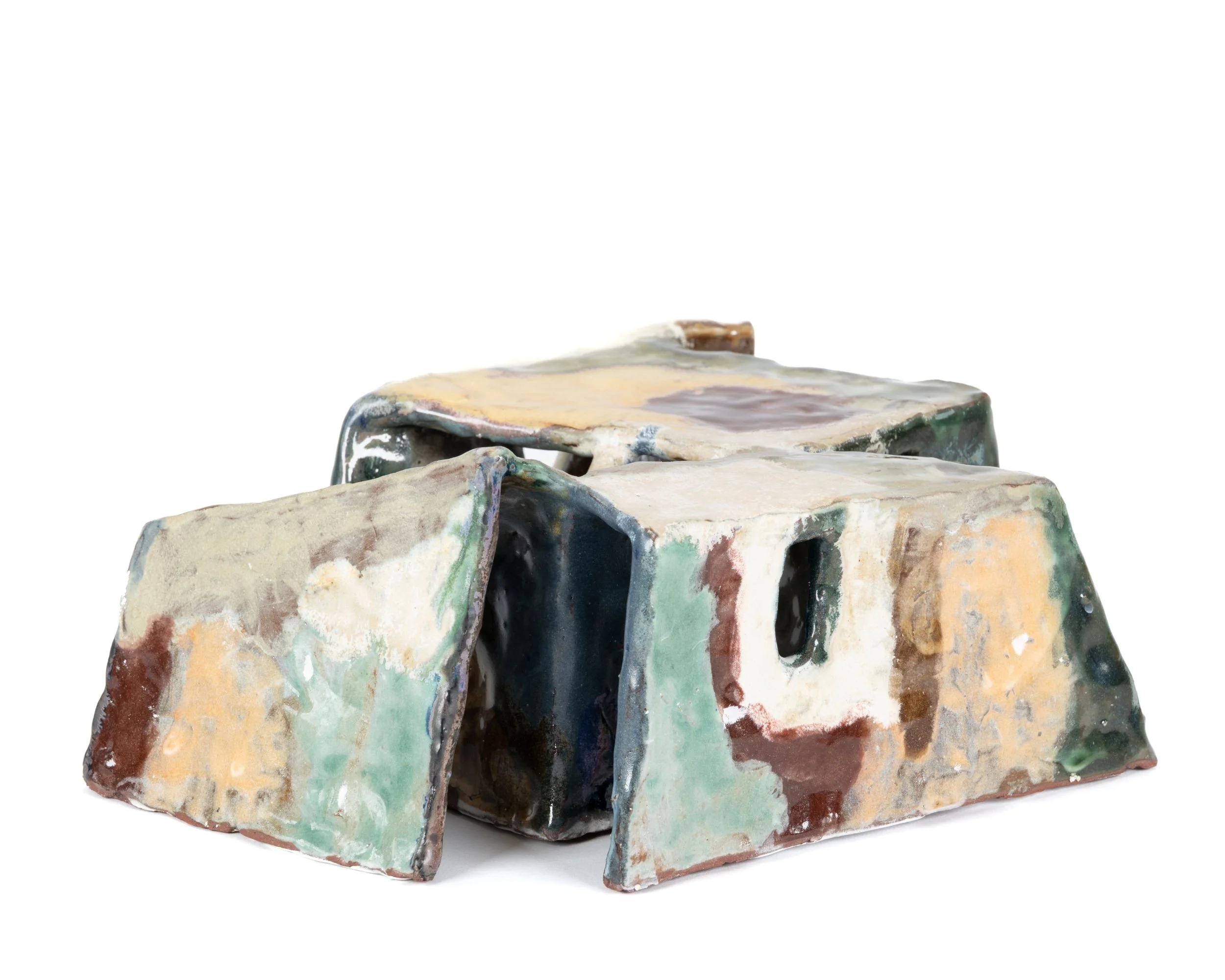
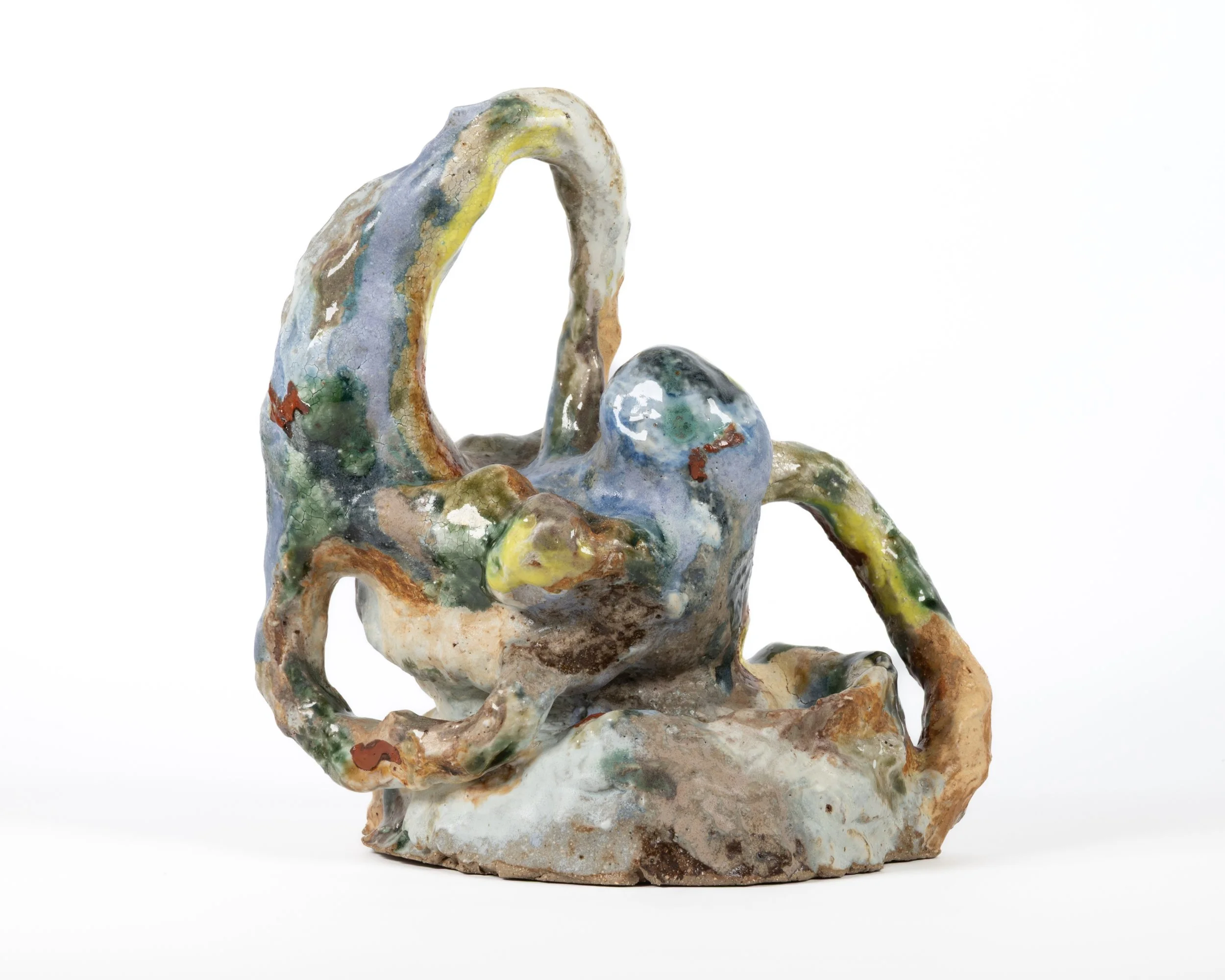
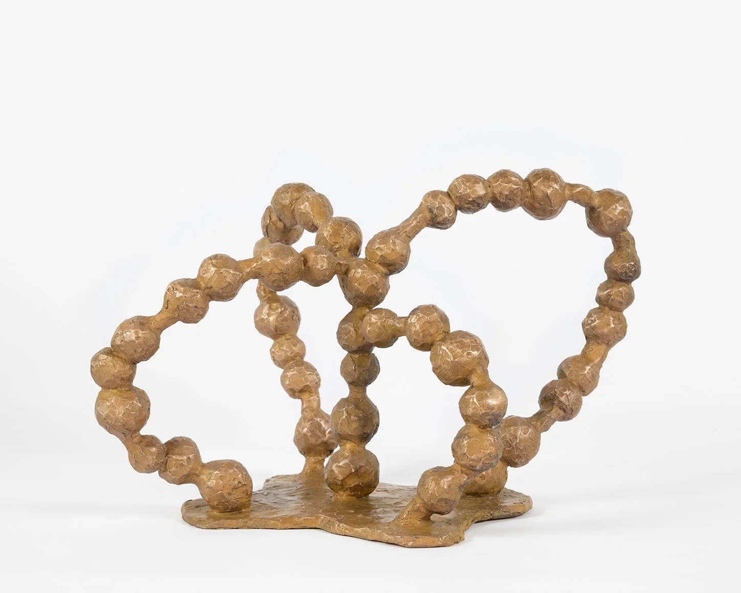
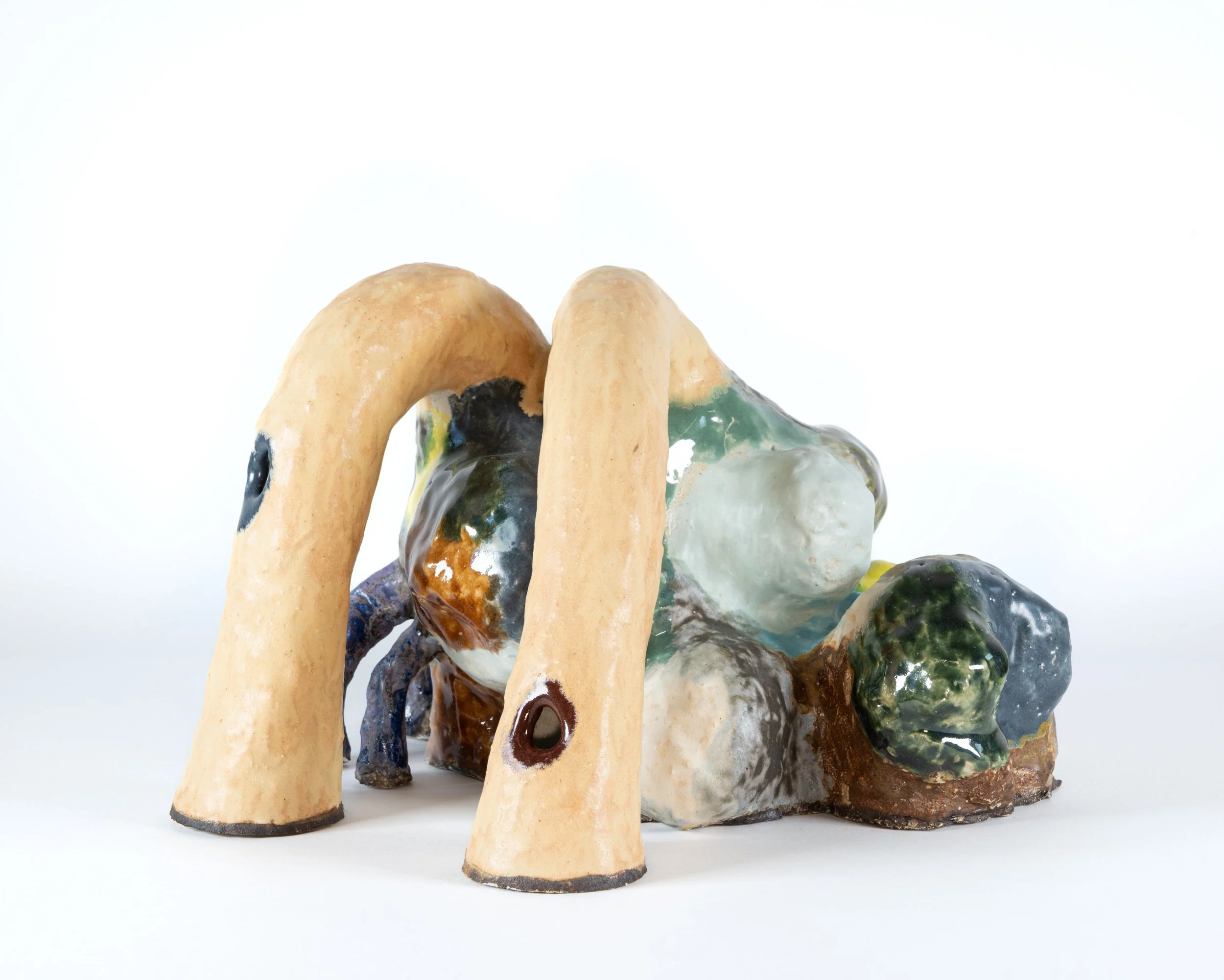
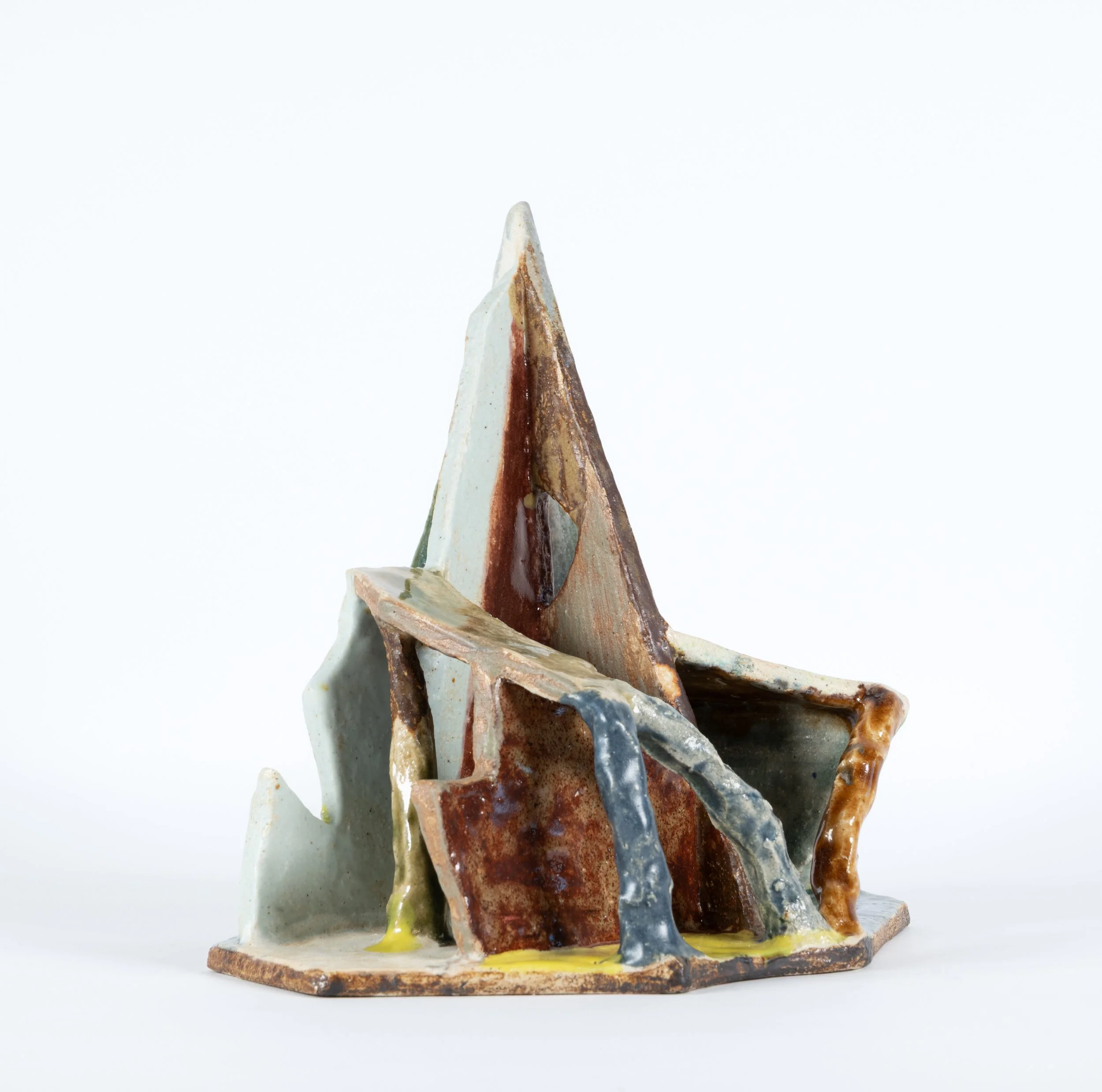
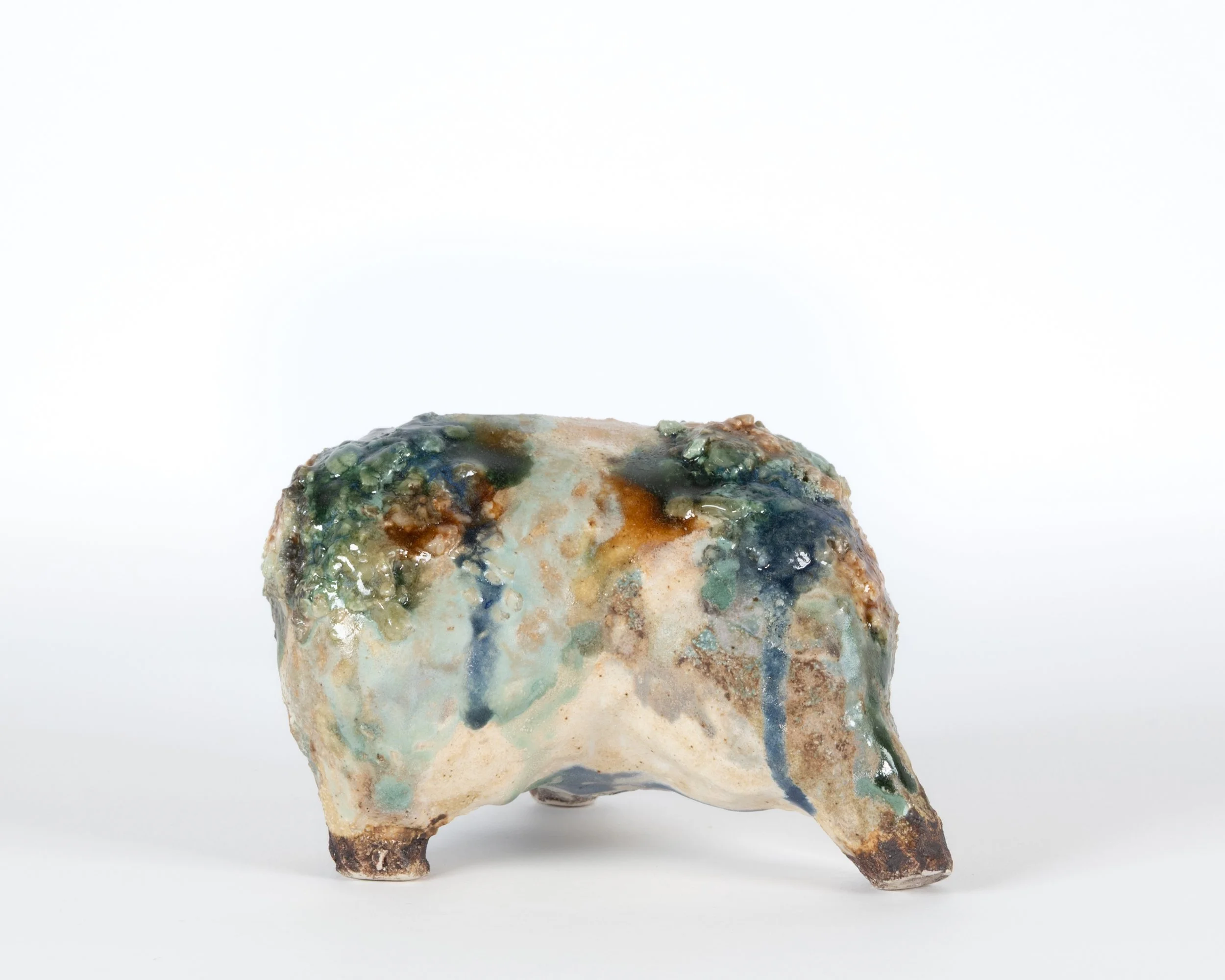
Opus Fictile brings together Gundars Lusis (1928–1996), Pamela Miller, and Bianca Brzezek; three artists connected by their instinctive understanding of clay as both material and idea. From postwar modernism to today’s renewed interest in the handmade, the exhibition traces how form, colour, and touch continue to evolve through this most ancient medium.
Gundars Lusis arrived in Australia from Latvia in 1949, after years in displaced persons camps in Germany. In 1956, he founded Gunda Pottery in the garage of his family home in Camberwell. Over the next two decades, he produced a wide range of domestic ceramics; vases, dishes, lamps, and tableware that reflected a European modernist approach rare in Australian pottery of the time. Lusis turned away from the prevailing Anglo-Oriental traditions and the decorative romanticism of the Arts and Crafts movement. His work was precise, geometric, and optimistic, shaped by design rather than sentiment.
The Blackware series (1956–c.1964) stands as his defining achievement. More than 150 forms—triform dishes, bowls, and platters were coated in matte black glaze and enlivened with panels of colour and finely incised lines. These pieces combined precision with spontaneity, uniting the modern and the domestic in a single gesture.
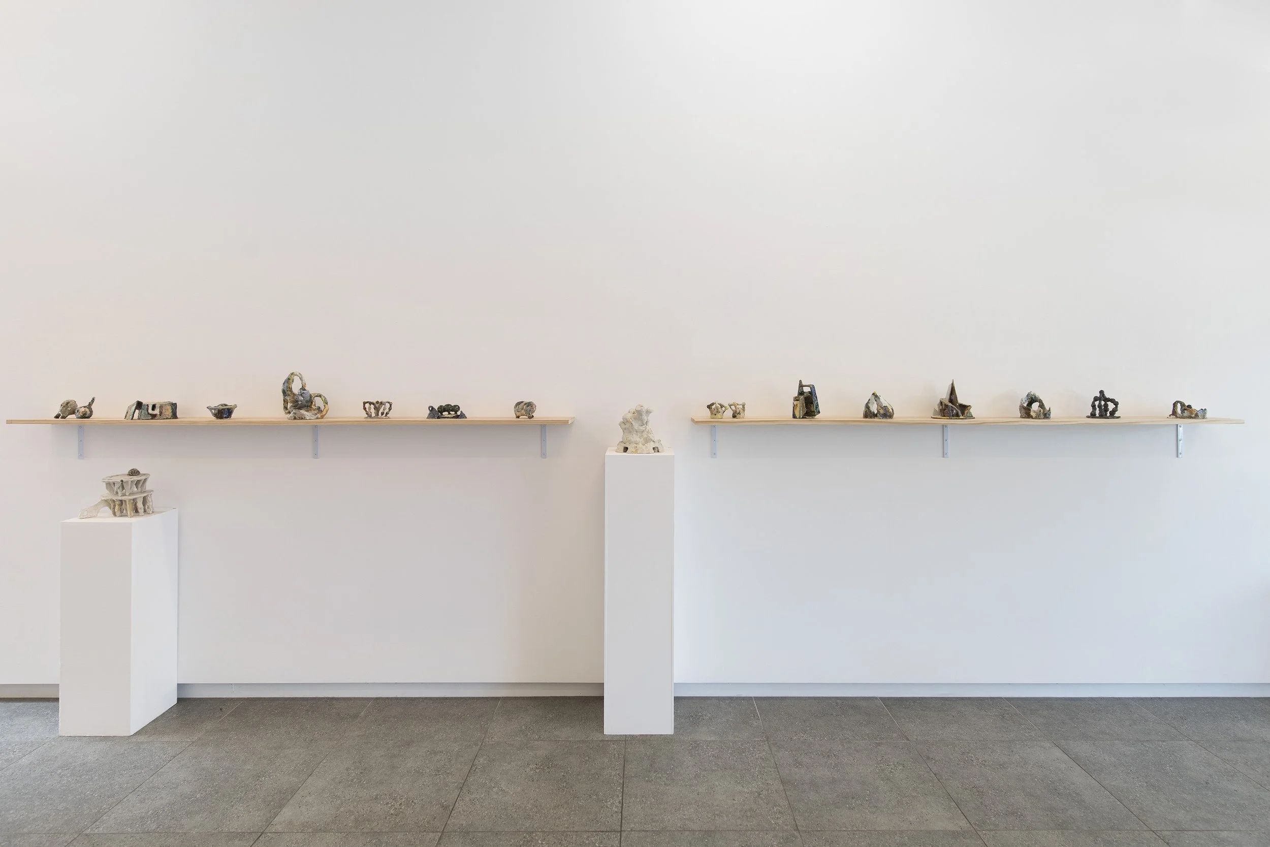
Pamela Miller continues this conversation with calm focus. Working from the School of Creative Arts in Brunswick, she hand-builds her forms and fires them in electric kilns. Layers of slip and glaze are applied, sometimes in several firings, creating surfaces that seem to hold light. Her work speaks quietly but carries strength—a reminder that transformation in clay happens through attention and time.
Bianca Brzezek has turned her suburban garage into a studio, much like Gundars Lusis once did in Camberwell. In this small space, she works intuitively, shaping clay through touch and repetition. Her forms evolve from rhythm and instinct rather than plan. Each piece holds the immediacy of its making, clay as both material and reflection, alive to every movement of the hand.
Together, these artists show how ceramics can still surprise. Opus Fictile is a reflection on continuity and change, how earth, form, and imagination meet, and how the language of clay continues to speak across generations.
BLOCKPROJECTS DIALOGUES: Q&A with PAMELA MILLER
BP: Pamela, you previously mentioned that you studied sculpture at VCA in the 80s. What first led you to ceramics?
PM: I spent seven years studying sculpture at four schools, working with a range of materials and processes, and exploring mixed-media work. However, none of those institutions offered ceramics instruction or facilities.
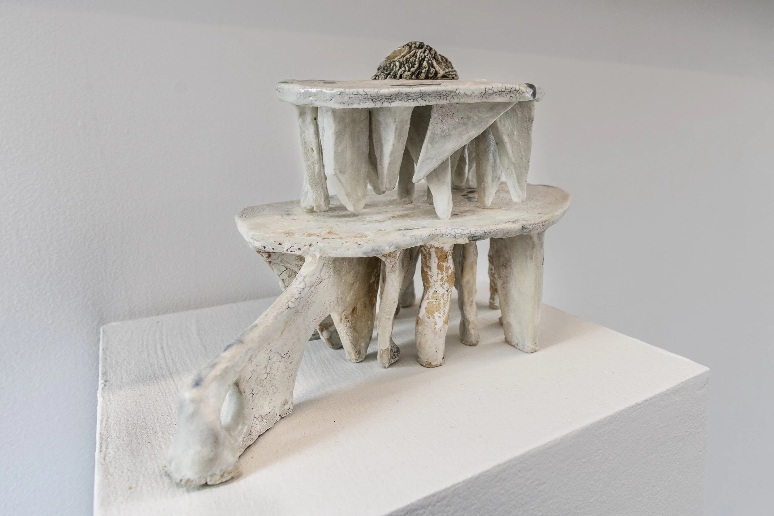
At art school, I learnt to use clay differently, building figures and, later, architectural forms around which I cast plaster moulds. The mould is filled with plaster or cement, then broken. This process works best on a larger scale, for life- or half-life-size figures or heads, and for simple, contained forms that require a mould of five or fewer pieces. This process involves preparing armatures and planning the pose or subject with the mould's parts in mind. It is slow and complex, allowing no major changes during its making.
I became interested in learning ceramics because I could see the potential to make more small objects quickly and directly. This has proved to be fascinating research. The material allows spontaneity and flexibility. It can feel like drawing in three dimensions. I can begin with a vague idea or feeling of what I want, and work in response to it. Within the seasonal drying variability of the clay, I can change and expand the work or turn it and continue building in another direction. The result can be unexpected and exciting
BP: Your surfaces often carry a calm intensity. How do you think about restraint when working with slips and glazes?
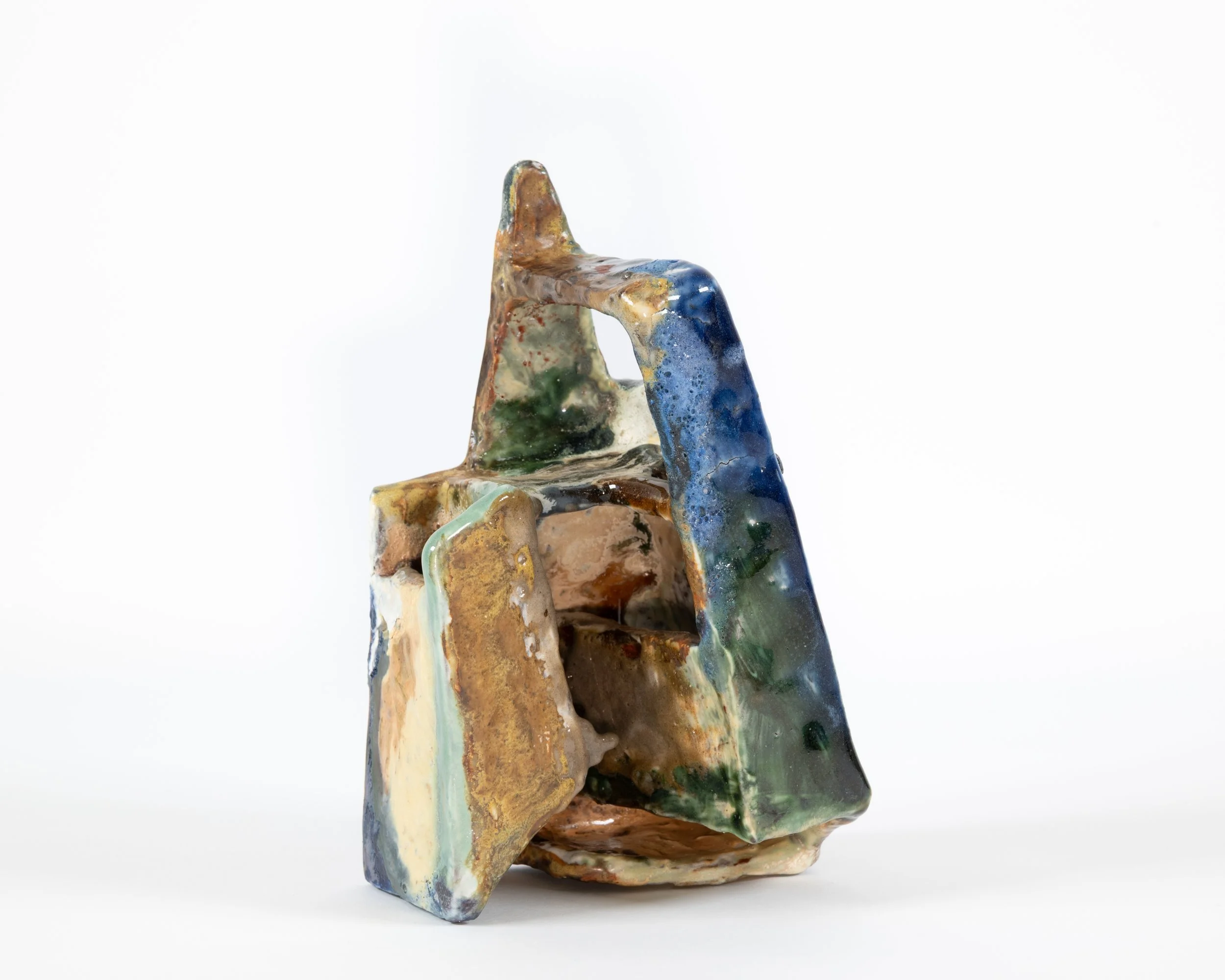
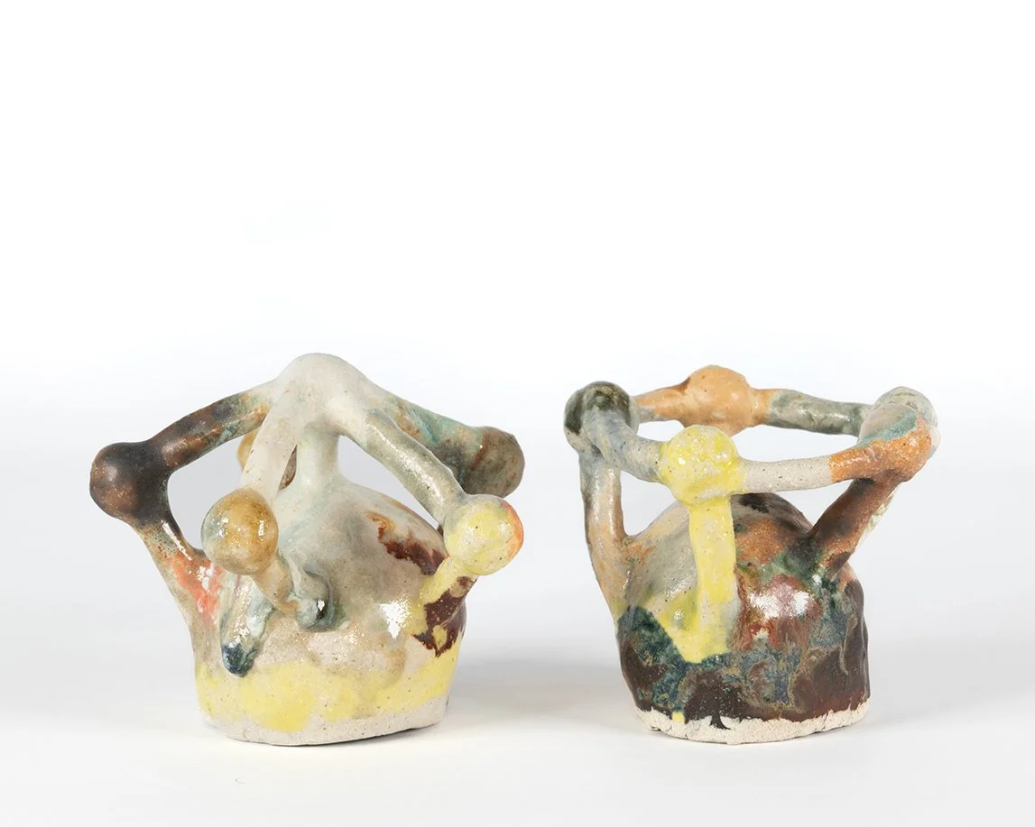
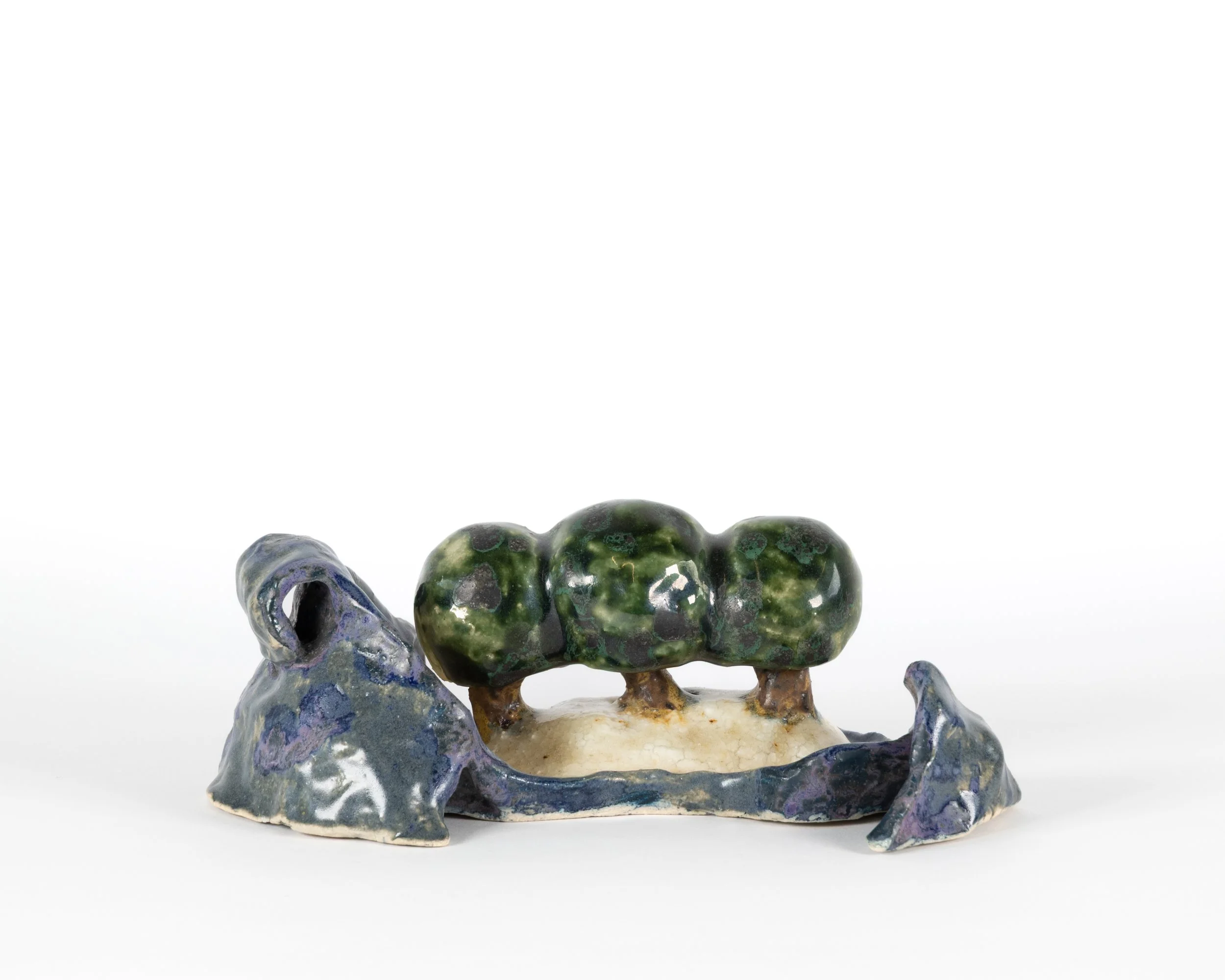
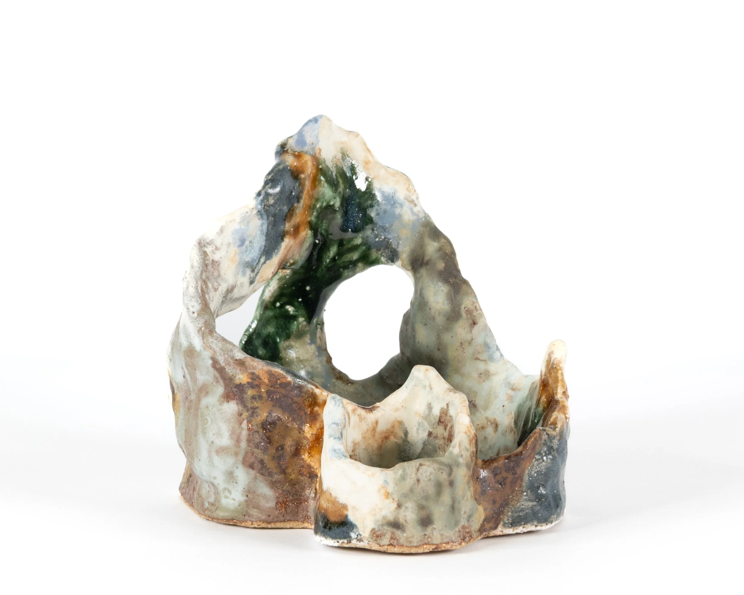
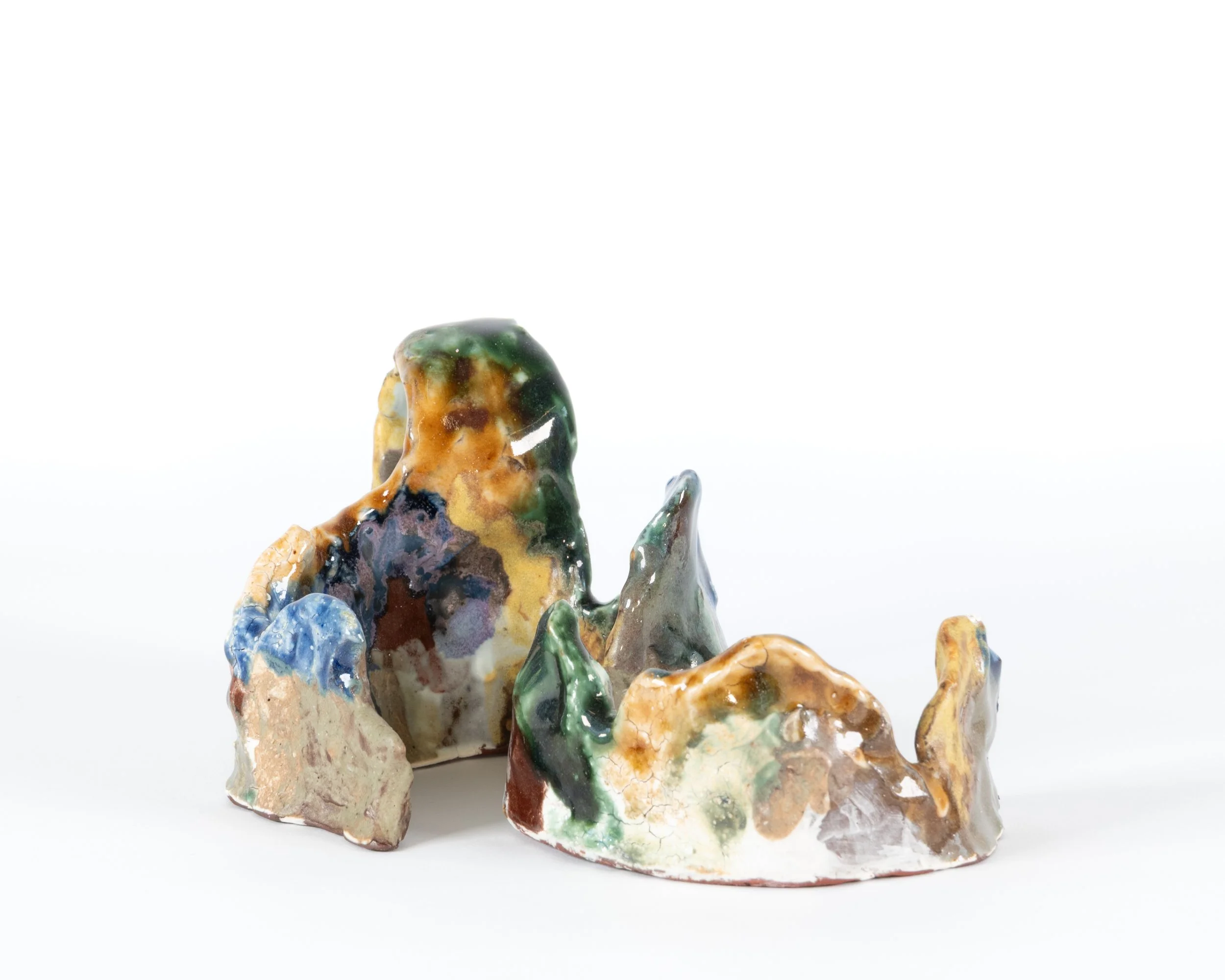
PM: When I am building these sculptures, I am seeking to create an intense activation of the space within and around the form. They exist within a small space where much movement and tension happen in the details within the form itself. The calmness is created by their static nature and the coloured spaces working together in harmony with the form. In this body of work, I used stronger colours than I have before. This is part of an experimental study to see what would happen if I used many bright colours on one sculpture and if I could make it work. So, in some ways, I am working against restraint by using complex colour on complex shapes. I tried to be courageous and make something contemporary, moving apart from historic ceramics.
When I started glazing ceramic sculpture, my glazes tended to be plain and even, with little colour. I didn't want to take attention away from the form, yet I found that this sometimes dulled the piece instead. Years of experimentation have helped me find a better balance—neither too much nor too little surface activity for each shape. Yet this remains a constant challenge. Surface possibilities, from rough to smooth, shiny to flat, and light to dark, raise endless questions and choices. Gaining more knowledge only expands these possibilities.
BP: You describe clay as elemental. How does this understanding guide your decisions in the studio?
PM: All clay and glaze ingredients come from the extraction and mining industries. In nature, clays and minerals are seldom found in a pure state; geological processes take millennia to create them. Before use, commercial clays are cleaned and processed, and some contain added pigments. What appears simple and safe is, in reality, precious and can be hazardous.
Hand-building creates less waste clay than wheel throwing, so I use this method to avoid washing away much material. When I reject an unfired form, I can soak and reconstitute the clay. Only firing transforms clay into permanent stone. Afterwards, it cannot return to the earth or pollute the environment. Dust from dry clay is hazardous and must be cleaned with water, as inhaling it is dangerous. Some coloured oxides are also toxic if absorbed through the skin.
Every glaze is composed of ground minerals and elements. When preparing glazes, a fitted mask is essential to prevent breathing in fine powders. Many glaze materials, including coloured oxides, are toxic if released in water, requiring careful disposal.
Awareness of clay’s origins and transformations guides my work, as firing echoes the geological forces that shape the material into art.
BP: Working at SoCA Brunswick gives you access to specific kilns and materials. How has that environment supported or shifted your practice?
Each term, teaching centres on a glazing or building project. Experienced students, like myself, use these projects to explore ideas and techniques. The setting offers ongoing, qualification-free study among peers with diverse experience.
The camping-out series, squiggle, and rock-face works originated from a project that introduced folding and tearing paper. Other projects have included finding a palette of colours within an image of a painting and recreating those colours in glaze. Different glaze recipes and ingredients respond to the coloured oxides in different ways.
I benefit from the school community’s shared research and testing. Group discussions and recipe sharing broaden options, which makes narrowing focus vital. Teachers’ expertise and available resources continually expand possibilities.
BP: How do you navigate the balance between controlled technique and the unpredictability of firing?
PM: Gravity, heat, and clay shrinkage during firing can be anticipated but not completely controlled. Departing from circular forms increases the risks of structural shifts. Each sculpture is an engineering experiment, requiring flexibility and adaptation.
In glazing, I test glazes on small samples before applying them to sculptures. Using multiple glazes on irregular shapes introduces chemical and physical unpredictability, especially at glaze intersections.
All ceramics, and especially glazing, is an exercise in acceptance.
BP: Each piece becomes its own glazing project. What does your testing process look like, and how do you record what works?
PM: Most of the glazes in this body of work are satin or clear glazes with a pigment added. These are either a mineral oxide powder or a commercial stain powder.
During testing, I impressed a slab of clay onto a plaster block, creating a grid of 35 squares separated by low ridges for glaze testing. I test five dilutions of seven glazes by starting with a strong colour, then adding uncoloured glaze to lighten it. Ingredients are measured to 100g dry weight, with pigment included in this amount. When I measure the ingredients, the mixture should have a slightly gritty texture, providing resistance when stirred with a spoon. I may first add 10% more pigment by dry weight, then dilute by wet volume, measuring with a teaspoon or syringe. During this step, the mixture becomes smoother, resembling thick cream, which ensures it's ready for application. All measurements are recorded and referenced after firing.
The desired shade is recreated mathematically, but testing and adjustment are usually needed, as the process can be inexact. Test results with another tile or a simple object reveal interactions between glaze and clay. Some glazes behave differently when layered or on varied surfaces. Test pieces should use shapes and surfaces similar to the final work. Detailed notes are essential to make testing meaningful.
BP: Light distinctively interacts with your surfaces. Do you plan this early on, or does it emerge during the firing process?
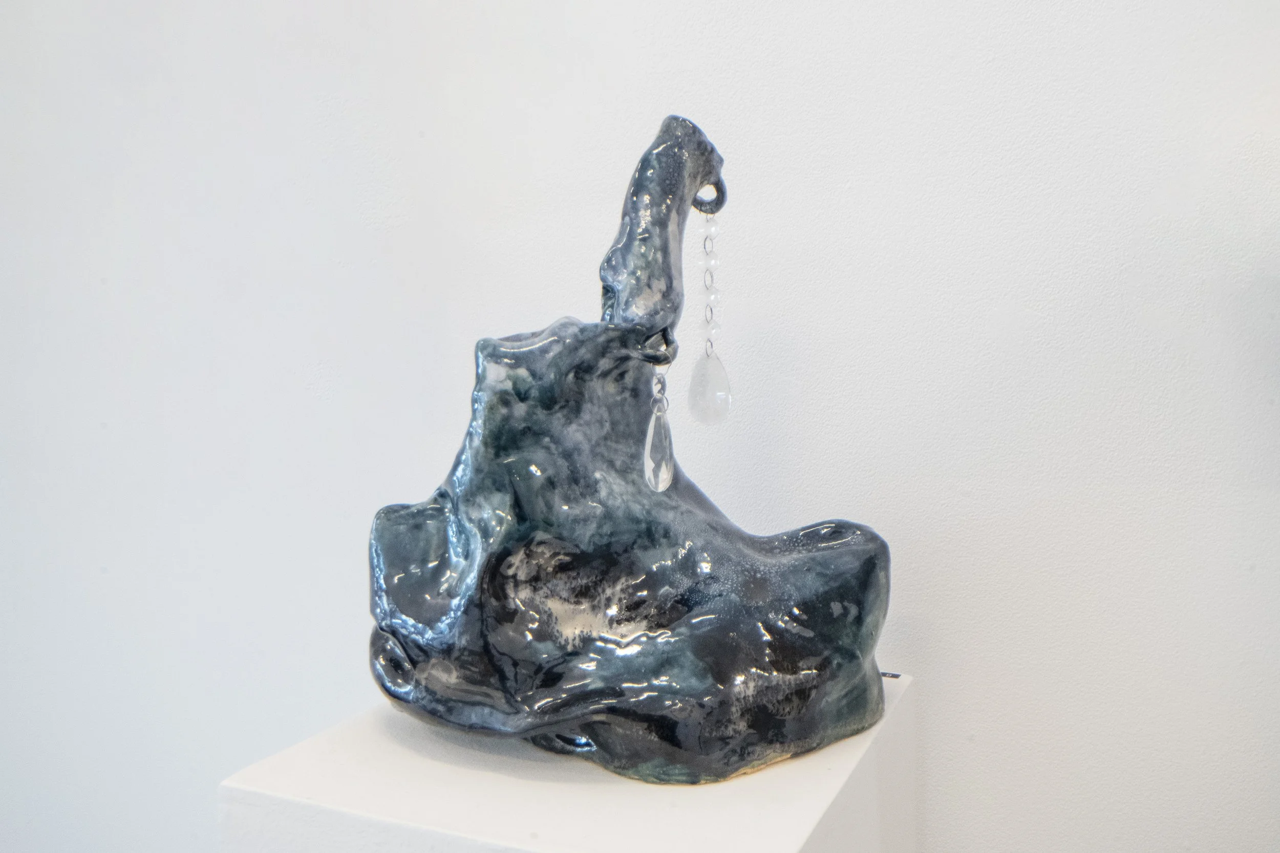
PM: This series primarily uses clear, shiny, or satin glazes, with some drier variants. Fired crystals in each type interact distinctively with light.
Most pieces have a coloured, shiny, clear glaze. This uncoloured would allow the viewer to see directly to the surface of the clay. I use colours within these glazes to deflect this clarity and yet allow the light to penetrate and reflect on the surface. This internal light gives these colours brightness. The satin glazes are less immediately reflective, becoming white and crystalline if used without colour. The white base creates softer colours that still have some satin sheen through the crystals on the surface, and can be made darker with the addition of more colourant.
I consider light’s impact before glazing. Reflective surfaces enhance visually solid forms. For example, in one piece, the glossy upper part stands out, while dark satin glazes define the 'legs.'
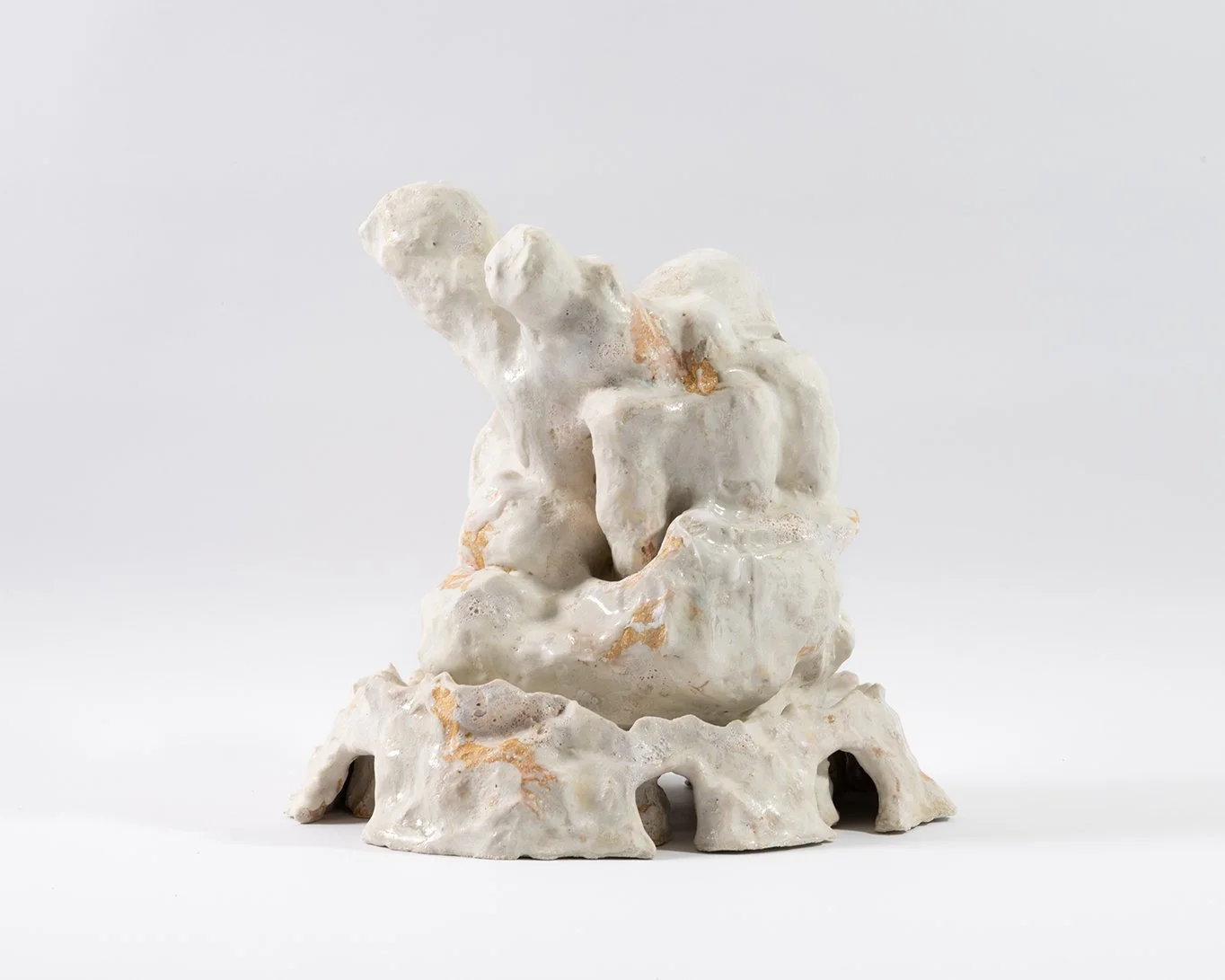
If used on a more open form with spaces, such as ‘root’, colour and shine can become a distraction from seeing the shapes and shadows created within the form. I used a series of white glazes on ‘root’ and ‘the hypnotist’ as they are complex forms. They create their own shadows. The different surfaces and slight variations within the whites create complexity yet still allow the form to be seen as a whole. These are just some examples.
BP: What artists, potters or thinkers have influenced the way you approach material transformation?
PM: Making sculpture begins with a material or substance and visually or physically transforming it in every work. Just the making of an object that did not exist before transforms nothing into something unfamiliar and unknown, which exists in the same space as the viewer and confronts the viewer with its material nature. The mutability of matter and the transformation of material are inherent in all sculptural practice.
I have a longtime love of sculpture and have admired many sculptors and installation artists working in diverse materials and scales.
I appreciate sculptors who work over a long career in a diverse range of materials, such as Louise Bourgeois, who worked in textiles, plaster, wood, stone, bronze, and steel, yet strangely never in ceramics. Her work may be a small, embroidered fabric book or a room-sized installation made of steel and stone. Tony Cragg’s later sculptural works are very mysterious in their transformative qualities. His large metal works are cast from originals which are made in wood. I like Linda Marrinon’s plaster and ceramic figures and landscape sculpture. Her skill with plaster shows her years of understanding this transformative material. It begins as powder, becomes a liquid and then a solid. Her work is so mysterious to me because I don’t know exactly how she makes them. This applies to much of the artwork that I like the most. It has an origin and evolution that are a mystery to me.
I have always liked sculpture made from found objects. Taking these forlorn and unwanted objects, rejected by our society and then reforming them into an artwork takes a special kind of imagination. To make something that has its own kind of beauty yet carries the story of its first purpose and then abandonment. Contemporary artist Isadora Vaughn combines this with ceramic works to create lyrical installation projects.
During my childhood, I learnt about and loved early modernist art. The bright colours of painters such as Edvard Munch and the Fauve, Nabi and Constructivist groups inform some of my glazing and the early abstract sculpture of Constructivism and Surrealism inspires with its formal inventiveness and mystery.
The large-scale installation art of Phyllida Barlow uses industrial and generic materials combined with traditional materials such as plaster and paint to transform and fill huge open spaces, working with the surrounding architecture in galleries and public spaces. Within this collection of materials, some are recognisable, and some are not, yet together they are altered by their context and juxtaposition.
Much of contemporary ceramic sculpture is either restrained and figurative, often referring to ancient cultures and traditions, or large, simple forms created through material exploration and the mixing of stones into the surface, exposing their rocky nature, or shapes disguised by the experimental application of large amounts of glaze. My work is neither of these; the creation of a mysterious new form is important to me, and my use of glaze is more like painting, close to or part of the surface rather than used to change the form.
BP: As your practice evolves, what directions in form, surface or scale are you most interested in pursuing next?
Since completing the works for this exhibition, my most recent pieces are small, experimental, complex and landscape-ish. In glazing the first two, I introduced a new flat dry glaze, coloured with bright stains, alongside some of the ones I know. I am yet to see the results. As I mentioned earlier, I find that a less reflective glaze can help to see more complex forms with uneven surfaces and spaces in them. I have begun research into this flat glaze to apply to these new pieces. I will also test this same glaze with oxides to create a large range of different colours to combine with the bright stain colours I have already made.
The new works are made with a blend of cream and red clays, some of which will be left exposed unglazed as part of the surface treatment.
My practical research often involves different building and glazing projects going in different directions at once. Over the years, I have made works that combine geometric elements with slabs and more organic, modelled sections. They are often elevated, stand on legs, and have activity both below and above a horizontal surface, creating the atmosphere of a landscape on a stage. These works have proved difficult to make and even harder to glaze due to their complexity. I will continue with this project, as I think it has more potential, both in form and surface, than I have yet resolved.
Whenever I make new glaze colours, I will incorporate them with the surfaces I know into experimental projects. Small pieces can be made quickly, and their size allows less distortion from gravitational and atmospheric forces during firing than occurs with a larger form. I find that the larger a ceramic object is, the greater the forces of change within the firing. Even a round form, such as a pot, is harder to build and more likely to fail if it is large, because these forces are greater on the weight within the object. The constraints of the material and process mean that the larger a form, the more it must be contained within a vertical and rounded profile. Any horizontal projections will collapse and slump in the kiln under their own weight if they are heavy. What does too large and heavy look like? This can depend on the clay, shape and temperature of the firing and is a continuing exploration.
BP: What kind of music do you listen to in the studio, and how does it shape the rhythm or atmosphere of your making?
PM: Much of my making occurs in the school environment. I work within the imagined silence in my head while ignoring the ambient noise of a room full of people at work. Glazing projects require my complete concentration, and I try to ignore conversations I am not part of, people hitting their work with a paddle for hours, the hiss of the decompressing pugmill, and the occasional clink of ceramic falling to the ground and breaking, along with the accompanying exclamation. At home, I do much of my building. This may be in silence, listening to music, or listening to a podcast, which is mostly ignored. Background noise that helps stop distracting thoughts. I don’t think that it has much influence on the work.
Firing and material development SOC Brunswick
ARTWORKS:


enquire.
MERRIC BRETTLE: PSYCHOPOMP 2 : POETRY OF THE MECHANICS
MERRIC BRETTLE
26.11.25 - 20.12.25
Installation images
Psychopomp 2 - The Poetry of Mechanics.
At the heart of my practice is an exploration of what it means to be an individual within our contemporary socio-cultural condition. With this in mind, I make two types of work. The first investigates what this condition ‘is’, and the second expresses my reflections on what it means to ‘be’ within it.
The first type of work therefore, investigates the social world we share, as I collect and remake bits of it that convey some ‘sense’ of it to me. These ‘bits’ are all images from the Internet, and the works I make from them are my Pattern Finding pieces. In these works I reverse engineer these sense/samples and explore how they ‘work’ on me.
It is by capturing the look of screen backlighting, for instance, that I come to understand our experiential relationship to a mechanised culture, and by making abstract pieces using colour pallets from advertising material, that I get an idea of a socio-cultural mood.
In these works, ‘I’ exist in their translation from sample image to object, and the ‘marks’ of my presence relate to ‘impression’ as opposed to ‘expression’.
While constructing these works is an ongoing process, there is another type that I make paral-lel to them. These are my Reflection pieces, and they express ‘what’ I considered this condition to be, ‘the way’ that I saw it, and ‘how’ I understood being within it at different times. In them I employ an expanding number of systems of being creative, in series, to explore my ideas.
In some of these system/series, for example, I add to pattern finding pieces and overlay them with other materials to express the personal relationship I had with them when I ‘found’ them. In others I join two or more samples to explore a resonance that express’ something else. In yet others I explore the materials, methods and images I found in my pattern finding works, as a kind of language through which to express my ideas. These systems/series are represented in the Liminal Object, Ritual Process and Sense Data works shown here.
In these works ‘I’ exist in them as samples, yet also in the choices that my system/series afford. Consequently, within them, the ‘mark’ of my presence is multiple, exists in layers, and expresses both impression and expression.
Contemplating the works in this exhibition, they are all ‘visual poems’ and as such they are all emotional and experiential responses to ‘being in the world’. In saying this however, their poetry probably lies just as much in the mechanics of the systems I use as in the surface image I construct.
With this in mind, I hope that the viewer reads the works formally as they would allow for the poetry in these mechanics to be seen. Consequently, I would like them to consider the works as experiential metaphors of they way that I as one individual came to terms with our strange new digitized and globalised condition.
It is as an experiential metaphor thus, that I hope for them to explore the systems I employ to make work, as they reflect those that we all use to understand reality itself. That they consider the levels of choice that these systems generate in the works, as they create a ‘space’ between the viewer and object for them to explore. And that they understand the ‘senses’ that they receive from the work themselves, as they are a product of not just my agency, but also of the worlds on me.
Seen in this way the poetry of this ‘rude mechanical’ lies in understanding my works as personal ‘flights of being’. The mechanics of my poetry understood as the systems I devise to explore the possibilities of my own creativity. And the beauty of these mechanics, as to me, these poetics of creativity, express the limits and possibilities of ‘being’ itself.
Merric Brettle, 2025
ARTWORKS:
david freney-mills: continuum
DAVID FRENEY-MILLS
01.10.25 - 25.10.25


Installation images
Continuum
David Freney-Mills approaches abstraction as something alive, shifting and adapting like an organism. His paintings hold the traces of thought, cuts, layers, and gestures that build into constellations of presence. Language becomes his subject, not written or spoken, but sensed as an evolving system of signs, shapes, and rhythms.
In his first solo exhibition at Blockprojects, titled Continuum, Freney-Mills presents painting as a dynamic encounter rather than a static object. Central to the exhibition is the Hyperglyph series. These artworks start with ink applied to Korean hanji paper, which is then hand-painted, torn, and rearranged before being mounted on canvas. They convey a sense of movement and transformation. The overlapping and dissolving fragments resemble glyphs from a lost script, creating an atmospheric presence that evokes memory and the continuity of thought across time.
Freney-Mills moves easily between traditions. His work embodies the discipline of reductive abstraction while also drawing inspiration from East Asian aesthetics, including ink painting, calligraphy, textile dyeing, and woodblock printing. This dialogue produces paintings that are direct, sensorial, and quietly transformative.
The works carry the resonance of history while speaking in a voice that feels entirely of the present. They invite an experience that is both immediate and enduring, a language of presence and transformation that unfolds differently for each viewer.
ARTWORKS:


jarryd Cooper: juggernaut
Jarryd Cooper
Jarryd Cooper
03.09.25 - 27.09.25


Artworks
Jagganath
Philip Guston put down his brush and crushed his cigarette out in his palette. Ash pink dawn was breaking, and the cold light crept into his studio and cast an illuminating ray over his efforts, confirming what he had started to suspect. Completion.
What was it he saw there, in the countless strokes and scrapings? Some great steamroller. A chariot of dread proportion ploughing its way through all before it. From beneath the weight of the heavy roller, prickly legs issue forth in agony, crushed crimson and bulbous. Their shoes, horse shod, turned upwards to a bloodshot sun. He had always preferred Newton to Einstein. The gravity of it all!
He had been at it all night. He ate spaghetti and meatballs with Musa then made the short walk to the studio. When he squeezed out his first pustules of cadmium red, everybody was there. Friends, family, peers, critics. The whole bloody pantheon. But as he pondered and paced, and prodded and prised, one by one they all started to leave. Just like he always said they would. Was he going to leave too?
He took out his iphone and opened the camera. The clack of the shutter. A pale facsimile. Crooked and bowed, a deformed likeness if any. His thick and clumsy digits, so deft with the brush, plodded and fumbled numbly across the sleek paint smeared device, and eventually stumbled into Instagram.
He had never even wanted it. Bill de Kooning had persuaded him to get it. He had been late to Facebook too but had gradually succumbed. His last post read something along the lines of… “I do not give Facebook or any entities associated with Facebook permission to use my pictures.”
All his poet friends were on twitter, and he secretly wished he could join them. But Bill could be so persuasive. It’s freedom Phil! And that’s your true subject!
Ah well. Give it a go! What’s the worst that could happen?
*
The sun is starting to rise up over the trees. Crows perch on power lines and a cat knocks over a dustbin. But Philip can only stare in anxious wait at the greasy portend. Nothing. Why is it taking so long? Idiot. You fool, you should never have been so stupid. How could you let Bill talk you into this? To think that anyone could possibly appreciate what you’re doing. And what’s happened to you? In what sad pathetic world would anyone with a shred of integrity resort to… wait. A flash. A buzz. Like flies waking, and picking up their first scent, steadily they start to swarm. The dam busts open, and the deluge of approval washes in like a flood. He can’t fathom it. The adulation, the glory, all there in his paw.
No jibes and snide remarks. No accusations or mention of mandarins and stumblebums. Just positivity. Yes. Just nice words of affirmation. They like it. They actually like it. I’ve made something that people like. Fuck!
Thumbs up. OMG love this! The Pink is on point!
What do they mean by that, on point?
Now what, they’re making comparisons? Oh Jesus!
Love the Krazy Kat vibes. You should check out George Herriman. Hey @robertcrumbofficial get a load of this! Fuck yeah dude channelling some hungover De Chirico energy.
Oh, God stop! Stop! He tries to write back to these people. Tell them they’re wrong. Tell them the painting is a failure. An utter failure. But Bill didn’t teach him how to respond. Didn’t show him where it’s @
So, he shouts into the void. Can’t you all see this fraudulence? Can you not see you’ve been hoodwinked?
What have I done? They had all gone. They had finally left me alone, and then fool that I am, frail creature of vanity, I invited them all back in. I opened the box. I threw myself under the rampaging wheels of Jagganath. I am solely to blame. This and many more desperate utterances are spat into the chasm, unaware that with indifference, the algorithm had ploughed on, swallowing his words like a street sweeper, churning them up, perhaps to one day cast them adrift, to wash up on a desolate foreign shore.
Haggard and bereft, his day ruined, he lights a cigarette and takes a deep contemplative drag. Nothing to do now but paint. He takes his titanium white and empties it onto his palette. With his biggest brush, he begins to erase and undo. But he struggles against the weight of that mighty chariot. All that red and black, still wet, still living. History is written by victors and Guston wasn’t winning. But gradually things settle, and he relaxes into the process. Slowly though, he starts to sense something. A sound. What is that? Some kind of tone. Tinnitus? No, far worse. A high pitch note, constant, without break. It’s near. It’s inside the building. He steps out of his studio into the hallway, and follows the sound to a room he never even knew was there. No Entry. DANGER. Cellular site. TELSTRA. What is Telstra doing in Upstate New York? Subsidising his studio? Paying his rent? Funding his entire existence? Have they been listening this whole time? Would you believe it? The door isn’t locked.
Inside, everyone is there. Bill, Morty, even Jackson. John is performing four minutes and thirty-three seconds of silence. In this version, two split systems rage against the heat of a giant computer running hot, and that same ear-piercing tone, strikes its blistering knell. Lights flash green, but one is red, bloodshot even, and it doesn’t flash. It sits static, radiating like it were painted. It hums along to the silence. A socket beneath it plays host to a snaking cord. He’s down to one line now. With Mickey Mouse gloves, he grips it. The line goes taut and Guston, sweating under his hood, tastes salt on his lips. Well, he says to himself. What’s the worst that could happen?
Written by Harry Hay.
Hay is a painter and writer based in Melbourne.
ARTWORKS:


darren munce: snakes & ladders
Darren Munce
06.08.25 - 30.08.25


Installation Images
SNAKES & LADDERS
Dear Darren,
You told me over the phone you felt to always be saying the same thing about paintings. I know the feeling, but once the call ended I got thinking about why that might be such a bad thing. Or what the compulsion even to say new things is or where it comes from or why it might be least useful, especially, and most of all, when dealing with something as mysterious and obvious as a painting.
Have you ever seen the Paul Klee painting The Snake on the Ladder? I love the title more than the work. If the snake is on the ladder we can neither climb upward nor slide down. Which is a way of saying that action organises grammar or grammar organises action. Either way, the snake and the ladder entwine and our reading of both must change.
I’m writing this from a plane and the coastal low has scalloped the air up here. We shoogle like gravel in a gold pan. Crazed waves break in all directions below us, sea looks roughed with sandpaper. The sun hits the wing and I’m blinded. I wish I understood the weather like I wish I understood engines. It exists to me mostly as a vague, unruly and persistent claim the world makes unto itself, a kind of petulance we accommodate with a set of instruments that tell us where not to be and when. Flight routes are altered, towns evacuated with warning or with sudden fire or water.
But this isn’t a climate letter. Though perhaps it is a things turning up in ways we don’t expect letter. Like a snake on a ladder. Or the scuzzy flecks of an underpainting skulking below the final layer.
Which I was reminded of recently when a doctor scooped a benign lump from my forearm. I watched him insert and tighten stitches, arrange narrow tabs over the wound, dab it with minerals, align and smooth a dressing over the lot and finally waterproof it with a strange sticky plastic. At which point the whole configuration seemed to shimmer and I felt to be seeing through the gauze itself and looking upon the tabs and minerals and stitches which had been covered only a moment ago, and then through them into the cavity which they were put there to seal, and then through even that, through time, through every other surgery my doctor has ever conducted, through his medical training, through each and every overdetermined current buoying him into his profession and me atop his operating table. I thought of you, of our friends, bent over their various labours––paintings and poems and songs––delicately applying, shifting and removing things in an unruly and persistent submission to claims the world makes unto itself.
Which is to say, Darren, the weather is the weather. How we proceed––in those labours or in travel––is a matter of how we read it. Let’s see if the snakes uncoil.
Love,
Gabriel
Text by Gabriel Curtin
ARTWORKS:


the distance between then & now: james clayden, sydney nolan, david thomas, jenny watson, fred williams
The Distance Between Then & Now
09.07.25 - 02.08.25


BLOCKPROJECTS presents The Distance Between Then and Now, a cross-generational exhibition curated by artist and gallerist Jeremy Kibel.
Here, time is not measured in years but in layers of memory, perception, and material. Bringing together five Australian artists, Jenny Watson, James Clayden, Fred Williams, Sidney Nolan, and David Thomas, the exhibition showcases works that span decades yet share a sustained engagement with the temporal nature of image-making.
Each artist navigates time in distinct ways: through autobiographical symbolism, gestural abstraction, reimagined landscape, or conceptual stillness. This is not a historical survey, but a meditation on how the past continues to shape the present and how painting can hold that continuity.
James Clayden, whose practice spans painting, experimental cinema, theatre, and music, contributes his monumental triptych Morning Window #1, #2, #3 (each 244 × 122 cm). Dense and immersive, these works hover between presence and dissolution. Writing on Clayden’s 2020 exhibition at BLOCKPROJECTS, critic Adrian Martin described his painting as “a game of fleeting projection and recognition... the eternal mystery of the horizon.” In Clayden’s hands, that horizon is less a boundary than a zone of psychological tension where form dissolves, re-emerges, and remains suspended.
Fred Williams’s Fallen Tree (1966) is a compact yet commanding painting in which the Australian bush is orchestrated with precision. Dominant vertical trunks are interrupted by the angled fall of a single gum, all framed within a circular composition that asserts quiet structural control. Williams once remarked that when the landscape offered “no focal point,” it had to be built into the paint. In Fallen Tree, the circle becomes a point that concentrates the eye and resolves the visual tension between vertical, diagonal, and horizontal movement.
What might in life appear unremarkable, a tree downed among others, becomes, through colour, compression, and painterly texture, an event of perception. Bark emerges through dragged pigment; the ground lifts gently toward a clear horizon. The everyday becomes extraordinary. The painting reads like a chord: upright trunks sustain the rhythm, the fallen tree cuts across it like an interval, and the horizon holds the final note. It’s a work that evokes “the seeing of sound and the sound of seeing” a synaesthetic charge common to Williams’s most poetic abstractions. Exhibited in Dealer’s Choice at Rudy Komon Gallery in January 1968, Fallen Tree stands as a pivotal expression of Williams’s evolving formal language.
Sidney Nolan’s Parkville (1944–45), a rarely seen early work, offers a lyrical portrait of wartime Melbourne suburbia. With softened contours and flattened perspective, the work captures not topographical specificity, but the mood of a moment. Formerly held by the Sidney Nolan Trust and exhibited at ICA London in 1962, Parkville trades the theatrical intensity of the Ned Kelly series for a quieter, more introspective atmosphere where houses, trees, and telegraph poles settle into a gently pulsing rhythm.
Jenny Watson’s Anointing (1991), first exhibited at Annina Nosei Gallery in New York, is a symbolic, intimate work rendered on fabric. Pairing stylised figuration with diaristic text, Watson’s visual language, shaped by feminist discourse and punk sensibility, transforms lived experience into archetype. Her paintings blur the line between confession and construction, where memory becomes a shared, visual script.
David Thomas’s Untitled (1990-1991), exhibited publicly for the first time, was painted during his residency at the Cité Internationale des Arts in Paris. Modest in scale and meditative in tone, the work reflects Thomas’s sustained inquiry into perception, light, and temporality. “I’ve enjoyed the opportunity to revisit these earlier pieces from my younger days,” he reflects not with nostalgia, but with renewed presence. This quiet painting rewards slow looking, offering a stillness that lingers beyond the canvas.
While diverse in approach, what unites these five artists is not a shared movement or moment, but a profound commitment to painting as a durational, meaning-making act. Their works resist spectacle and urgency, instead favouring depth, return, and resonance.
As Jeremy Kibel observes: “This exhibition is not about nostalgia. It’s about what persists what painting still carries after everything else has passed.”
Each work here reflects a lifelong dedication to painting not as a performance or product, but as a process. These are not images designed for quick consumption or instant affirmation. They are shaped through quiet attention: to place, to material, to memory. And it is within that space between intention and perception, between then and now, that something enduring continues to unfold.
ARTWORKS:


enquire.
STEMS by One Three Collective: features work by artists Alison Kennedy, Andrew Gunnell, Belinda Reid, David McBurney and Mark Dustin.
STEMS by One Three Collective
11.06.25 - 05.07.25


STEMS by One Three Collective
STEMS features work by artists Alison Kennedy, Andrew Gunnell, Belinda Reid, David McBurney and Mark Dustin. This inaugural exhibition of One Three Collective presents an experimental framework where individual artists are invited to contribute, and then interpret, a pool of shared source imagery. Working with print-informed methods to disassemble and reassemble this information, the project explores the finitude and collective location of images in a shared visual world.
Experimental print project One Three Collective operates with the simple provocation that working collaboratively opens new perspectives. This approach, inviting chance and surprise, is implicit in the project title where one doesn’t always lead to two—but rather, with collaboration, might sometimes leap to three.
The project is an open, creative opportunity rather than a closed collection of participants. Primarily an experimental print project, the Collective depends on a group of two or more artists agreeing to collaborate, and the members of the group can vary as the project is iteratively engaged. For instance, the Collective’s pilot outcome included just two artists, but this current iteration involves five printmakers, all collaborating to create STEMS.
To maintain coherence the project runs to a set of guidelines:
Gather two or more artists critically engaged with printmaking.
Choose a word prompt to serve as a conceptual starting point.
Invite each participating artist to source and contribute one high-resolution image from the internet in response to the word prompt.
Each artist works with at least two of the collected images and creates an individual outcome from each.
Outcomes that originate from a shared source image are exhibited together.
On a practical level, this framework offers opportunity to create fresh outcomes without continually needing to invent new scenarios. On a conceptual level, inviting multiple artists to collaborate on shared source material offers a method to explore perspectives on one of print’s functional roles: the movement of image information from place to place, from person to person, and from time to time.
—
For any artist experienced with printerly image reproduction, this project acknowledges a shared enjoyment, frustration, appreciation, and required control of technical production. Yet beyond the shared technical foundation of 'how' prints are made, this project also explores the fundamental question of 'what’ is made through the process of printing. This starting position respects traditions and conventions of artistic printmaking but then goes on to speculate about emergent meanings that arise when individual printmakers create work from identical source material.
In doing so the Collective project considers printmaking (and printmakers) in relation to a world where content-sharing and image reproduction have evolved significantly in recent years.
To be more specific, it was only 2009 when artist Hito Steyerl described the value and contemporary ‘reality’ of ‘the poor image’.[i] At the time Steyerl was observing a pervasive visual language of noticeable degradation—incurred when images were reproduced for sharing across digital devices and the internet. Today, sharing images is unlikely to result in aberration.
In the time since Steyerl's writing, light-speed reproduction of digitally liberated, high-resolution image information has become ubiquitous. Accompanying this, the technology of everyday display devices has improved to the point where the delivery of images, at typical viewing distances, no longer reveals the pixelated trace of reproductive processes. In contrast with Steyerl's visibly ‘poor image’, and as a result of intervening developments, it could be argued that the current 'reality' of image reproduction is now characteristically invisible.
This progression toward invisible process extends to print production—evident in how even domestic desktop-printers can now rival photographic seamlessness. However, unlike the mass online migration towards invisibility, the material processes of printmaking often remain necessarily visible and characteristic. For example, the mechanically required and visible dots of silkscreening invite noticeably different encounters compared to the barely perceptible dots of an inkjet. And the tangible surface of prints may also reveal an architecture of production—as is the case with intaglio prints which, in addition to delivering an image, are often impressed with a narrative of process.
Given this context, the initial project prompt (to create prints from a common source) invites deeper consideration. The Collective’s experimental approach to printmaking offers a chance to explore not only the resulting artwork, but also the functional transfer of contemporary images.
ARTWORKS:


enquire.
Stephen eastaugh: fluffy geography
Stephen Eastaugh
14.05.25 - 07.06.25


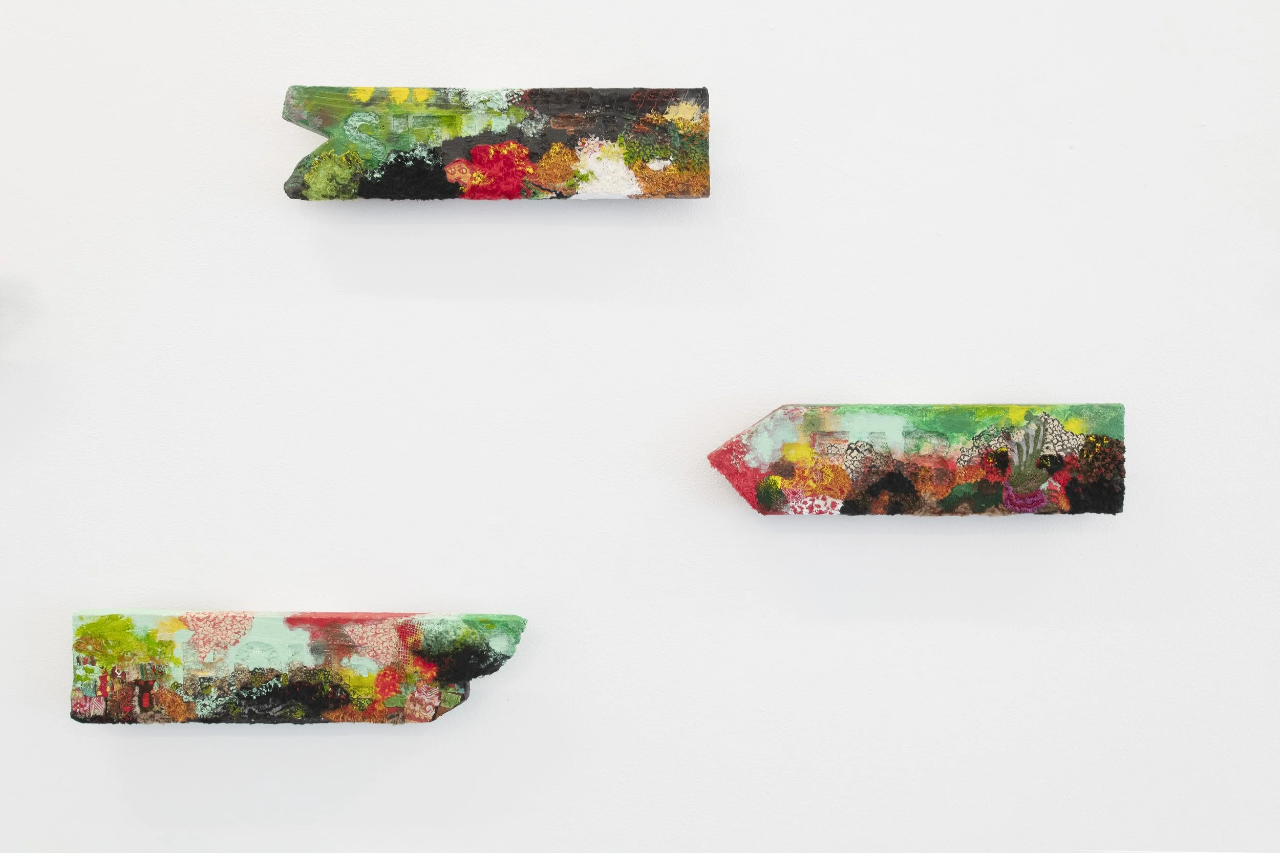
FLUFFY GEOGRAPHY
In Fluffy Geography, Australian artist Stephen Eastaugh offers a tactile, poetic meditation on movement, place, and the fluid geographies shaped by memory and imagination. Developed across Taiwan, Fiji, and Australia, the exhibition brings together 37 small-scale works that blur the boundaries between map and memory, language and landscape. Made from salvaged wood, thread, fabric, and gouged text, each piece functions like a signpost—yet rather than pointing toward fixed destinations, these works invite drift, reflection, and intuitive navigation.
For more than four decades, Eastaugh has embedded travel into the core of his practice. Having worked in over 80 countries—including multiple long residencies in Antarctica—he creates from the perspective of the perennial outsider, one who engages place not as a backdrop, but as a collaborator. Yet Fluffy Geography is not about documenting travel. These are not souvenirs. Instead, they are markers of inner topographies—visual and linguistic fragments shaped by movement and material.
Each work resembles a directional sign, but what it directs is uncertain. Abstracted panoramas sit alongside single-word inscriptions gouged into the wood—symbols and scenes that hover between clarity and suggestion. The stitched elements and worn surfaces hint at landscapes that may be remembered, imagined, or entirely invented. The use of text does not explain but deepens the mystery. Words here feel like found thoughts, partially buried or weathered over time, inviting interpretation rather than instruction.
The title, “Fluffy Geography,” encapsulates the conceptual tension at the heart of the show. “Fluffy” evokes softness, atmosphere, and a sense of ambiguity. “Geography,” by contrast, implies order, measurement, and control. Eastaugh brings these opposing forces into conversation, allowing them to coexist in each piece. What results is a kind of emotional cartography—artworks that don’t chart space so much as they suggest how it might feel to move through it.
Rather than offering a linear narrative, Fluffy Geography unfolds as a dispersed landscape of thought. Each work is a waypoint, not in the navigational sense, but as a moment of pause—an invitation to stop, consider, and reorient. These are artworks made to be read slowly, felt physically, and understood over time.
Stephen Eastaugh’s ongoing commitment to working with found materials—wood scarred with age, fabric frayed by use, thread as both line and suture—adds to the sense of lived history embedded in the work. In his hands, the act of stitching becomes an act of mapping; the gouging of words, a form of excavation. Together, these gestures form a language that resists certainty and celebrates ambiguity.
Fluffy Geography offers no destination and no clear route. Instead, it proposes a different kind of journey—one shaped by intuition, memory, and openness to the unknown. Eastaugh reminds us that place is never just where we stand, but how we feel, remember, and imagine. In this world of soft signs and shifting symbols, the viewer is invited not to arrive, but simply to wander.
Q&A
BP: What conditions or contexts gave rise to the Beautiful Borders series?
SE: This series was developed during my second residency in Taipei, at the Treasure Hill Artist Village—a compact, characterful space nestled within a layered urban ecosystem. I spent six intensive weeks there: exhibiting, walking mountain trails, reflecting on Taiwan’s precarious geopolitical position, and engaging with the local art community. The looming, unresolved threat from mainland China lingered in the background, sharpening my awareness of visible and invisible divisions. From that atmosphere emerged this suite of 16 mixed-media works.
BP: How does materiality function in this body of work?
SE: Each work—20 by 35 centimetres—combines acrylic, cotton thread, fake grass, metallic paint, watercolour, felt, and Belgian linen. I deliberately chose a tactile, sometimes contradictory palette. Softness alongside synthetic, stitched lines crossing open fields. These materials behave like borders themselves: shifting between containment and permeability, comfort and friction.
BP: Borders are central to the series—what draws you to them, conceptually?
SE: Borders occupy a liminal terrain that is both real and symbolic. I’m drawn to their contradictions—how they can simultaneously separate and connect. They operate like emotional seismographs: sites of joy and sorrow, confrontation and reconciliation. I see them as see-saws—tipping between states, never still. They’re where abstraction and representation meet, where politics collides with personal experience.
BP: How do you articulate the shifting nature of frontiers through your imagery?
SE: I stitched barbed, red thread and scattered grid-like formations across ambiguous islands—gestures that suggest mapping, but resist legibility. These visual interventions aren’t literal—they’re speculative. They mirror the unstable, often contradictory character of borders: places where strangers encounter one another, for better or worse. The ambiguity is intentional.
BP: Do you imagine a future for borders beyond their current function?
SE: That’s the hope buried in the title. Borders can be violent, bureaucratic, cold—but they can also transform. Frontiers become walls, then trenches, then maybe bridges. Landscape, of course, doesn’t care about our divisions. The idea of beautiful borders isn’t naïve optimism—it’s a provocation. A hope that these charged zones can evolve into places of genuine, humane encounter.
REQUEST MORE INFORMATION ABOUT THE EXHIBITION ENQUIRE
ARTWORKS:


enquire.
david walLage: free falling
David Wallge
09.04.25 - 10.05.25


David Wallage: Free failing
David Wallage's latest exhibition, Free Falling, explores the essential elements of painting and sculpture. Wallage approaches his work with a commitment to abstraction, seeking to understand the most essential components of art—form, colour, and material. His approach echoes the modernist tradition of non-representational art, influenced by ground-breaking figures such as Joseph Albers, Imi Knoebel and Agnes Martin.
Wallage's process is driven by a desire to eliminate excess, distilling his work to its most basic and essential aspects. Albers famously stated, “Simultaneous contrast is not just a curious optical phenomenon—it is the very heart of the painting,” emphasising the critical role of colour relationships. For Wallage, this idea serves as a foundation for his creative process, where the interaction of colours and materials is central to the artwork's meaning and impact.
For Wallage, each painting becomes an opportunity for experimentation, working serially and continuously refining his exploration of essential forms. His use of materials remains straightforward, focusing on the tactile relationship between the surface and the viewer. Wallage remains committed to a rigorous, abstract practice that does not simply create art but instead attempts to unearth the fundamental relationships that define our interaction with the visual world.
ARTWORKS:


enquire.
JAMES CLAYDEN: 100 DRAWINGS 2020 - 2022
James Clayden
12.03.25 - 05.04.25


James Clayden: 100 Drawings
"These drawings were made between 2020 and 2022 when for no reason l kept them roughly the same size. They weren’t done with paintings in mind, but purely as intimate drawings for themselves alone. When l looked back over them l thought they could possibly go together in a small landscape format book. I had them photographed and slowly l began arranging them into the order they are in this book. There seemed to be a good feeling to the idea of there being 100 drawings, so l made a selection from all l had done in that time and here they are."
James Clayden, a visionary painter, filmmaker, and musician, presents 100 Drawings 2020-2022, a collection that offers an intimate, raw exploration of his creative process during the global pandemic. Through these drawings, Clayden distils his ongoing fascination with abstraction, form, and the delicate interplay of space—unveiling a personal and visceral narrative of artistic evolution.
Spanning two years, 100 Drawings captures a moment of transformation, allowing us to witness the artist’s journey as it unfolds across each piece. This exhibition reveals not only the development of Clayden’s distinctive language but also his deep engagement with the rhythms of time, space, and perception.
Accompanying the exhibition, Blockprojects is proud to release a comprehensive publication showcasing the full series of 100 drawings, offering a deeper insight into Clayden's world and the evolution of his art during these pivotal years.
ARTWORKS:
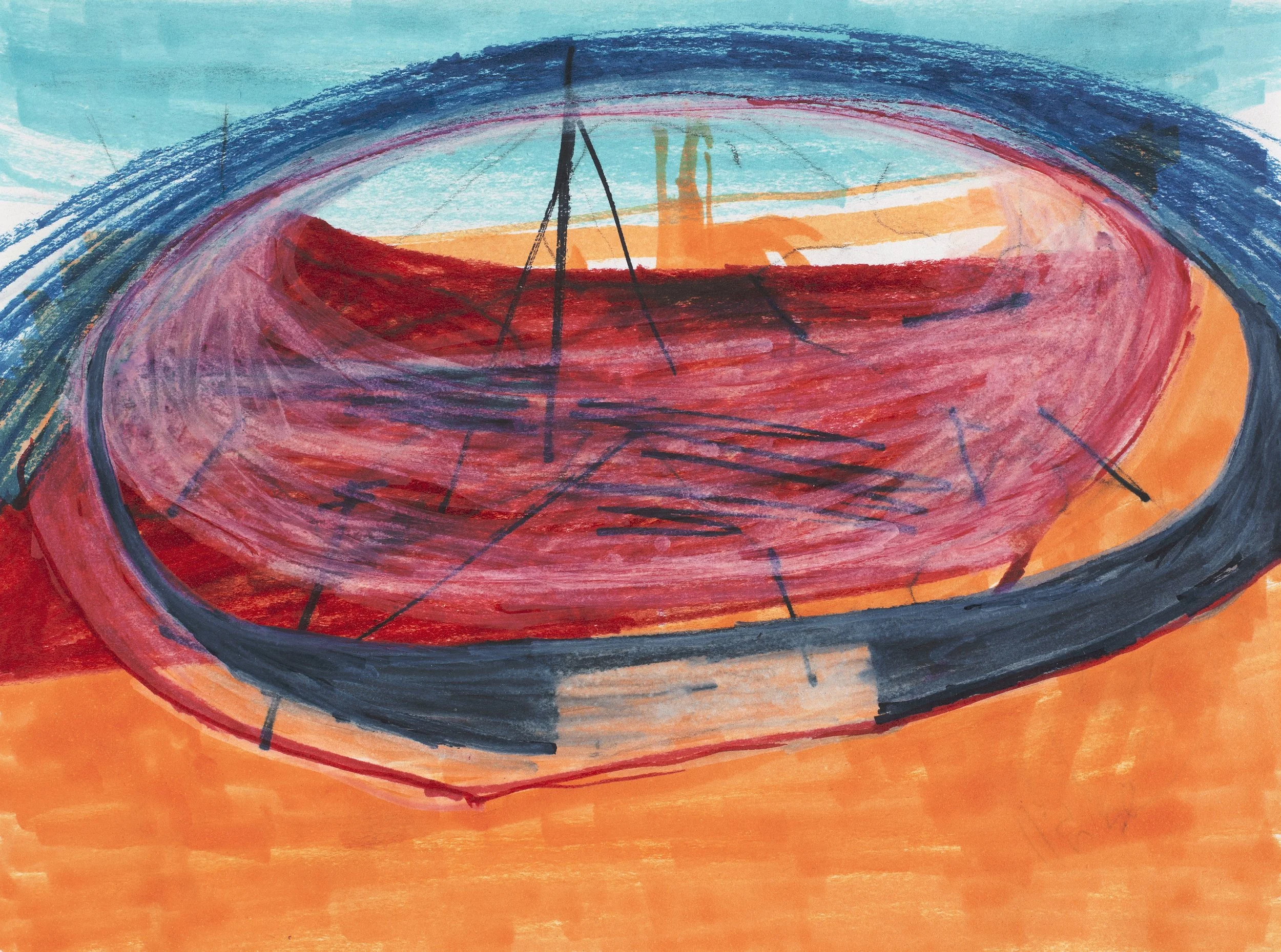


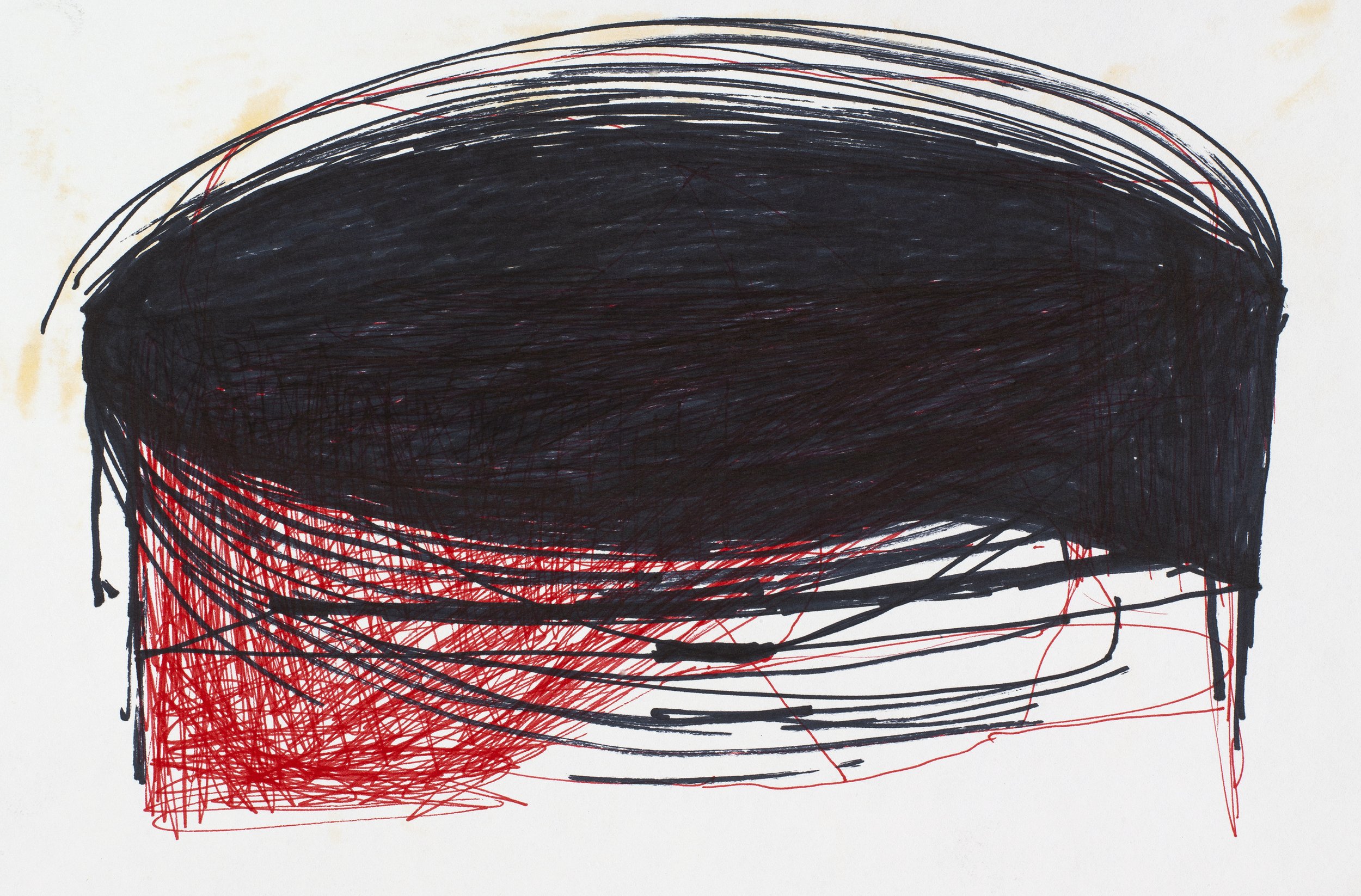


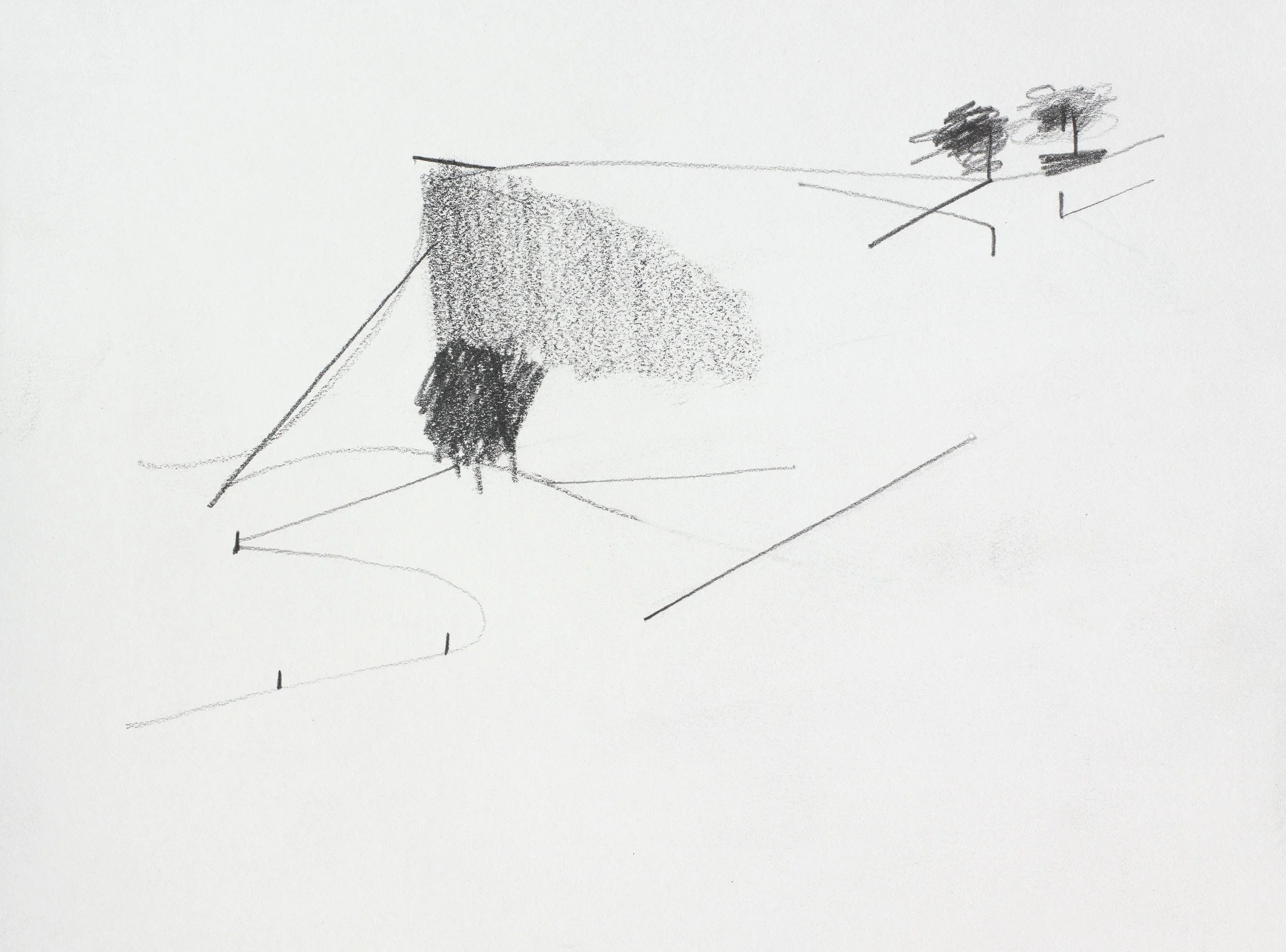


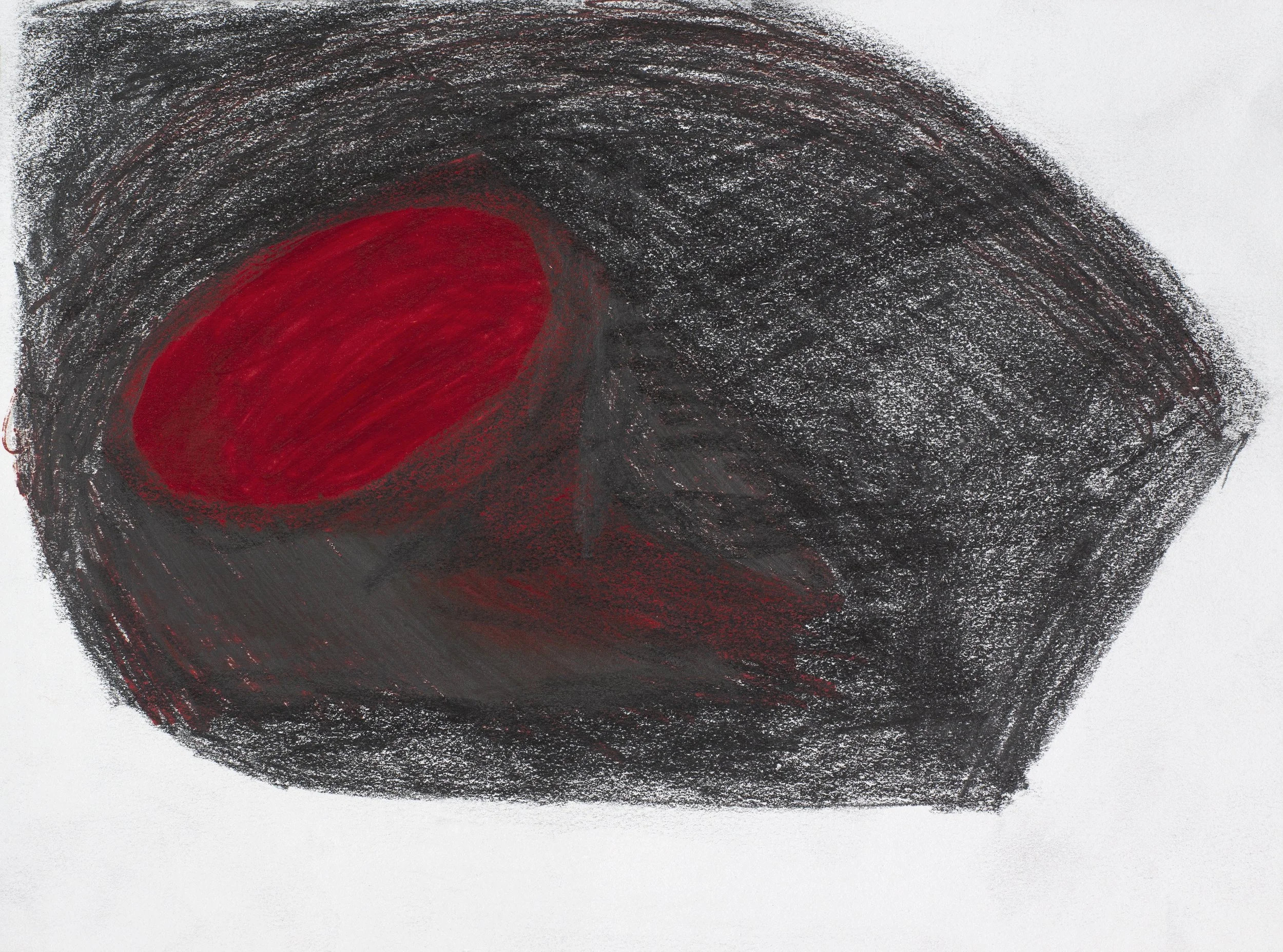


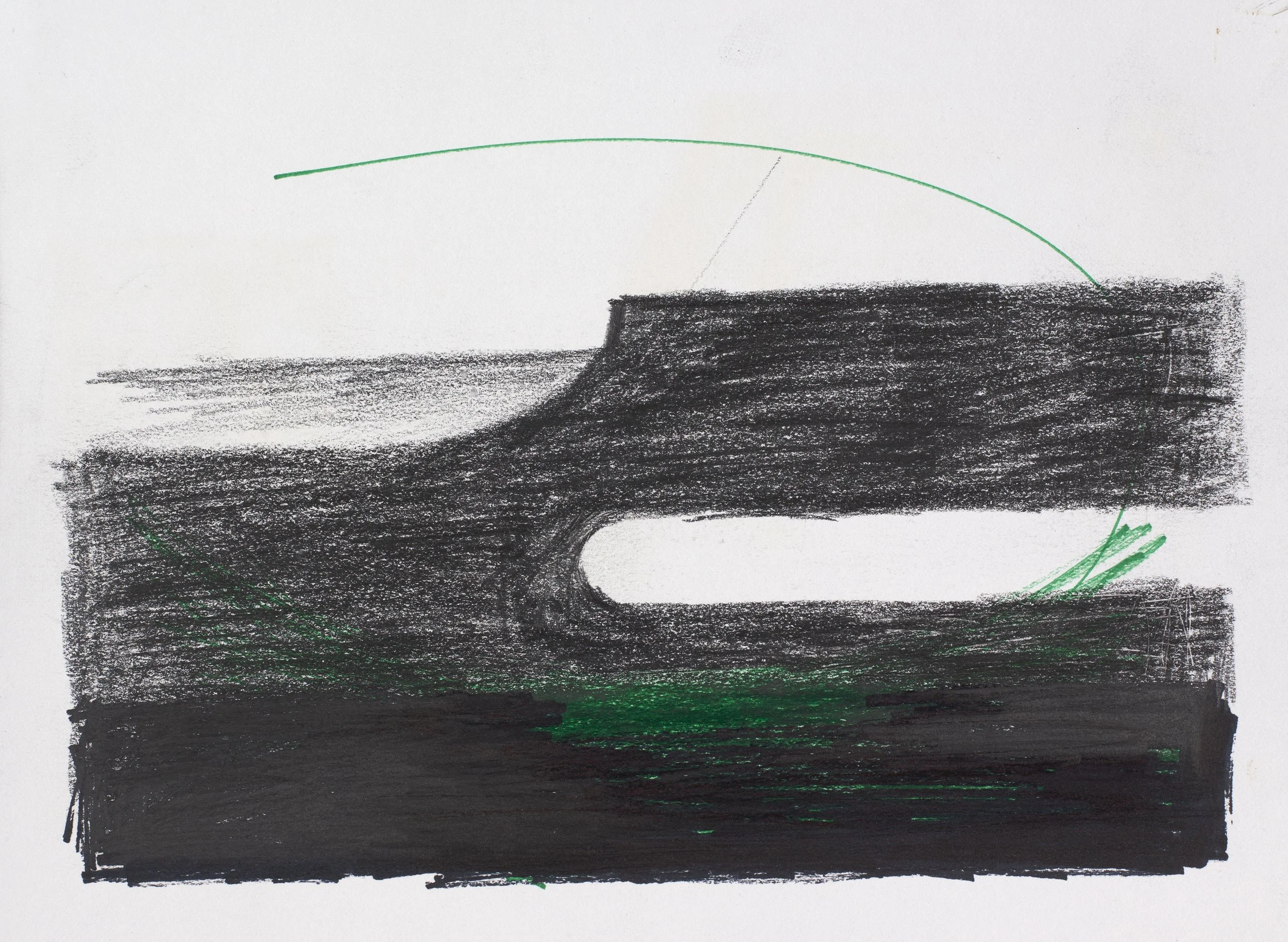


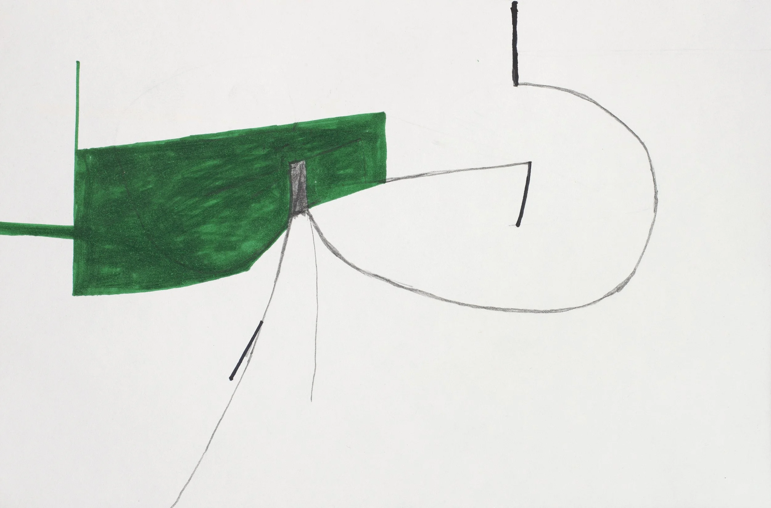


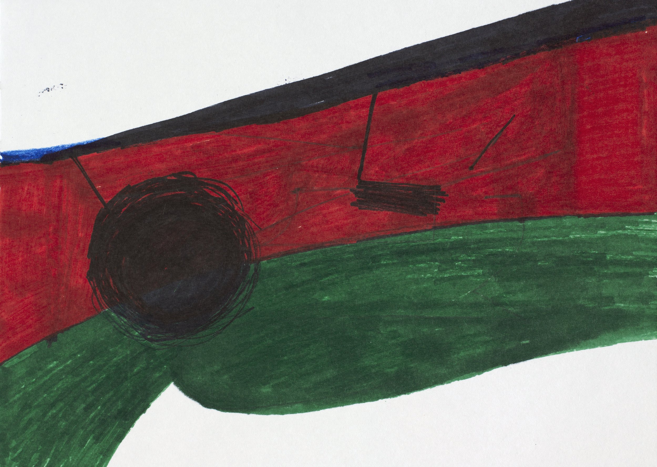


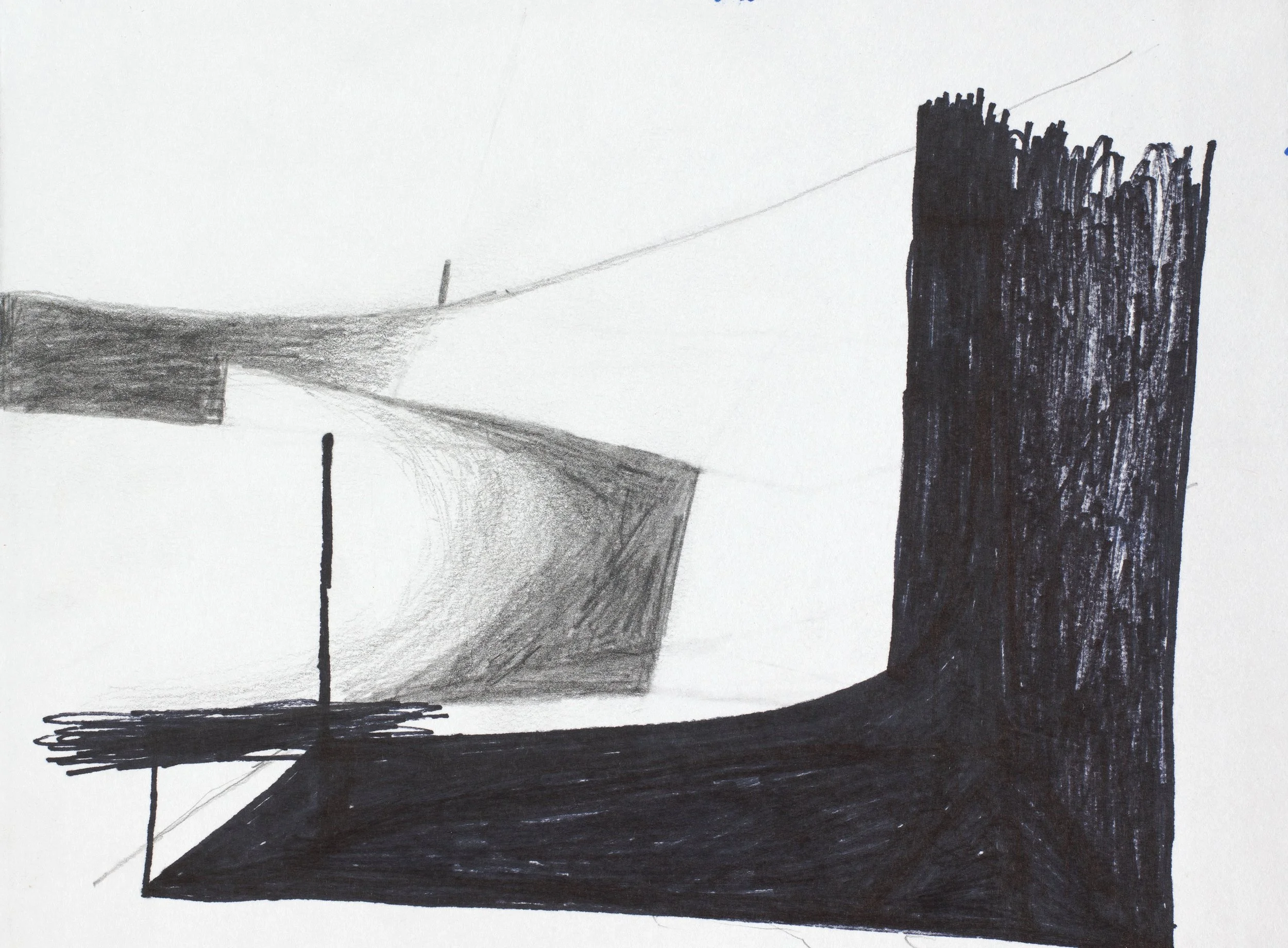

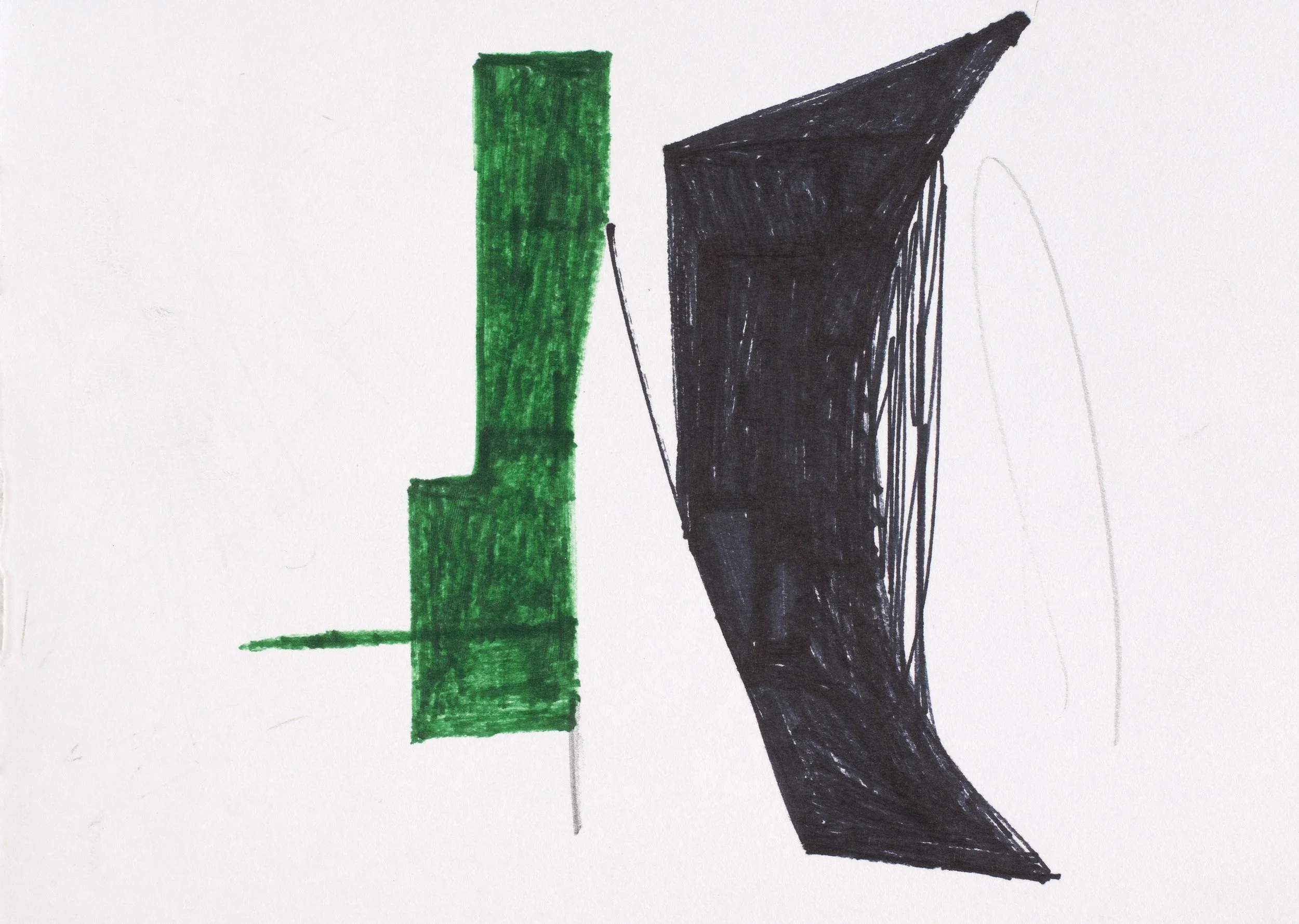
enquire.
marc freeman: all things being equal
Marc Freeman
12.02.25 - 08.03.25


Marc Freeman: All things being equal
In an age when the digital and the physical intermingle with increasing ease, Marc Freeman’s latest exhibition, All Things Being Equal, examines the delicate dance between historical iconography and contemporary visual culture. The show dissolves rigid artistic boundaries, offering a space where classical painterly traditions and the aesthetics of algorithmic design meet, forging a landscape in which past and present exist in constant dialogue.
Freeman’s latest body of work treats painting as both an act of excavation and reinvention. He retrieves, dissects, and reconstructs historical references through a distinctly contemporary lens. These compositions shift seamlessly between the digital and the handmade, challenging established hierarchies and collapsing the divide between medium and time. Elements of pixelation, glitch aesthetics, and machine-generated forms intertwine with expressive brushstrokes and careful composition, blurring the line between fleeting digital imagery and the permanence of paint on canvas.
A key reference point here is Frank Stella’s late-career embrace of digital technologies—his evolution from strict minimalism to computationally generated three-dimensional structures serving as an important precedent. Freeman follows a similar trajectory, disrupting linear art-historical narratives by merging abstraction and tradition. His inclusion in Thames & Hudson’s 100 Painters of Tomorrow, as well as his exhibitions in New York and Beijing, position him within a contemporary conversation on materiality and technological mediation. His receipt of the Marten Bequest Traveling Scholarship speaks to the expansiveness of his practice, both in terms of geography and conceptual ambition.
All Things Being Equal resists the temptation to frame tradition and innovation as opposing forces. Instead, it proposes a continuum—one where artistic methodologies evolve and hybridise. In Freeman’s work, painting is neither a nostalgic return nor a futuristic leap; it is an ongoing negotiation with time itself, investigating how images endure, adapt, and assert their presence in an ever-shifting visual world.
ARTWORKS:


enquire.
peter graham: diviner
Peter Graham
20.11.24 - 20.12.24


peter Graham : Diviner
‘Diviner’ is a project comprised of figurative studies, that depict an artist as a kind of primal, magical entity inhabiting a workshop within the mind. Sometimes long hours are spent in the studio staring dumbly at blank surfaces so that eventually a lack of inspiration becomes subject for the work itself.
At these times I have made observations of my own artistic practice as if it were some (absurd) ritual, undertaken in order to transcend its own limitations. I have often depicted my surrounding workshop like the interior of a giant head-space, a vault with indication of openings into the external world that exists beyond.
The figurative forms operating in this underworld are like bodily manifestations of an artist’s imaginative intent. I wonder how consciousness might extend its reach beyond the internal regions of a body, as if our physical-self was a slave to the spirit that motivates its actions. That an exhausted artist is like a golem to their inner creative drive: we are thaumaturgic beings, spellbound to motivate beyond the despondency and despair of an imagination in decay.
The paintbrush is like a wand, or antennae- a dark spark, or spore; as well as a hairy stick that seems to stop short of everything. I imagine a type of magical activity beyond its sad failed reach as if it were a lamp illuminating interior spaces on the other side of a picture plane. There the artist ventures like an archaeologist, attempting to steal the shine reflecting off a deeply kept secret located in the bunker of the mind.
ARTWORKS:


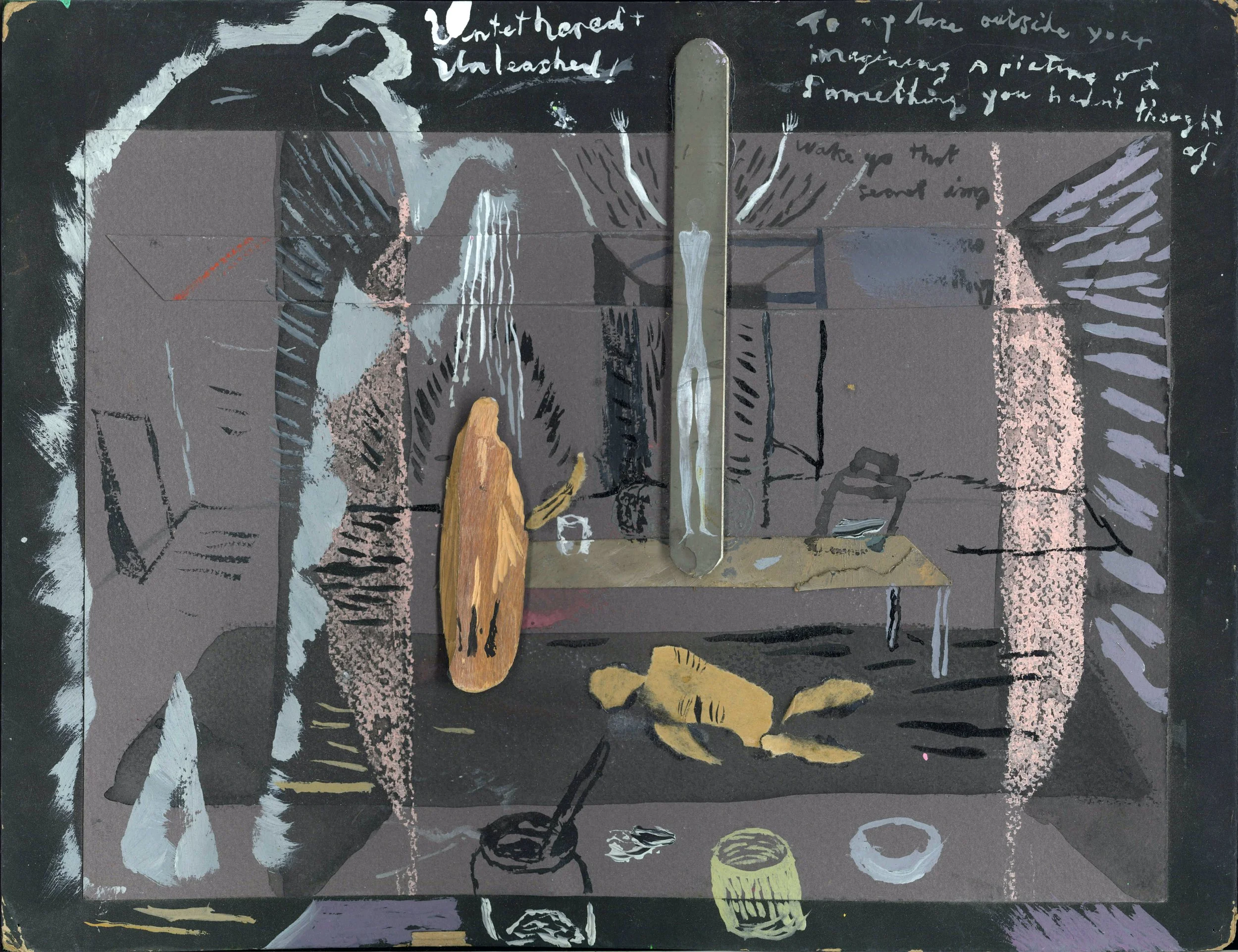


enquire.
jo wilson: wood/line/pins
Jo Wilson
16.10.24 - 16.11.24


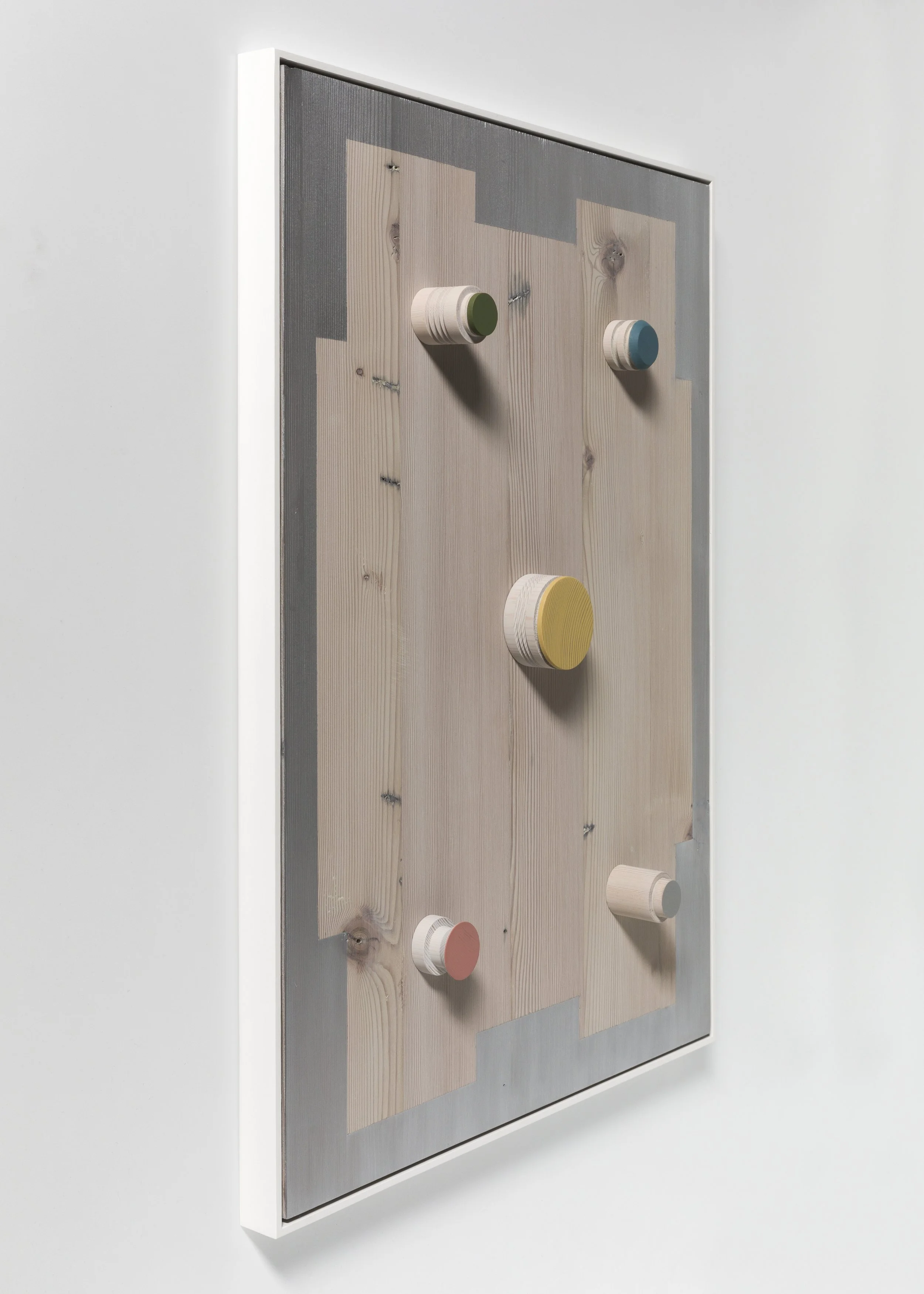

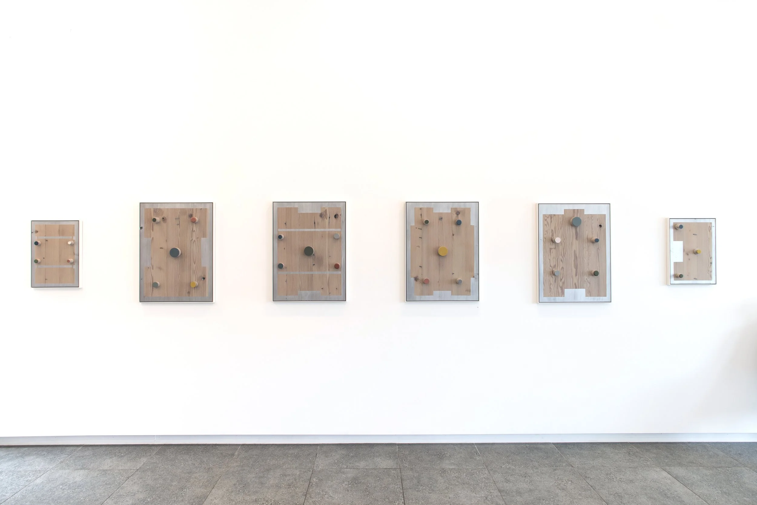

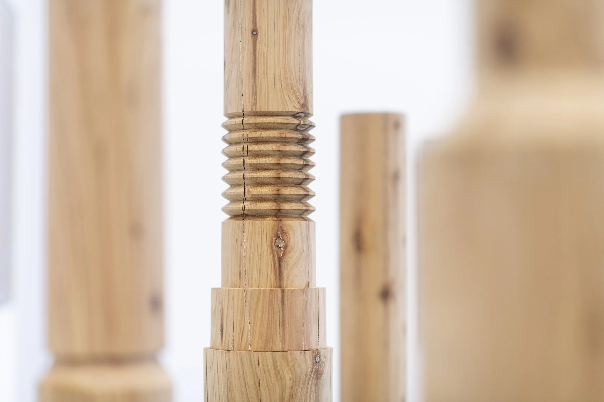


Jo Wilson: wood/line/pins
While nature and industry are not immediately obvious counterparts, they are the primary and consistent themes that characterise Jo Wilson’s recent art practice. Her work is distinctive both in its use of natural materials – typically reclaimed timber which is selected for the beauty of its grain, texture and colour, as well as its history – and in terms of the ongoing and wide-ranging influence of the plastic injection moulding factory that was established and operated by her father. Wilson’s studio is based at the factory and the varied elements of this familiar industrial setting provide a rich repertoire of source material that has inspired her work over many years. While others may not see beauty here, for Wilson, who is acutely aware of her environment and sensitive to its details, it is a site of artistic potential and constant creative renewal.
The woodLINE totems in this exhibition are based on steel tooling components stacked in imaginary assemblages which have been turned on a lathe into a series of single towering forms. Shape and line are perfectly calibrated in these works, but the precision of their design is interrupted by the natural features of the cypress – the irregular patterns of its grain, variations in colour and random knots in the timber – establishing a compelling interplay between the manmade and the organic. The same dynamic operates in the Channels and Pin/Point series where details from the factory are replicated in metallic paint and playfully coloured miniature pins (also turned on a lathe) on panels of richly figured cypress and oregon. The silver painted sections in these works follow the linear format of channels in plastic palettes which Wilson has sketched and photographed in the factory and while they recall the sheen of industrial machinery, sometimes appearing solid and dense, in certain lights the paint is also translucent, deliberately chosen so that the grain of the timber remains visible.
Wilson feels a strong connection with her medium – she loves its tactile material qualities, its patterning and tonal variation, even its scent. She is excited by the prospect of transforming discarded raw material into something beautiful and giving it new life. Beyond this, she is also conscious of the timber she uses as having an energy that connects it directly to the natural world. She observes the finely-set grain lines of one panel which indicate years of growth, for example, with fascinated awe. The slow, often hand-worked and labour intensive nature of the techniques that Wilson uses allows her to focus on these qualities, showing respect for the medium at the same time as stilling her own thoughts in a therapeutic form of making as meditation.
KIRSTY GRANT
Kirsty Grant is a curator and writer specialising in Australian art. She previously served as the Director of Heide Museum of Modern Art and was the Senior Curator of Australian Art at the National Gallery of Victoria (NGV).
ARTWORKS:


enquire.
julia powles: all these galaxies inside us
JULIA POWLES
18.09.24 - 12.10.24


Julia Powles: all these galaxies inside us
In her most recent solo exhibition Julia Powles maps out a trajectory of human feeling. A large series of black and white drawings titled A brief history of crying, runs along one wall of the gallery. In this work we find numerous tear shapes - a common motif for Powles - drawn in white pencil and chalk onto ink; erased and re-drawn in a manner reminiscent of a blackboard, the site where lessons are learned. With so many tears washing down the wall, we are reminded that weeping is also a collective action, and that through compassion and empathy we can find unity. Made using her engineer father’s drafting equipment – compasses, rulers and French curves – Powles employed tools that were once used to design the built environment, as a means for expressing inner emotions.
Similarly, a Venn diagram of overlapping circles has been painted onto a blanket that belonged to the artist’s mother. The schematic blanket painting operates as a kind of family portrait with members overlapping in significance, casting shadows and creating absences. So much happens, Powles says, in bed: sex, love, birth, death, illness, crying and dreaming, while the blankets, kept for years in her mother’s linen closest, bear witness to those events. In reusing her mother and father’s possessions to make art she can not only redeploy functional materials but embed the lived experience of others into her working methodology.
The paintings and drawings in this exhibition span a four-year period during which Powles sought to represent ideas relating to time and experiences. Sound waves, thoughts that resurface, stories told and retold, memories (actual and repressed) are manifest in paint through echoes, reverberations and ghosts – lines and colours repeat in more and more corrupted manners, shapes are erased, one form is buried beneath another, spatial structures emerge and collapse. A small relief sculpture completes the exhibition, appearing as a series of loops it is in fact a sentence: All these galaxies inside us. Made from a single coil of clay and gilded with silver leaf, the barely legible nature of the text is, like so much of our confusing, complex emotional lexicon, obvious once we can see it.


